2-D Density Map of Bigfoot Sightings
By Charles Holbert
October 1, 2022
Introduction
Data visualization is one of the first steps of the data science process. Data visualization is also an important element of the broader data presentation architecture discipline, which aims to identify, locate, manipulate, format, and deliver data in the most efficient way possible. The increased popularity of big data and data analytics have made data visualization more important than ever.
This post will focus on performing some basic spatial data analysis using Bigfoot sightings in North America and the R language for statistics and visualization. Bigfoot, otherwise known as Sasquatch, is regularly reported in forested lands of western North America, as well as being considered a significant indigenous American and western North American folk legend. Whether the creature exists or not is up for debate, but thousands of people have reported sightings going back hundreds of years, and I thought it might provide an interesting dataset for demonstrating some spatial analysis techniques. Future posts will take a deeper dive into the data including species distribution modelling.
Load Libraries
We’ll start by loading some libraries for manipulation, exploration, and visualization of the sightings data. Let’s also create a variable for the coordinate reference system using the European Petroleum Survey Group (EPSG) code. We’ll assign this variable the value of 4326, which refers to WGS84 as (latitude, longitude) pair coordinates in degrees with Greenwich as the central meridian.
# Load libraries
library(dplyr)
library(sf)
library(sp)
library(ggmap)

# Set EPSG
epsg <- 4326
Data
The data consists of a collection of reported Bigfoot encounters across North America archived by the Bigfoot Field Researchers Organization (BFRO). The BFRO has compiled a detailed database of Bigfoot sightings going back to the 1920s. Each sighting is dated, located to the nearest town or road, and contains a full description of the sighting. All reports posted into the BFRO’s online database are assigned a classification: Class A, Class B, or Class C. The difference between the classifications relates to the potential for misinterpretation of what was observed or heard.
Class A reports involve clear sightings in circumstances where misinterpretation or misidentification of other animals can be ruled out with greater confidence. Class B reports involve sightings at great distances, in poor lighting conditions, or in any other circumstance that did not afford a clear view. Class C reports involve second-hand reports, and any third-hand reports, or stories with an untraceable source.
# Read data in comma-delimited file
datin <- read.csv('data/bigfoot.csv', header = T)

# Inspect structure of data
str(datin)
## 'data.frame':	4273 obs. of  4 variables:
##  $ LONG : num  -79.7 -121.9 -86.1 -101.3 -83.5 ...
##  $ LAT  : num  36.9 49.2 46 48.3 35.7 ...
##  $ CLASS: chr  "A" "A" "A" "A" ...
##  $ DATE : chr  "8/15/1985" "3/2/2006" "4/1/1962" "4/21/2000" ...
There are over 4,200 reported sightings between January 1921 and August 2022. The data include longitude, latitude, date, and the class of sighting. Let’s format the date variable and add both month and year to the data.
# Prep data
sightings <- datin %>%
  mutate(
    DATE = as.POSIXct(DATE, format = '%m/%d/%Y'),
    MONTH = lubridate::month(DATE, label = T, abbr = T),
    YEAR = as.numeric(format(as.POSIXct(DATE), '%Y'))
  )
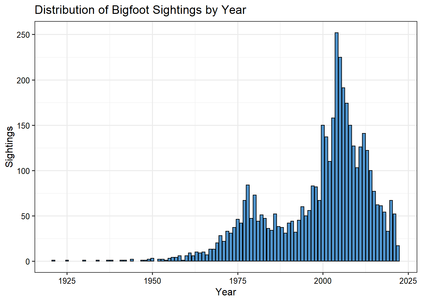
First, let’s plot the sightings by year. Reported Bigfoot encounters appear to have increased in the late 1970s and early 1980s and then again in the early 2000s.
# Plot of sightings by year
ggplot(data = sightings, aes(x = YEAR)) +
  geom_bar(stat = 'count', color = 'black', fill = 'steelblue3') +
  labs(title = 'Distribution of Bigfoot Sightings by Year',
       x = 'Year',
       y = 'Sightings') +
  theme_bw(base_size = 12) +
  theme(axis.text = element_text(color = 'black'))
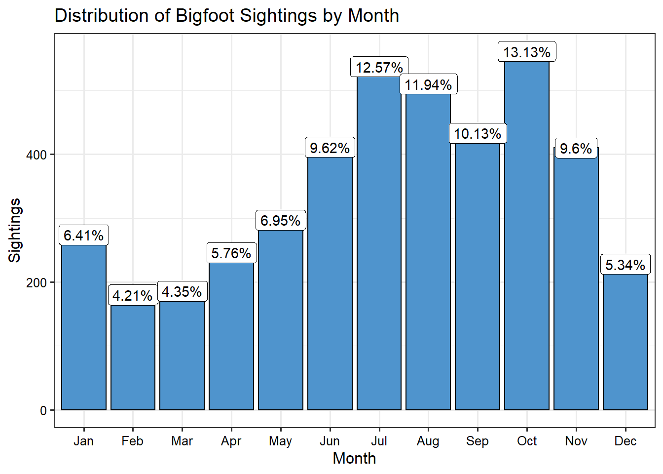
Next, let’s plot the sightings by month. It seems the best time to experience a Bigfoot encounter is late summer or early fall.
# Plot of sightings by month
ggplot(data = sightings, aes(x = MONTH)) +
  geom_bar(stat = 'count', color = 'black', fill = 'steelblue3') +
  geom_label(stat = 'count',
             aes(label = paste(round(..count../sum(..count..), digits = 4)*100, '%', sep = ''))) +
  labs(title = 'Distribution of Bigfoot Sightings by Month',
       x = 'Month',
       y = 'Sightings') +
  theme_bw(base_size = 12) +
  theme(axis.text = element_text(color = 'black'))
Let’s make the data a geospatial object and assign the coordinate reference system.
# Make data geospatial object
coordinates(sightings) = ~LONG+LAT
proj4string(sightings) = CRS(paste0("+init=epsg:", epsg))
Let’s use the st_bbox() function from the sf library to get the spatial extent of the data. Let’s create a base map defined with the spatial extent of the data using the get_map() function from the ggmap library. ggmap is an R library that makes it easy to retrieve raster map tiles from popular online mapping services like Google Maps and Stamen Maps and plot them using the ggplot2 framework.
# Use st_bbox() function from sf package to get spatial extent of data
bbox <- st_bbox(sightings) %>%
  as.vector()

# Create basemap
myMap <- get_map(bbox)
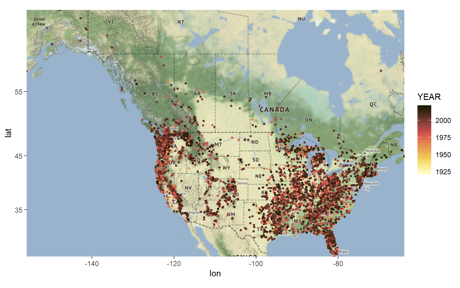
Let’s plot the locations of sightings on top of our basemap by adding a layer of points. Let’s color-code the points by year of reported sighting. Again we see an increase in the number of reported sightings after about 1975.
# Create map
ggmap(myMap) +
  geom_point(data = data.frame(sightings),
             aes(x = LONG, y = LAT, color = YEAR), size = 1) +
  scico::scale_color_scico(palette = 'lajolla') +  #'bilbao', 'vik'
 # scale_color_gradient2(low = 'blue', mid = 'white', high = 'red',
 #                      midpoint = 1975) +
  theme(legend.position = 'right')
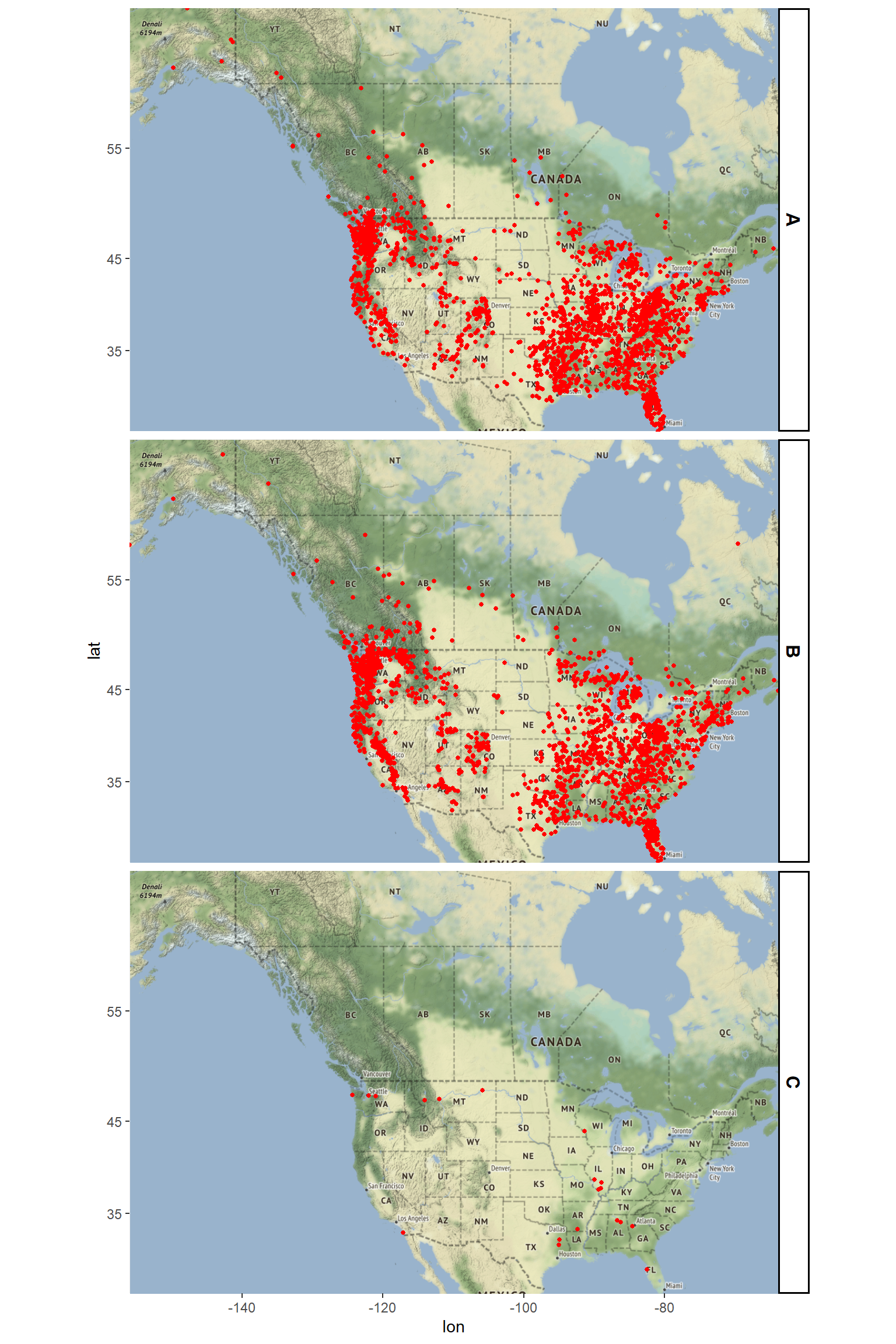
Let’s create a map of the data by classification. It seems that most of our data belong to Class A and Class B with very few ocurrances of Class C.
# Create map
ggmap(myMap) +
  geom_point(data = data.frame(sightings), aes(x = LONG, y = LAT),
             color = 'red', size = 1) +
  facet_grid(CLASS ~ .) +
  theme(strip.text.y = element_text(size = 12, color = 'black', face = 'bold'),
        strip.background = element_rect(color = 'black', fill = 'white',
                                        size = 1, linetype = 'solid'))
The pattern of sightings are not evenly distributed but appear clustered. There are distinct regions where sightings are incredibly common, likely due to terrain and habitat. The data are heavily overplotted. There are a few ways to mitigate this overplotting (e.g., manipulating the alpha aesthetic), but a great way is to create a density plot. The goal of density estimation is to take a finite sample of data and to make inferences about the underlying probability density function everywhere, including where no data are observed. In kernel density estimation, the contribution of each data point is smoothed out from a single point into a region of space surrounding it. Aggregating the individually smoothed contributions gives an overall picture of the structure of the data and its density function.
There are many ways to compute densities, and if the mechanics of density estimation are important for your application, it is worth investigating packages that specialize in point pattern analysis (e.g., spatstat). If on the other hand, you’re lookng for a quick implementation for the purposes of exploratory data analysis, you can also use ggplot’s stat_density2d() function, which uses the kde2d() function from the MASS library on the backend to estimate the density using a bivariate normal kernel. Let’s plot contour lines around the points to highlight the clusters.
# Create map
p1 <- ggmap(myMap) +
geom_density2d(data = data.frame(sightings),
aes(x = LONG, y = LAT), size = 0.3) +
stat_density2d(data = data.frame(sightings),
aes(x = LONG, y = LAT, fill = ..level.., alpha = ..level..),
size = 0.01, bins = 24, geom = 'polygon') +
scale_fill_gradient(low = 'yellow', high = 'red') +
scale_alpha(range = c(0, 0.4), guide = FALSE) +
theme(legend.position = 'none')
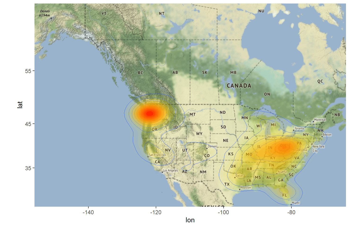
p1
We can also display the data in 3D using the rayshader package as seen below.
# Load library
library(rayshader)

# Create map
plot_gg(
  p1, multicore = TRUE, width = 16, height = 12,
  scale = 100, windowsize = c(1400, 900),
  zoom = 0.7, phi = 30, theta = 30, raytrace = TRUE
)
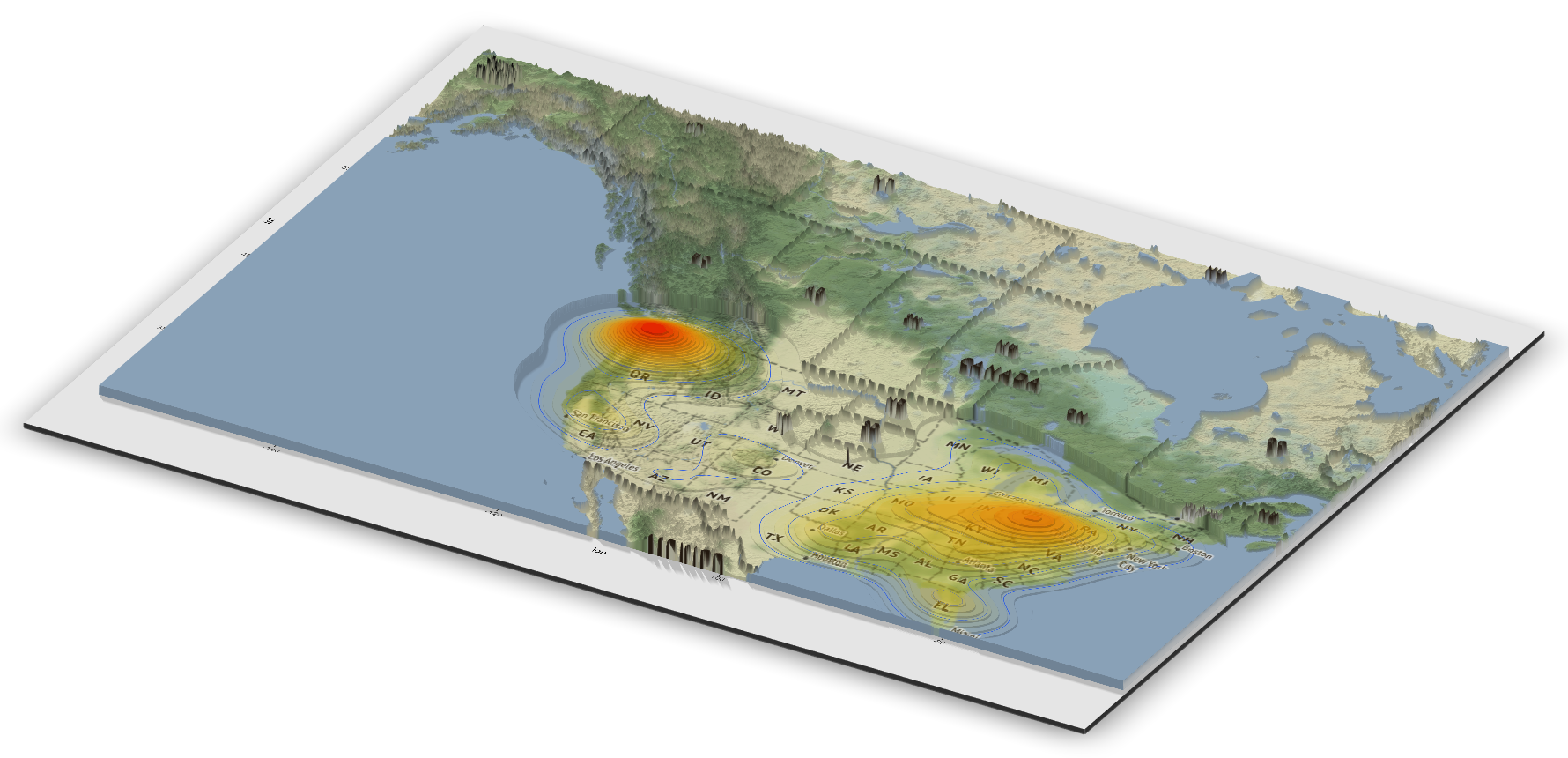
Looking at this map, there are areas that stand out as having a high concentration of sightings. These include the Pacific Northwest, the Ohio River Valley, central Florida, and the Sierra Nevada mountain range. The highest concentration is in Washington state, which is known for having the most bigfoot sightings in the country. In addition to being the most popular state for alleged Bigfoot encounters, Washington was also the first place to grant the mythical species legal protection.
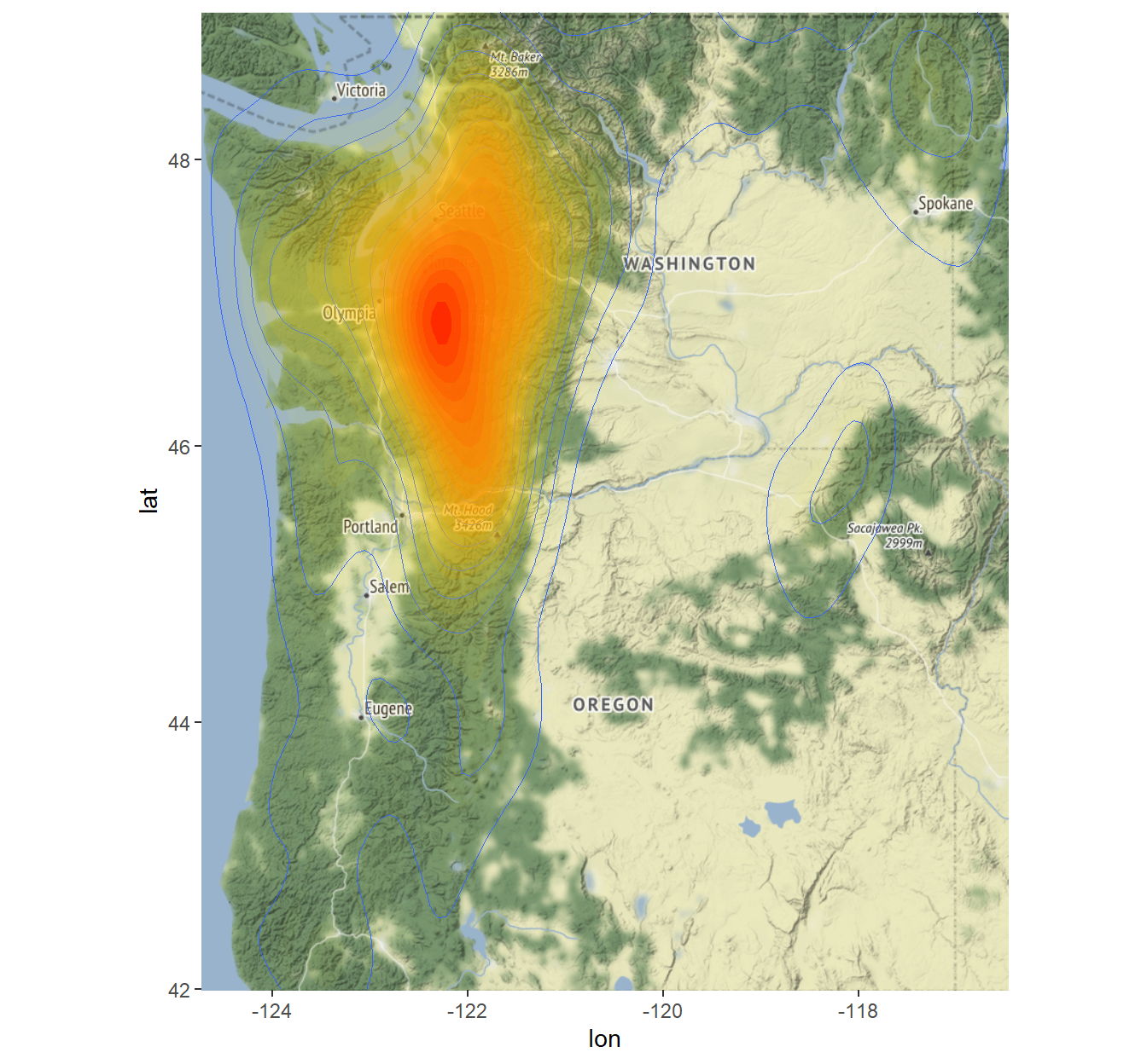
Below is a density map of reported Bigfoot sightings for the State of Washington. The map displays high concentrations of sightings in red from just east of Olympia, WA and running through the Cascade Mountains to just north of Mt. Baker and south of Mt. Hood.
# Get map of Washington and Oregon using tigris
library(tigris)
nw <- counties(
  state = c('Washington', 'Oregon'),
  cb = TRUE, resolution = '20m',
  progress_bar = FALSE
)

# Use st_bbox() function from sf package to get spatial extent of data
bbox <- st_bbox(nw) %>%
  as.vector()

# Create basemap
myMap <- get_map(bbox)

p2 <- ggmap(myMap) +
  geom_density2d(data = data.frame(sightings),
                 aes(x = LONG, y = LAT), size = 0.3) +
  stat_density2d(data = data.frame(sightings),
                 aes(x = LONG, y = LAT, fill = ..level.., alpha = ..level..),
                 size = 0.01, bins = 24, geom = 'polygon') +
  scale_fill_gradient(low = 'yellow', high = 'red') +
  scale_alpha(range = c(0, 0.4), guide = FALSE) +
  theme(legend.position = 'none')
p2
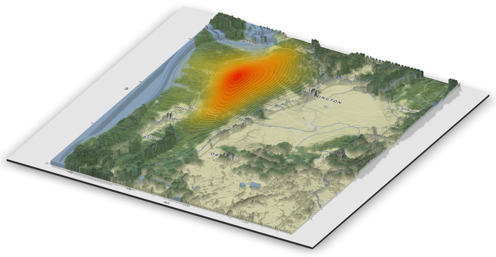
A 3D rendering of Bigfoot sightings in the state of Washington using the rayshader package is shown below.
# Create map
plot_gg(
  p2, multicore = TRUE, width = 12, height = 12,
  scale = 100, windowsize = c(1400, 900),
  zoom = 0.7, phi = 30, theta = 30, raytrace = TRUE
)
Now we know that the best chance of having a positive sighting of Bigfoot is in the state of Washington during late summer or early fall. However, the mystery of Bigfoot’s natural habitat and preferences is very much unanswered from this initial spatial analysis. With a broad range of variables still to explore - climate, altitude, food sources - future posts will attempt to determine what conditions lend themselves to the survival of Bigfoot.
- Posted on:
- October 1, 2022
- Length:
- 8 minute read, 1664 words
- See Also: