Exploratory Spatial Data Analysis and Kriging in R
By Charles Holbert
May 29, 2023
Introduction
For spatially correlated data, higher correlation is expected for points that are closer together. One of the most important objectives of exploratory spatial data analysis (ESDA) is to characterize the range of spatial autocorrelation that is exhibited in the data. This range can be used to guide sample spacing or to select an appropriate method for interpolation. The variogram is the most common ESDA method used to assess spatial correlation.
A variogram is a plot of the squared differences between measured values as a function of distance between sampling locations. The variance of the differences increases with distance until the spatial autocorrelation is no longer present. The variance at this distance, referred to as the range, is called the sill. At distances less than the range, measured values will exhibit spatial autocorrelation. The variogram is also referred to as a semivariogram because the values are one-half of the variance between two points with a given lag. A plot of one-half of the mean of the squares of the differences in measured values grouped by lag function of distance is the sample variogram (also called empirical variogram or experimental variogram). The variogram model fitted to the data is chosen from a set of mathematical functions that describe spatial relationships. The appropriate model is chosen by matching the shape of the curve of the experimental variogram to the shape of the curve of the mathematical function.
This post presents and demonstrates several methods for ESDA using the R language for statistical computing and visualization. These methods assist in understanding and modeling spatial correlation in data, which is a critical component of kriging.
Preliminaries
We’ll start by loading the main R libraries that will be used for the ESDA, variogram analysis, and kriging.
# Load libraries
library(dplyr)
library(raster)
library(gstat)
library(sp)
library(sf)
library(ggplot2)
library(grid)
library(gridExtra)
library(scales)
Let’s set the European Petroleum Survey Group (EPSG) code for our data. The EPSG code is a unique identifier for different coordinate systems. It’s a public registry of geodetic datums, spatial reference systems, Earth ellipsoids, coordinate transformations, and related units of measurement. Each entity is assigned an EPSG code between 1024-32767.
# Set EPSG code
epsg <- 28992
Data
For this example, we will use the meuse data set from Pebesma (2022). The meuse data set is a regular data frame that comes with the R sp library. It includes concentrations (in parts-per-million [ppm]) of four heavy metals sampled from the top soil in a flood plain along the river Meuse, near the village Stein in the Netherlands. Heavy metal concentrations are bulk sampled from an area of approximately 15 meters (m) by 15 m. Coordinates are in Rijksdriehoek (RDH) (Netherlands topographical) map coordinates. The data set also contains a number of covariates.
The R sp library also includes a meuse.grid data frame and a meuse.riv data frame. The meuse.grid data frame consists of a grid with 40 m x 40 m spacing that covers the Meuse study area. The meuse.riv data frame consists of an outline of the Meuse river in the area a few kilometers around the meuse data set.
# Load data
data(meuse)
data(meuse.grid)
data(meuse.riv)
Let’s convert the meuse data set from a regular data frame to a spatial points data frame. The difference between spatial points and a spatial points data frame are the attributes that are associated with the points. A spatial points data frame have additional information associated with the points while spatial points contain only the spatial information about the point. Let’s also assign the coordinate projection system to the data using the EPSG code.
# Convert meuse data to a spatial points dataframe
coordinates(meuse) <- ~ x + y
proj4string(meuse) = CRS(paste0("+init=epsg:", epsg))
Let’s inspect the structure of the data.
# Inspect data
str(meuse)
## Formal class 'SpatialPointsDataFrame' [package "sp"] with 5 slots
##   ..@ data       :'data.frame':	155 obs. of  12 variables:
##   .. ..$ cadmium: num [1:155] 11.7 8.6 6.5 2.6 2.8 3 3.2 2.8 2.4 1.6 ...
##   .. ..$ copper : num [1:155] 85 81 68 81 48 61 31 29 37 24 ...
##   .. ..$ lead   : num [1:155] 299 277 199 116 117 137 132 150 133 80 ...
##   .. ..$ zinc   : num [1:155] 1022 1141 640 257 269 ...
##   .. ..$ elev   : num [1:155] 7.91 6.98 7.8 7.66 7.48 ...
##   .. ..$ dist   : num [1:155] 0.00136 0.01222 0.10303 0.19009 0.27709 ...
##   .. ..$ om     : num [1:155] 13.6 14 13 8 8.7 7.8 9.2 9.5 10.6 6.3 ...
##   .. ..$ ffreq  : Factor w/ 3 levels "1","2","3": 1 1 1 1 1 1 1 1 1 1 ...
##   .. ..$ soil   : Factor w/ 3 levels "1","2","3": 1 1 1 2 2 2 2 1 1 2 ...
##   .. ..$ lime   : Factor w/ 2 levels "0","1": 2 2 2 1 1 1 1 1 1 1 ...
##   .. ..$ landuse: Factor w/ 15 levels "Aa","Ab","Ag",..: 4 4 4 11 4 11 4 2 2 15 ...
##   .. ..$ dist.m : num [1:155] 50 30 150 270 380 470 240 120 240 420 ...
##   ..@ coords.nrs : int [1:2] 1 2
##   ..@ coords     : num [1:155, 1:2] 181072 181025 181165 181298 181307 ...
##   .. ..- attr(*, "dimnames")=List of 2
##   .. .. ..$ : chr [1:155] "1" "2" "3" "4" ...
##   .. .. ..$ : chr [1:2] "x" "y"
##   ..@ bbox       : num [1:2, 1:2] 178605 329714 181390 333611
##   .. ..- attr(*, "dimnames")=List of 2
##   .. .. ..$ : chr [1:2] "x" "y"
##   .. .. ..$ : chr [1:2] "min" "max"
##   ..@ proj4string:Formal class 'CRS' [package "sp"] with 1 slot
##   .. .. ..@ projargs: chr "+proj=sterea +lat_0=52.1561605555556 +lon_0=5.38763888888889 +k=0.9999079 +x_0=155000 +y_0=463000 +ellps=bessel"| __truncated__
##   .. .. ..$ comment: chr "PROJCRS[\"Amersfoort / RD New\",\n    BASEGEOGCRS[\"Amersfoort\",\n        DATUM[\"Amersfoort\",\n            E"| __truncated__
The data consist of 12 variables with 155 observations. In addition to the the four heavy metals, the data set contains relative elevation above local river bed (elev); distance to the Meuse obtained from the nearest cell in meuse.grid (dist); organic matter (om); flooding frequency class (ffreq); soil type (soil); lime presence (lime); landuse class (landuse); and distance to the river Meuse in meters (dist.m).
We can inspect the attributes of the coordinate projection system of the meuse spatial points data frame using the slot() function. If needed, the slotNames() function can be used to return the names of the slots.
slot(meuse, 'proj4string')
## Coordinate Reference System:
## Deprecated Proj.4 representation:
##  +proj=sterea +lat_0=52.1561605555556 +lon_0=5.38763888888889
## +k=0.9999079 +x_0=155000 +y_0=463000 +ellps=bessel +units=m +no_defs
## WKT2 2019 representation:
## PROJCRS["Amersfoort / RD New",
##     BASEGEOGCRS["Amersfoort",
##         DATUM["Amersfoort",
##             ELLIPSOID["Bessel 1841",6377397.155,299.1528128,
##                 LENGTHUNIT["metre",1]]],
##         PRIMEM["Greenwich",0,
##             ANGLEUNIT["degree",0.0174532925199433]],
##         ID["EPSG",4289]],
##     CONVERSION["RD New",
##         METHOD["Oblique Stereographic",
##             ID["EPSG",9809]],
##         PARAMETER["Latitude of natural origin",52.1561605555556,
##             ANGLEUNIT["degree",0.0174532925199433],
##             ID["EPSG",8801]],
##         PARAMETER["Longitude of natural origin",5.38763888888889,
##             ANGLEUNIT["degree",0.0174532925199433],
##             ID["EPSG",8802]],
##         PARAMETER["Scale factor at natural origin",0.9999079,
##             SCALEUNIT["unity",1],
##             ID["EPSG",8805]],
##         PARAMETER["False easting",155000,
##             LENGTHUNIT["metre",1],
##             ID["EPSG",8806]],
##         PARAMETER["False northing",463000,
##             LENGTHUNIT["metre",1],
##             ID["EPSG",8807]],
##         ID["EPSG",19914]],
##     CS[Cartesian,2],
##         AXIS["(E)",east,
##             ORDER[1],
##             LENGTHUNIT["metre",1,
##                 ID["EPSG",9001]]],
##         AXIS["(N)",north,
##             ORDER[2],
##             LENGTHUNIT["metre",1,
##                 ID["EPSG",9001]]],
##     USAGE[
##         SCOPE["unknown"],
##         AREA["Netherlands - onshore, including Waddenzee, Dutch Wadden Islands and 12-mile offshore coastal zone."],
##         BBOX[50.75,3.2,53.7,7.22]]]
Now, let’s convert meuse.grid to a spatial points data frame and meuse.riv to a spatial polygon.
# Convert meuse grid to a spatial points dataframe
coordinates(meuse.grid) <- ~ x + y
proj4string(meuse.grid) = CRS(paste0("+init=epsg:", epsg))

# Convert meuse river to a spatial polygons
riv <- SpatialPolygons(list(Polygons(list(Polygon(meuse.riv)), 'meuse.riv')))
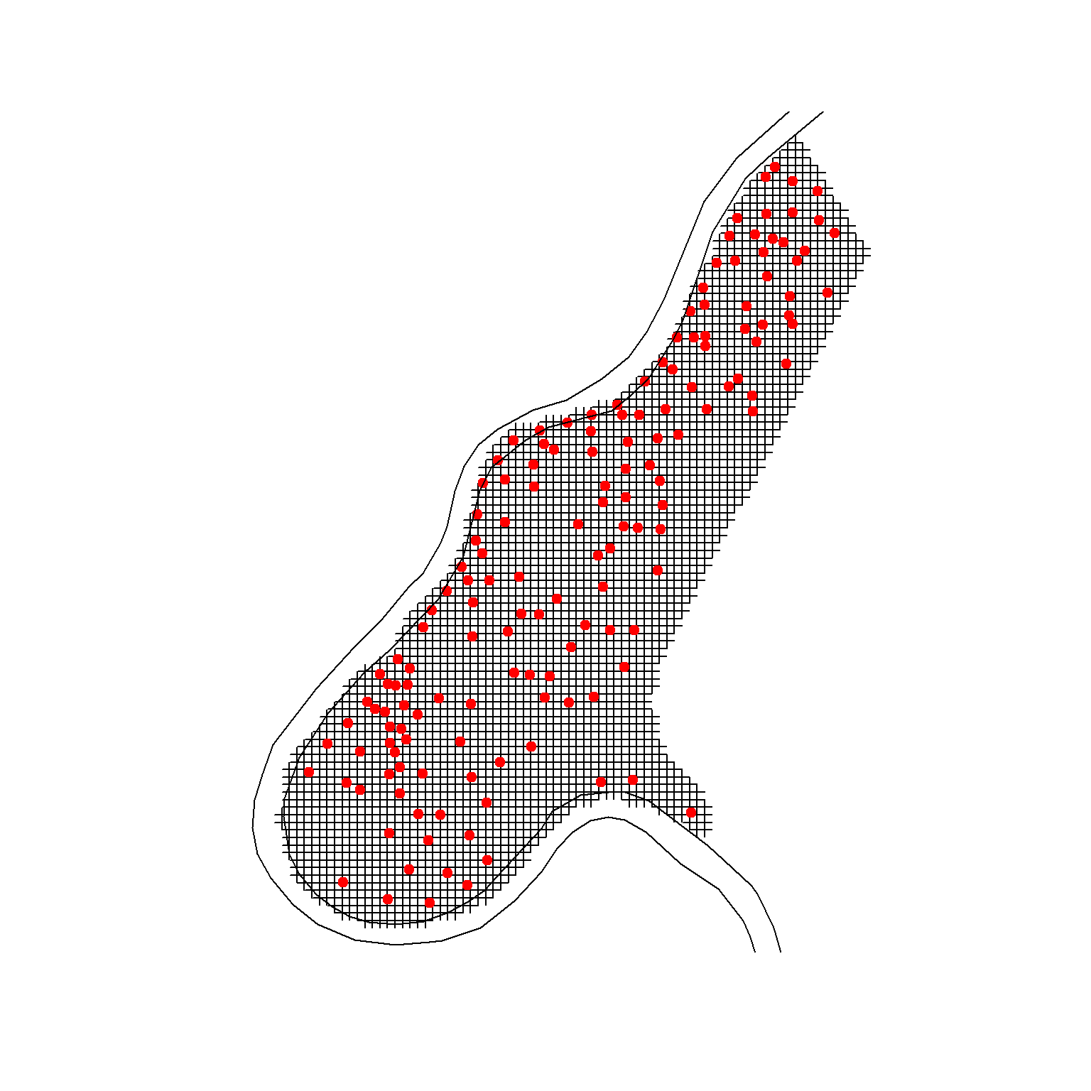
Let’s quickly create a simple map of the sample points, grid locations, and the Meuse river in the area surround the sample points.
# Plot the data
plot(meuse.grid)
points(meuse, pch = 20, cex = 1.5, col = 'red')
plot(riv, add = T)
Now, let’s specify that meuse.grid is gridded so that the grid topology will be added to the spatial object.
# Convert meuse grid to a spatial pixels dataframe
gridded(meuse.grid) = TRUE
Exploratory Spatial Data Analysis
ESDA encompasses a number of methods for analyzing spatially referenced data. ESDA focuses on visualizing and summarizing both the statistical and spatial distributions of data, with an emphasis on assessing if samples near each other have similar values of an attribute or variable. Detecting such a pattern of spatial autocorrelation suggests that spatial data analysis, which uses statistical descriptions and models that incorporate spatial relationships, may be used rather than assuming independent observations.
Data Mapping
Generally, ESDA starts with the plotting of maps with a measured variable of the data. Let’s visually inspect how zinc concentrations vary over the study area where concentration is related to point size.
# Visually inspect how zinc varies over domain of interest
meuse_riv <- st_polygon(list(meuse.riv)) %>% st_sfc() %>% st_set_crs(epsg)
meuse %>%
  as.data.frame %>%
  ggplot() +
  geom_sf(data = st_sf(meuse_riv), fill = 'lightblue', color = NA) +
  geom_point(aes(x = x, y = y, size = zinc), color = 'blue', alpha = 3/4) +
  ggtitle('Top Soil Zinc Concentration (ppm)') +
  coord_sf(datum = sf::st_crs(epsg)) +
  scale_x_continuous(limits = c(178300, 181800),
                     breaks = seq(178500, 181500, by = 500),
                     expand = c(0, 0)) +
  scale_y_continuous(limits = c(329400, 334000),
                     breaks = seq(329500, 334000, by = 500),
                     expand = c(0, 0)) +
  theme_bw()
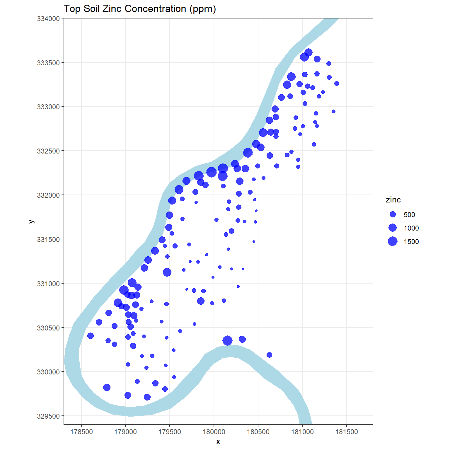
The concentration of zinc in the top soil seems to be larger close to the banks of the river Meuse and in areas with low elevation. The data suggest that sediments polluted by these heavy metals are transported by the river and are mainly deposited near the shore and in low-lying areas. However, spatial variability of metal pollution within the floodplains of the river Meuse is complex, and deposition of contaminated overbank sediments during flood events alone is insufficient to explain the variability in metal pollution depth (Middelkoop 2000).
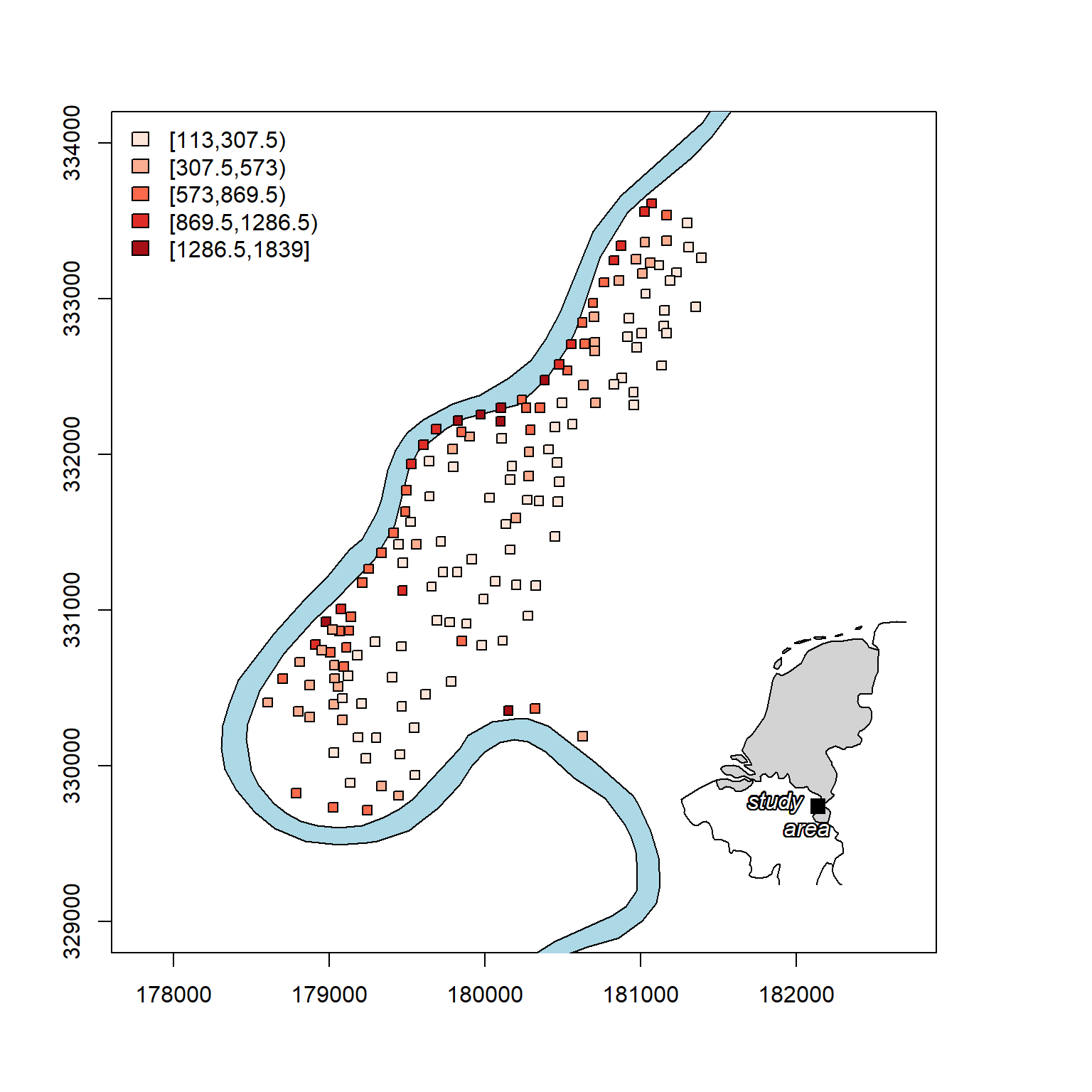
Now, let’s create a nicer plot of zinc concentrations that includes a map inset of the study area relative to the Netherlands.
# Load libraries
library(gridBase)
library(TeachingDemos)
library(rworldmap)
library(RColorBrewer)
library(classInt)

# Attach country polygons
data(countriesLow)
cous <- countriesLow

# Find the Netherlands
net <- cous[which(cous@data$NAME == 'Netherlands'), ]

# Classify zinc into 5 classes
q_5 <- classIntervals(meuse@data$zinc, n = 5, style = 'fisher')
pal <- brewer.pal(5, "Reds")
my_cols <- findColours(q_5, pal)

# Transform meuse to lat/lon coordinates
meuse_tr <- spTransform(meuse, proj4string(net))

# Create the figure
plot.new()
vp_1 <- viewport(
  x = 0, y = 0, width = 0.91, height = 1,
  just = c('left', 'bottom')
)
vp_2 <- viewport(
  x = 0.61, y = 0.19, width = 0.22, height = 0.25,
  just = c('left', 'bottom')
)

# Main plot
pushViewport(vp_1)
par(new = TRUE, fig = gridFIG())
plot(
  raster::crop(riv, bbox(meuse) + c(-500, -1000, 2000, 2000)),
  axes = TRUE, col = 'lightblue',
  xlim = c(178500, 182000), ylim = c(329000, 334000)
)
plot(meuse, col = 'black', bg = my_cols, pch = 22, add = TRUE)
legend(
  'topleft', fill = attr(my_cols, 'palette'),
  legend = names(attr(my_cols, 'table')), bty = 'n'
)
upViewport()

# Inset map
pushViewport(vp_2)
par(new = TRUE, fig = gridFIG(), mar = rep(0, 4))
# plot the Netherlands and its neighbors
plot(
  cous[net, ], xlim = c(4.2, 5.8), ylim = c(50, 53.7),
  col = 'white', bg = 'transparent'
)
plot(net, col = 'lightgray', add = TRUE)
# add the study area location
points(
  x = coordinates(meuse_tr)[1, 1], y = coordinates(meuse_tr)[1, 2],
  cex = 1.5, pch = 15
)
shadowtext(
  x = coordinates(meuse_tr)[1, 1] - 0.35,
  y = coordinates(meuse_tr)[1, 2] - 0.1,
  labels = 'study         \n area', font = 3
)
Stationarity
Stationarity means that characteristics of a random function stay the same when shifting a given set of points from one part of a region to another. There are several types of stationarity depending on which statistical properties are assumed to be invariant over space. Stationarity is an important assumption for advanced geospatial methods because it allows data from different locations to be combined together to estimate an overall model of spatial correlation. If the data show a trend, then the variogram does not stabilize at a sill but rather continues to climb. When this occurs, concentration cannot be predicted based on lag distance.
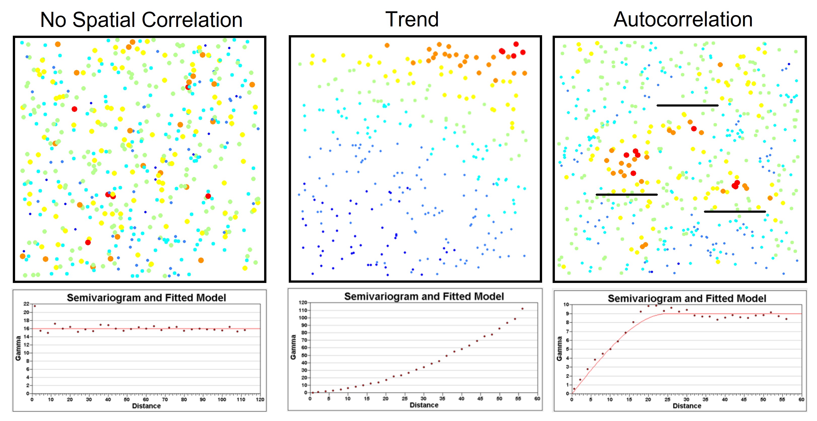
A spatial process is called strictly stationary if for any set of points the multivariate distribution does not change. A less restrictive condition is given by weak stationarity, which is also called second-order stationarity because it only assumes stationarity of the first two moments of the distribution, the mean and variance. It also assumes that the covariance between two observations separated by a distance h only relies on the distance h between the observations and not on the spatial location inside the region. A specific type of second-order stationarity, and most important for variogram analysis, is called intrinsic stationarity. Intrinsic stationarity assumes second-order stationarity of the differences between pairs of values at two locations. This implies that the variance of these differences does not depend on location but only depends on separation distance h:
$$Var(Z(x + h) - Z(x)) = 2\gamma (h)$$
Let’s quickly display the zinc concentration data to visually check for spatial patterns and trends in the data.
# Visually check for trend
par(mfrow = c(2, 2))
plot(coordinates(meuse)[,'x'], log(meuse@data$zinc))
abline(lm(log(meuse@data$zinc) ~ coordinates(meuse)[,'x']))
plot(coordinates(meuse)[,'y'], log(meuse@data$zinc))
abline(lm(log(meuse@data$zinc) ~ coordinates(meuse)[,'y']))
plot(log(zinc) ~ dist, meuse)
abline(lm(log(zinc) ~ dist, meuse))
plot(log(zinc) ~ sqrt(dist), meuse)
abline(lm(log(zinc) ~ sqrt(dist), meuse))
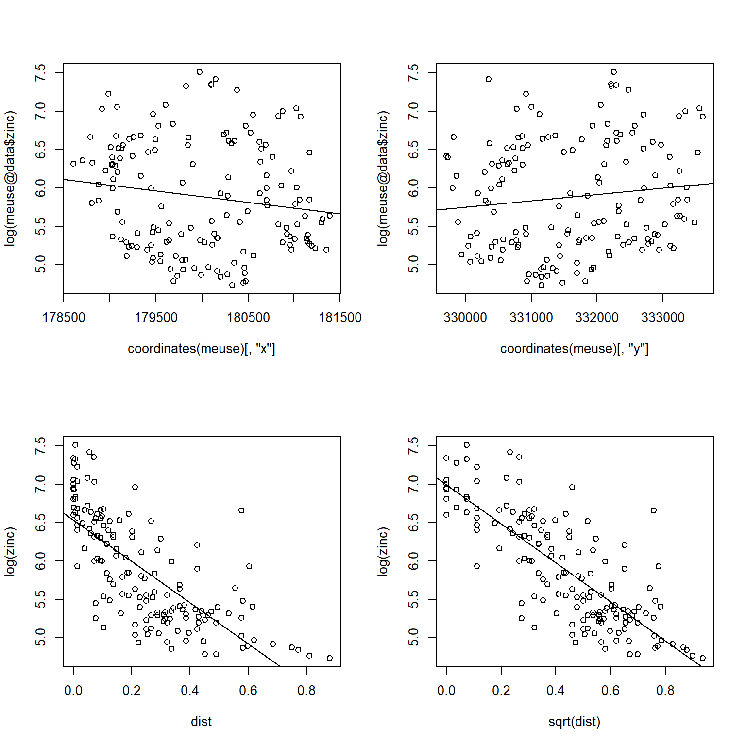
The log of zinc concentrations are higher near the river and seem to exhibit a nonlinear relationship with distance to the river. The relationship becomes approximately linear by taking the square root of the distance. Let’s verify that distance is an appropriate predictor of zinc concentration by fitting a linear model that predicts the log of zinc concentrations as a function of the square root of distance from the river.
# Formally check for trend
summary(lm(log(zinc) ~ sqrt(dist), data = meuse))
##
## Call:
## lm(formula = log(zinc) ~ sqrt(dist), data = meuse)
##
## Residuals:
##      Min       1Q   Median       3Q      Max
## -1.04624 -0.29060 -0.01869  0.26445  1.59685
##
## Coefficients:
##             Estimate Std. Error t value Pr(>|t|)
## (Intercept)  6.99438    0.07593   92.12   <2e-16 ***
## sqrt(dist)  -2.54920    0.15498  -16.45   <2e-16 ***
## ---
## Signif. codes:  0 '***' 0.001 '**' 0.01 '*' 0.05 '.' 0.1 ' ' 1
##
## Residual standard error: 0.4353 on 153 degrees of freedom
## Multiple R-squared:  0.6388,	Adjusted R-squared:  0.6364
## F-statistic: 270.6 on 1 and 153 DF,  p-value: < 2.2e-16
The p-value of the slope is very low, indicating a strong linear relationship between the log of zinc concentrations and the square root of distance from the river.
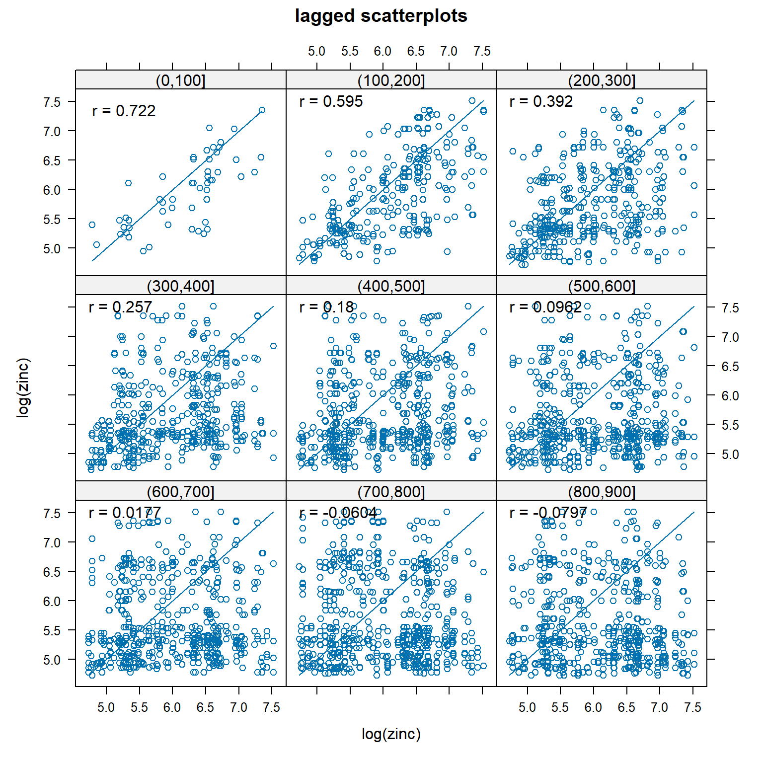
Lagged Scatterplot
A lagged scatterplot, also called a H-scatterplot, is used to evaluate spatial correlation within a data set. It is a plot of the measured values for pairs of data points. For a given lag, or separation distance, measured values at each location are plotted against measurements from locations separated by that lag. The degree of scatter in the resulting plot graphically displays the degree of correlation between points with the specified lag. The correlation coefficients are also shown on the plots. For spatially correlated data, as the lag increases, the scatter also is expected to increase.
A lagged scatterplot of the log of zinc concentrations in top soil along the river Meuse is shown below. The correlation between pairs of points less than 100 m apart is 0.722. Up to a separation distance of approximately 400 to 500 m, there is still significant spatial correlation between zinc concentrations.
# Lagged scatterplots
gstat::hscat(log(zinc) ~ 1, meuse, (0:9) * 100)
Variogram Cloud
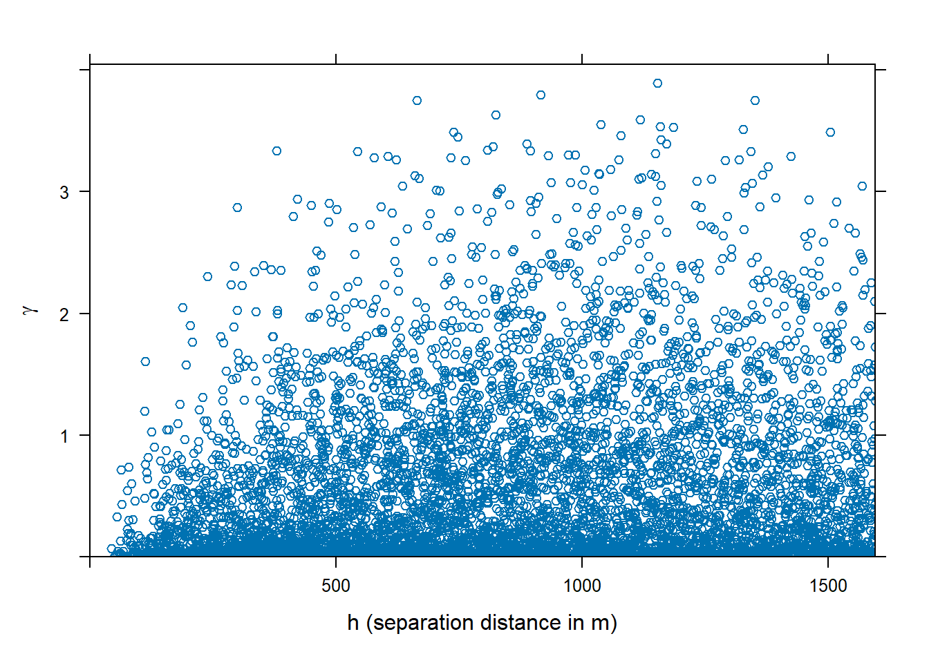
The variogram cloud is a plot of the semivariance ($\gamma$) of all pairs of data points as a function of the lag. Because \(\gamma\) is a measure of dissimilarity (i.e., the smaller the dissimilarity the more similar are observations), the variogram cloud illustrates if sample pairs closer to each other are more similar than pairs further apart, which is usually the case. The variogram cloud provides a the visual depiction of the distribution of dissimilarity at particular distances. For example, the variogram cloud shown below for log zinc concentrations in top soil along the river Meuse has a skewed distribution at any distance. That is, the majority of plots are similar even at higher distances. However, dissimilarity increases with distances up to about 500 m.
# Variogram cloud
meuse.vc <- variogram(log(zinc) ~ 1, meuse, cloud = TRUE)
plot(meuse.vc, ylab = bquote(gamma), xlab = c('h (separation distance in m)'))
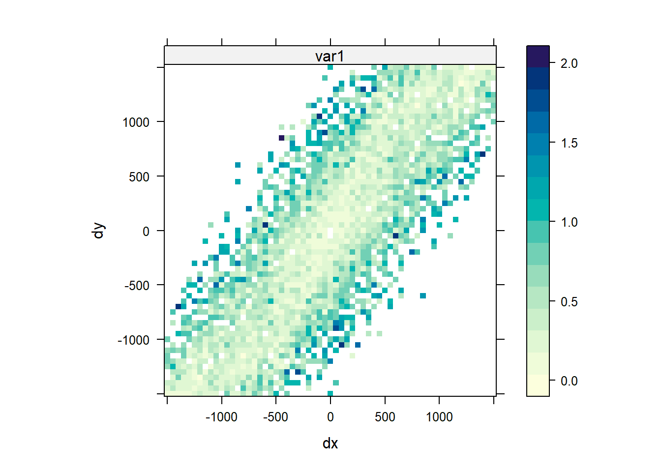
Anisotropy Variogram Map
Another method that can be used to evaluate directional dependence in semivariograms is to create a variogram map. Instead of classifying point pairs \(Z(s)\) and \(Z(s + h)\) by direction and distance separately, we classify them jointly. If h = (x, y) is the two-dimentional coordinates of the separation vector, the semivariance contribution in the variogram map of each point pair \((Z(s) - Z(s + h))^2\) is attributed to the grid cell in which h lies. The map is centered around (0, 0), as h is geographical distance rather than geographical location. The semivariance map is point symmetric around (0, 0), as \(\gamma (h) = \gamma (-h)\). When we plot the map, we can set a threshold value so that only semivariogram map values based on at least that many pairs of points are shown. In the plot shown below of the log of zinc concentrations in top soil along the river Meuse, a value of 4 was used. The plot indicates a stronger autocorrelation between values located along the north-east to south-west axis than in the other directions.
# Analyzing the anisotropy variogram map
vgm.map = variogram(
  log(zinc) ~ 1, data = meuse,
  cutoff = 1500, width = 50,
  map = TRUE
)
plot(vgm.map, threshold = 4)
Variogram Modelling
Kriging and geostatistical simulation methods require a model of spatial correlation. Spatial autocorrelation can be modeled using the variogram or covariance function. Typically, the sample variogram is plotted based on the data, and a variogram model is fit to the sample variogram. The variogram is a quantitative descriptive statistic that can be graphically represented in a manner which characterizes the spatial continuity of a data set. The sample variogram is obtained by computing estimates of \(\gamma (h)\) for distance intervals, \(h_{i} = [h_{i,0}, h_{i,1}]\) (Pebesma and Bivand 2023):
$$\hat{\gamma}(h_{i}) = \frac{1}{2N(h_{i})}\sum_{j=1}^{N(h_{i})}(z(s_{i}) - z(s_{i} + h^{'}))^2, \ \ h_{i,0} \le h^{'}< h_{i,1}$$
where \(N(h_{i})\) is the number of sample pairs available for distance interval \(h_{i}\). The variogram expresses the variability of the data set as a function of space: if data are spatially correlated, then on average, sample points close together are more alike and have a smaller semivariance than samples farther apart.
A variogram has three basic properties:
-
nugget: the initial value at zero distance; in most cases, it is zero, but sometimes it represents a bias in observations.
-
sill: the point where the variogram flattens and reaches approximately 95% of dissimilarity.
-
range: the distance where a variogram reaches its sill; larger distances are less important for interpolation.
The critical step for interpolation is selecting a valid variogram model \(\gamma (h)\) for all distances h. The process for fitting a variogram model to the sample variogram is as follows:
- Choose a suitable variogram model, with or without a nugget.
- Fit the model by eye or with software.
- Examine the resulting fit visually and using cross-validation.
The fitted variogram model is used to calculate the data values (for example, contaminant concentrations) at each modeled point. Therefore, a model must be created that is as representative as possible of the spatial characteristics of the data set and, by extension, of the sample variogram. If anisotropy is observed, which is common in environmental data, then an anisotropic variogram must be developed that takes into account different spatial directions. When fitting a variogram, whether to use a nugget effect, and the most suitable range or sill value must be determined. It is best to produce several variogram models that could match with the contaminant concentration behavior. Then, cross validation can be used to compare the accuracy of each model in order to identify the most appropriate model.
Basic variogram models available in the gstat library are listed below.
# Show list of basic variogram models available in gstat
library(kableExtra)
kbl(vgm()) %>%
  kable_minimal(full_width = F, position = "left", html_font = "Cambria")
| short | long |
|---|---|
| Nug | Nug (nugget) |
| Exp | Exp (exponential) |
| Sph | Sph (spherical) |
| Gau | Gau (gaussian) |
| Exc | Exclass (Exponential class/stable) |
| Mat | Mat (Matern) |
| Ste | Mat (Matern, M. Stein's parameterization) |
| Cir | Cir (circular) |
| Lin | Lin (linear) |
| Bes | Bes (bessel) |
| Pen | Pen (pentaspherical) |
| Per | Per (periodic) |
| Wav | Wav (wave) |
| Hol | Hol (hole) |
| Log | Log (logarithmic) |
| Pow | Pow (power) |
| Spl | Spl (spline) |
| Leg | Leg (Legendre) |
| Err | Err (Measurement error) |
| Int | Int (Intercept) |
A visual overview of these basic variogram models is shown below.
# Show visual overview of basic variogram models available in gstat
show.vgms()
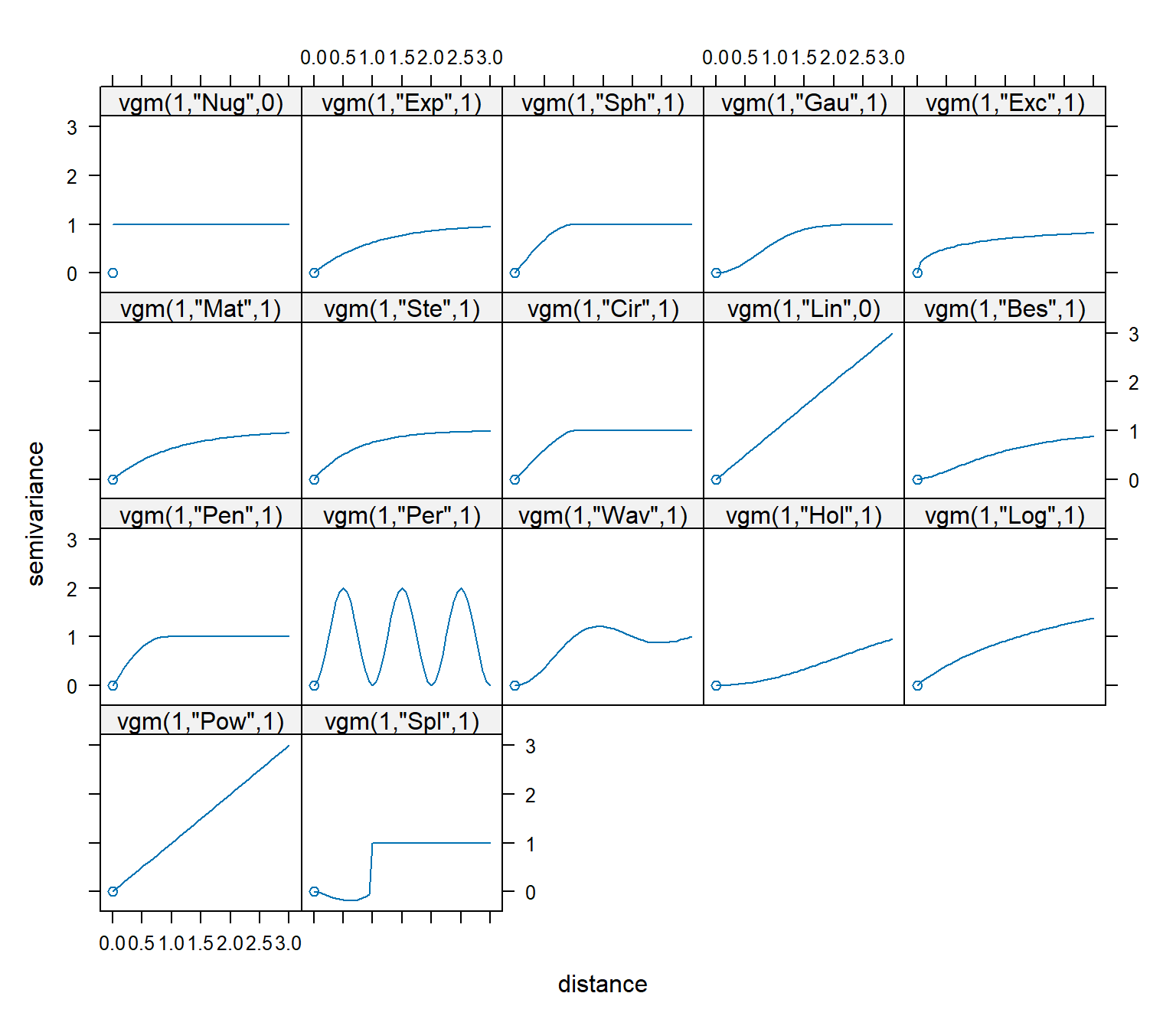
Theoretical variogram models commonly used in the environmental sciences include exponential, spherical, Gaussian, Matérn, power, and linear. With the exception of the linear model, these theoretical models differ primarily in their behavior close to the origin. An illustration of the common theoretical variogram models is shown below.
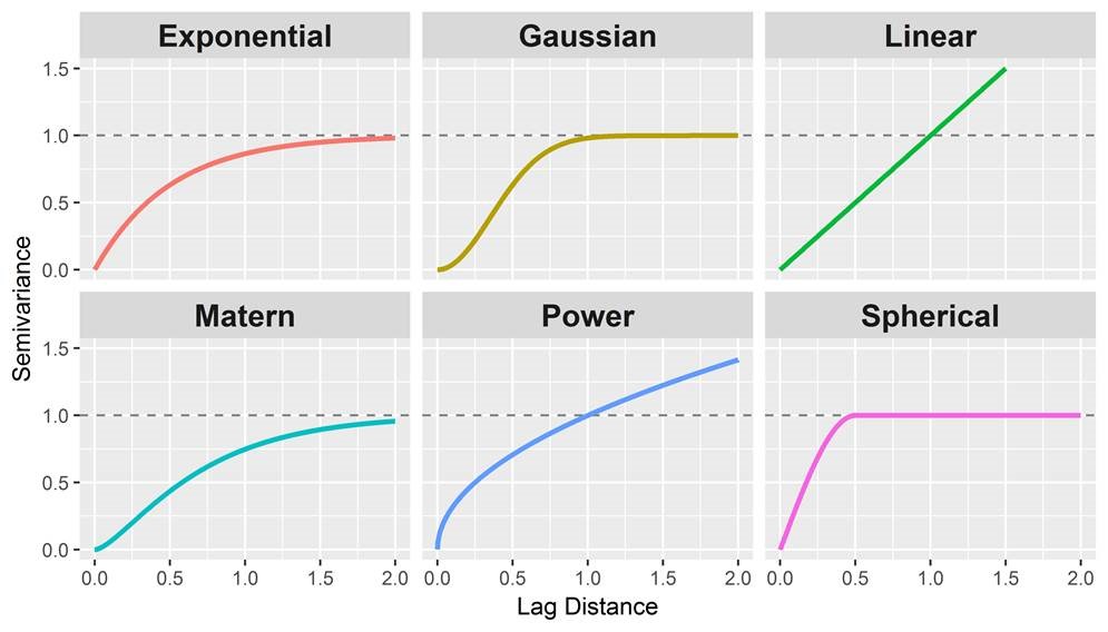
Spherical models are the most commonly used model. They exhibit a somewhat linear behavior at small separation distances near the origin, but flatten out at larger distances. Exponential models reach the sill asymptotically. Like the spherical model, the exponential model is linear at small distances near the origin, yet rises more steeply and flattens out more gradually than a spherical model. Erratic data sets can sometimes be fit better with exponential models. Gaussian models are characterized by parabolic behavior at the origin, rising to reach the sill asymptotically. Gaussian models are used to model extremely continuous phenomena. In models with a nugget effect, the variance does not go through the origin of the plot, indicating that even at very close distances (indeed, even at a distance of zero) the data points show some degree of variability. Typically, this happens when change occurs over the surface at distances less than the sampling interval. A pure nugget effect observed in the variogram indicates the absence of spatial correlation (strict stationarity). A variogram with a large nugget relative to the sill indicates variability in the data that cannot be accurately predicted using kriging.
Linear Variogram
If the sample variogram never levels out, a linear variogram model may be appropriate. In this case, the value of the variogram increases as a linear function of distance. A simple linear variogram model usually generates acceptable predictions, especially during the initial stages of data analysis. However, the estimation variances generated using a linear variogram are meaningless.
# Linear variogram model
fit.lin <- vgm(1, 'Lin', 0)
kbl(
  fit.lin[, 1:4],
  col.names = c('model', 'psill', 'range', 'kappa'),
  align = 'lccc'
) %>%
kable_paper(full_width = F, position = 'left', html_font = 'Cambria')
| model | psill | range | kappa |
|---|---|---|---|
| Lin | 1 | 0 | 0.5 |
Omnidirectional Variogram
An omnidirectional variogram serves as a useful starting point for detecting the presence of spatial continuity in a sample data set. An omnidirectional variogram has a directional tolerance of 90 degrees and thus, provides little information about anisotropy. The sill of an omnidirectional variogram provides an approximate idea of the total sill of specific directional variograms.
gstat
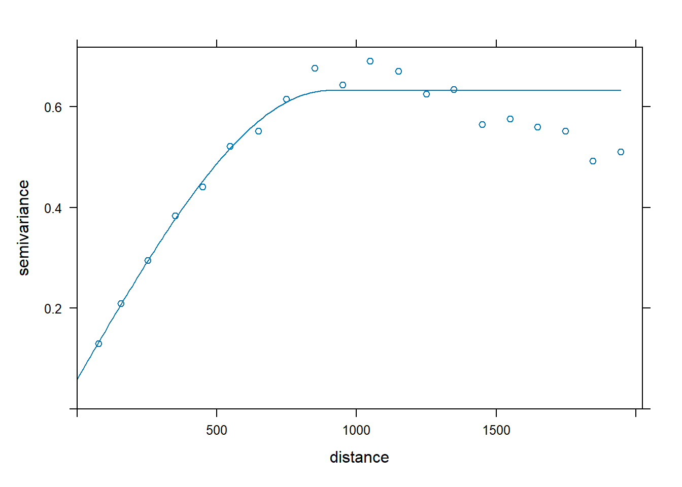
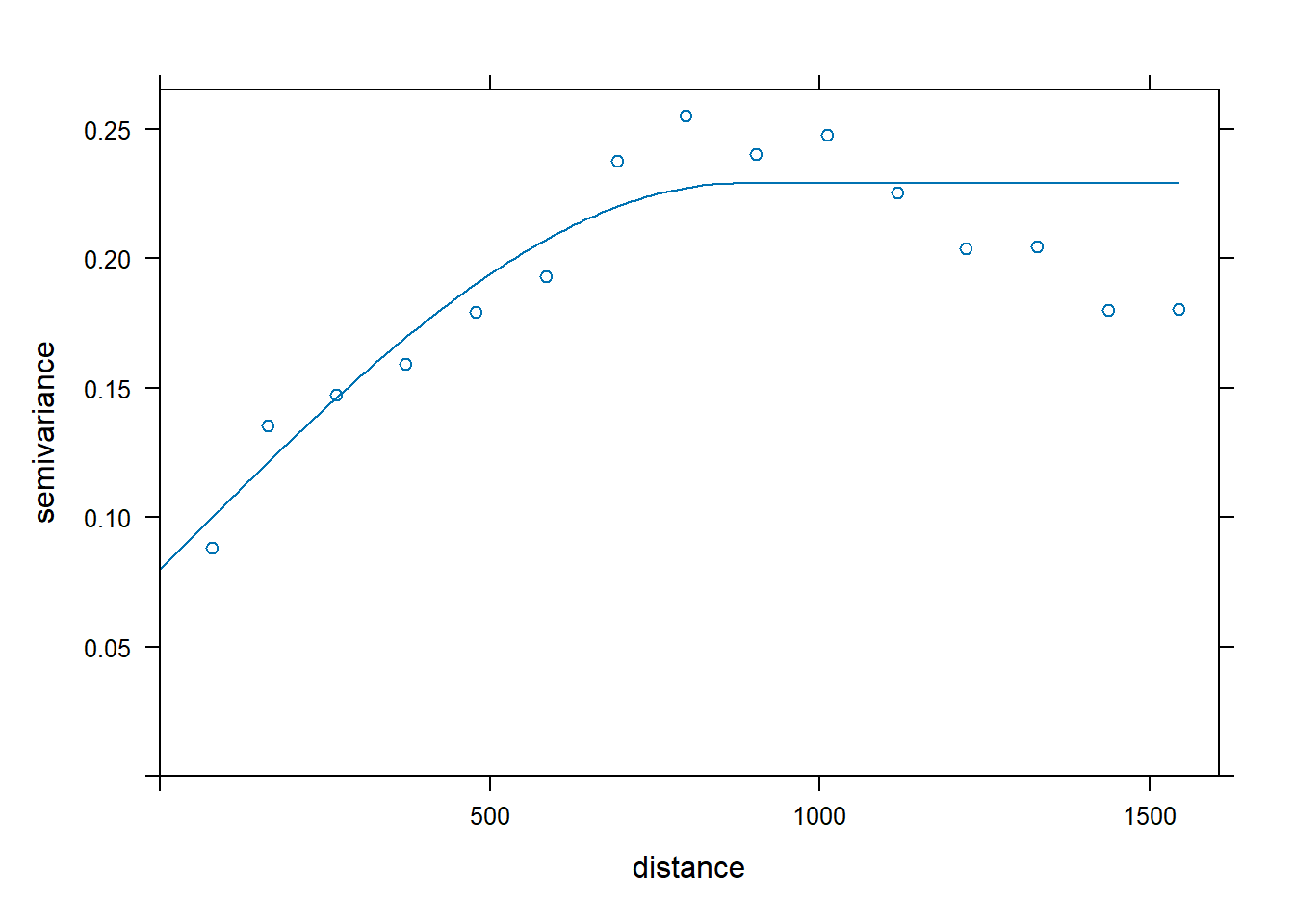
Let’s fit an omnidirectional spherical variogram model to the zinc concentration data using the fit.variogram() function in the gstat library. The fitting method uses nonlinear regression to fit the coefficients using a weighted sum-of-square errors, minimizing
$$\sum_{i=1}^{n}w_{i}(\gamma (h_{i}) - \hat{\gamma} (h_{i}))^2$$
with weights \(w_{i}\) by default equal to \(N(h_{i})/h^{2}\). Other weight options are available through argument fit.method (Pebesma and Bivand 2023). The optimization routine alternates over a direct fit of the partial sills, and nonlinear optimization of the range parameter(s), given the last fit of partial sills, until convergence (Bivand et al. 2013). The function fits a model for a given direction if the sample variogram only includes this direction. Otherwise, the model is fitted to an average of all directions. The variogram() function chooses as default one-third the length of the bounding box diagonal for maximum distance (cutoff) and the cutoff divided by 15 for interval width (width).
# Calculate the sample variogram from the data
vgm.omni <- variogram(
  log(zinc) ~ 1, data = meuse,
  cutoff = 2000, width = 100
)

# Fit omnidirectional spherical variogram model using gstat
fit.omni <- fit.variogram(
  vgm.omni,
  vgm(0.6, 'Sph', 800, 0.05)
)

# Inspect results
kbl(
  fit.omni[, 1:4],
  col.names = c('model', 'psill', 'range', 'kappa'),
  align = 'lccc'
) %>%
kable_paper(full_width = F, position = 'left', html_font = 'Cambria')
| model | psill | range | kappa |
|---|---|---|---|
| Nug | 0.0595895 | 0.0000 | 0.0 |
| Sph | 0.5726625 | 901.0559 | 0.5 |
plot(vgm.omni, fit.omni)
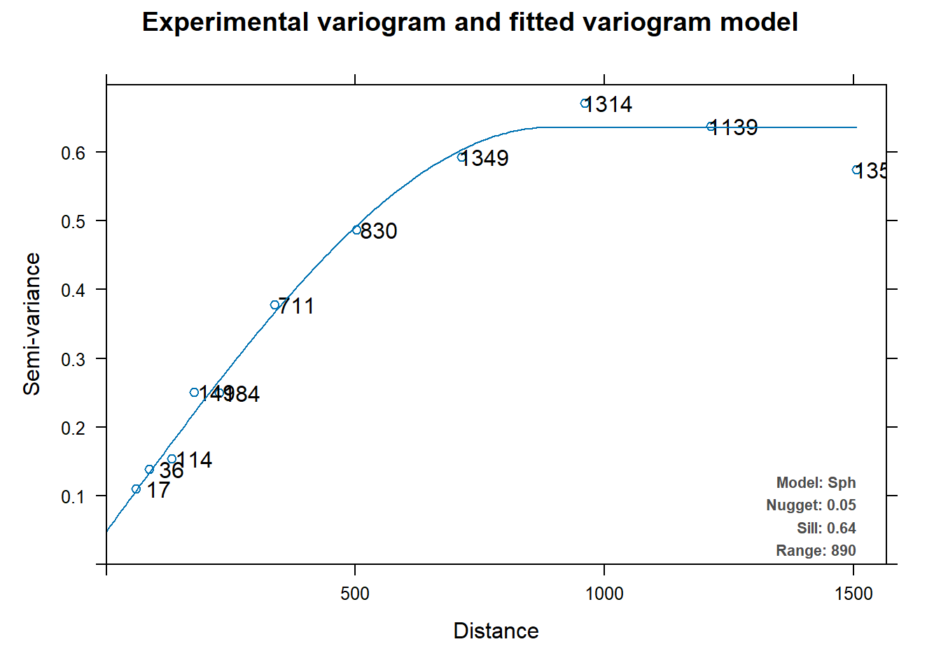
automap
The automap library automatically fits a variogram to the data on which it is applied and then interpolates using gstat. The automatic fitting is done through the fit.variogram() function in gstat. In the fit.variogram() function, the user supplies an initial estimate for the sill, range, etc. In the autofitVariogram() function, parameters are estimated based on the data before calling fit.variogram().
Let’s fit an omnidirectional variogram to the zinc concentration data using the autofitVariogram() function from the automap library.
# Load library
library(automap)

# Get variogram
fit.auto <- autofitVariogram(log(zinc) ~ 1, meuse)

# Inspect results
kbl(
  fit.auto$var_model[, 1:4],
  col.names = c('model', 'psill', 'range', 'kappa'),
  align = 'lccc'
) %>%
kable_paper(full_width = F, position = 'left', html_font = 'Cambria')
| model | psill | range | kappa |
|---|---|---|---|
| Nug | 0.0484809 | 0.0000 | 0 |
| Sph | 0.5875474 | 889.9084 | 0 |
plot(fit.auto)
GSIF
The GSIF library contains tools and procedures to manage soil data and produce gridded soil property maps to support the global soil data initivatives, such as the GlobalSoilMap.net project. The fit.vgmModel() function fits a 2D or 3D variogram model based on a regression matrix and spatial domain of interest. Note that if the data set is large, this process can be computationally intensive.
Let’s fit an omnidirectional spherical variogram to the zinc concentration data using the fit.vgmModel() function from the GSIF library.
# Load functions
source('functions/fit.vgmModel.R')

# Produce a regression matrix
ov <- over(meuse, meuse.grid)
ov <- cbind(data.frame(meuse['zinc']), ov)

# Get variogram
fit.gsif <- fit.vgmModel(
  log(zinc) ~ 1, rmatrix = ov, meuse.grid,
  vgmFun = 'Sph', dimensions = '2D'
)

# Inspect results
kbl(
  fit.gsif$vgm[, 1:4],
  col.names = c('model', 'psill', 'range', 'kappa'),
  align = 'lccc'
) %>%
kable_paper(full_width = F, position = 'left', html_font = 'Cambria')
| model | psill | range | kappa |
|---|---|---|---|
| Nug | 0.0508389 | 0.0000 | 0.0 |
| Sph | 0.5906895 | 898.2808 | 0.5 |
plot(variogram(log(zinc) ~ 1, meuse), fit.gsif$vgm)

Now, let’s compare the fitted parameters for the omnidirectional variogram model obtained from the three different mathematical algorithms.
# Compare models
rbind(
  data.frame(method = 'gstat', fit.omni[, 1:4]),
  data.frame(method = ' automap', fit.auto$var_model[, 1:4]),
  data.frame(method = 'gsif', fit.gsif$vgm[, 1:4])
) %>%
  mutate_at(3, round, 2) %>%
  mutate_at(4, round, 0) %>%
  mutate_at(5, round, 1) %>%
  kbl(
    col.names = c('method', 'model', 'psill', 'range', 'kappa'),
    align = 'lcccc'
  ) %>%
kable_paper(full_width = F, position = 'left', html_font = 'Cambria')
| method | model | psill | range | kappa |
|---|---|---|---|---|
| gstat | Nug | 0.06 | 0 | 0.0 |
| gstat | Sph | 0.57 | 901 | 0.5 |
| automap | Nug | 0.05 | 0 | 0.0 |
| automap | Sph | 0.59 | 890 | 0.0 |
| gsif | Nug | 0.05 | 0 | 0.0 |
| gsif | Sph | 0.59 | 898 | 0.5 |
Directional Variogram
Environmental data often has different levels of spatial correlation in different directions, referred to as anistropy. The variogram can be used to detect anisotropy by constructing multiple variograms with data point pairs restricted to a range of directions. Typically, four directions are chosen, such as 0, 45, 90, and 135 degrees. Using the gstat library, 0 degrees corresponds to due north and the other directions are measured clockwise from due north. Four variograms are constructed: one for the direction where the maximum spatial correlation is observed (reference direction) and three other perpendicular directions in order to define the lower levels of correlation in other directions. As with lag distance, the specified direction actually represents the center of a range or bin of directions. For example, 90 degrees includes 90 degrees plus or minus 22.5 degrees.
Generally, the procedures of distinguishing between isotropy and anisotropy are the same. A variogram model is fit along all the directions and then different variograms are obtained along with different directions. If the values of the sill, range, and nugget from the variogram along all directions are the same, then it is isotropic; otherwise, it is anisotropic.
Anisotropy, according to its different structures, is divided into three main categories:
-
Geometric Anisotropy: the sill of the geometric anisotropic variogram varies with distance, but not with direction. When the distances between samples in various spatial angles are the same, their sill is the same, but their ranges may vary along with different angles.
-
Zonal Anisotropy: the sill of the zonal anisotropic variogram varies with distance and direction. When the distances between samples in any spatial angle are the same, their sill is not the same, and their ranges also vary along with different angles. Zonal anisotropic variogram model consists of 2 or more anisotropic variograms. Typically, natural phenomena do not exhibit this kind of anisotropy.
-
Mixed Anisotropy: the sill and range vary with direction. Natural phenomena often have this kind of spatial variability. For example, geological changes usually have a bigger effective range in the horizon direction than in the vertical direction.
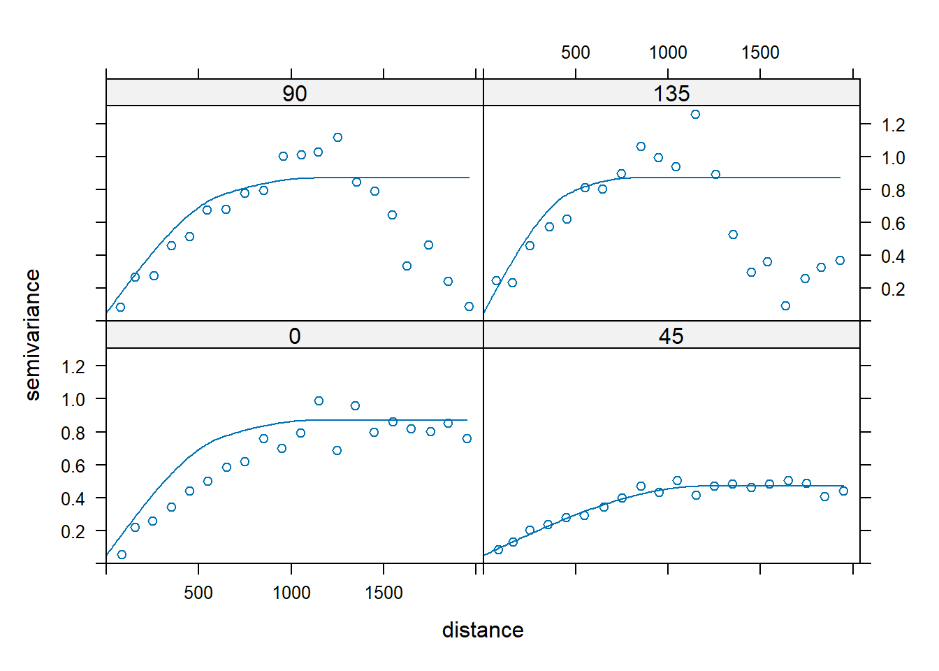
Let’s create directional variograms along azimuth directions of 0, 45, 90, and 135 degrees using the zinc concentration data. The argument alpha in the variogram() function represents the direction in degrees clockwise, starting from positive Y (i.e., north); thus, alpha = 0 is north and alpha = 90 is east.
# Plot directional variograms along azimuth directions of 0, 45, 90, and 135
vgm.aniso <- variogram(
  log(zinc) ~ 1, data = meuse,
  alpha = c(0, 45, 90, 135),
  cutoff = 2000, width = 100
)
plot(vgm.aniso, cex = 1)
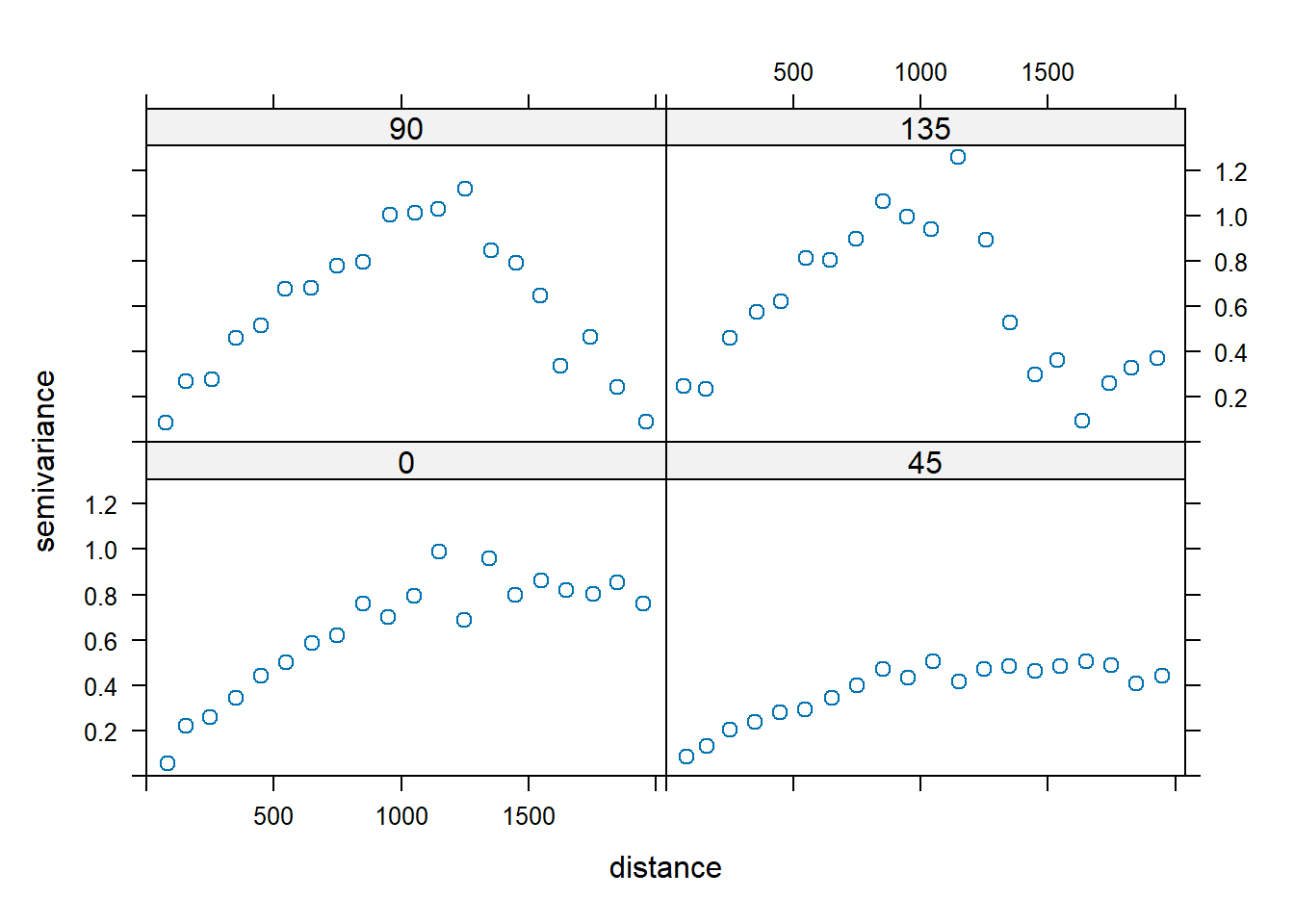
There is clear evidence of anisotropy in the variograms, with the highest level of spatial correlation shown in the 45 degree variogram. When the sill appears to be different in different directions, this suggests a trend in the data. There are a few ways to address this: (1) fit a nested semivariogram model with an infinite range in one direction; (2) fit a semivariogram along one direction with no trend; or (3) fit a trend to the data, and then fit a semivariogram with a sill to the residuals.
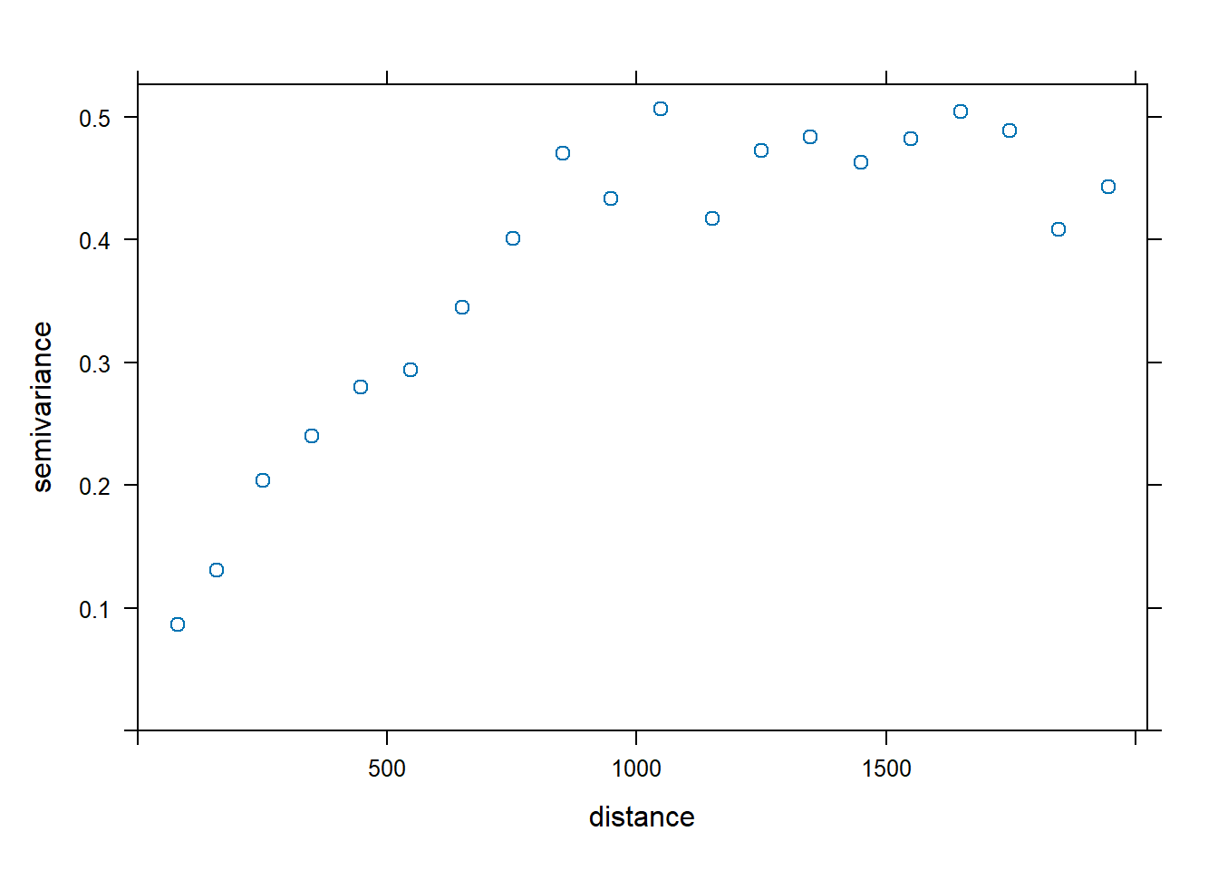
Generally, the zinc concentration data appear stationary in the 45 degree direction, and the trend appears to be largest in the 135 degree direction. Let’s plot the variogram in the 45 degree direction by finding rows in the semivariogram that used data pairs separated along a 45 degree direction.
dir.45 <- vgm.aniso$dir.hor == 45
plot(vgm.aniso[dir.45,], cex = 1)
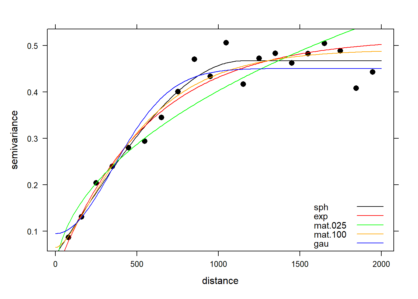
Let’s fit the variogram automatically to the data, assuming a spherical, exponential, Matérn, and Gaussian model. The exponential, Matérn, and Gaussian models reach their sill asymptotically, that is as \(h \to \infty\). The effective range is the distance where the variogram reaches 95% of its sill, and this is 3a for an exponential model, \(\sqrt{3a}\) for a Gaussian model, and 4a for a Matérn model with kappa equal to 1, where a is the range (Pebesma 2014). For a spherical model, the effective range equals a.
fit.sph <- fit.variogram(
  vgm.aniso[dir.45,],
  vgm(0.42, 'Sph', 1200, 0.05)
)
fit.exp <- fit.variogram(
  vgm.aniso[dir.45,],
  vgm(0.42, 'Exp', 1200/3 , 0.05)
)
fit.mat.025 <- fit.variogram(
  vgm.aniso[dir.45,],
  vgm(0.42, 'Mat', 1200, 0.05, kappa = 0.25)
)
fit.mat.100 <- fit.variogram(
  vgm.aniso[dir.45,],
  vgm(0.42, 'Mat', 1200/4, 0.05, kappa = 1)
)
fit.gau <- fit.variogram(
  vgm.aniso[dir.45,],
  vgm(0.42, 'Gau', 1200/sqrt(3), 0.05)
)
Now that we have our model variograms, let’s see how they compare to each other and to the sample variogram.
# Combined plot using lattice
library(lattice)

v0 <- variogramLine(fit.sph, maxdist = 2000)
v1 <- variogramLine(fit.exp, maxdist = 2000)
v2 <- variogramLine(fit.mat.025, maxdist = 2000)
v3 <- variogramLine(fit.mat.100, maxdist = 2000)
v4 <- variogramLine(fit.gau, maxdist = 2000)

xyplot(vgm.aniso[dir.45,]$gamma  ~ vgm.aniso[dir.45,]$dist,
  col = 'black', pch = 16, cex = 1.1,
  xlab = 'distance',
  ylab = 'semivariance',
    panel = function(x, y, ...) {
      panel.xyplot(x, y, ...)
      llines(v0, col = 'black')
      llines(v1, col = 'red')
      llines(v2, col = 'green')
      llines(v3, col = 'orange')
      llines(v4, col = 'blue')
    },
    key = list(
      corner = c(0.98, 0.02),
      text = list(labels = c('sph', 'exp', 'mat.025', 'mat.100', 'gau'), cex = 0.9),
      lines = list(col = c('black', 'red', 'green', 'orange', 'blue'), lty = 1, lwd = 1)
    )
)
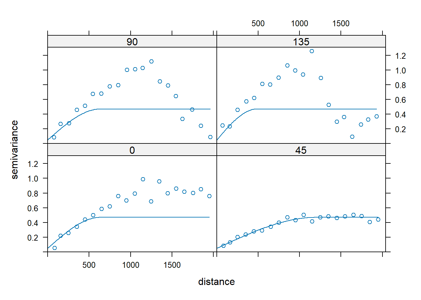
Let’s modify the best fitting spherical semivariogram model for anisotropy. If the major direction is 45 degrees with a range of 1,200 m, the minor axis (135 degrees) appears to have a range of about 400 to 500 m, or approximately 40% of 1,200 m. The argument anis in the vgm() function defines an anisotropy ellipse in two dimensions. The first parameter refers to the main axis direction. It is the angle for the principal direction of continuity (measured in degrees, clockwise from positive Y, [i.e., north]). The second parameter is the anisotropy ratio, which is the ratio of the minor range to the major range (a value between 0 and 1). For this example with the range in the major direction (45 degrees) of 1,200 m, the range in the minor direction (135 degrees) is 0.4 x 1,200 = 480 m.
sph.aniso <- vgm(
  psill = 0.42,
  model = 'Sph',
  range = 1200,
  nugget = 0.05,
  anis = c(45, 0.4)
)
plot(vgm.aniso, sph.aniso)
Ordinary Kriging
Ordinary kriging assumes that the overall mean is constant, though unknown, and the variance is finite (the variogram has a sill value). The goal is to produce a set of estimates for which the variance of the errors is minimized. To accomplish this goal, ordinary kriging weights each sample based on its relative distance from the location of the data point to be predicted. The spatial correlation model for kriging can be based on either the covariance function or variogram. In general, it is easier to estimate a variogram model than a covariance function because no estimate of the mean is required.
This method is subject to the following constraints:
- Data are either locally second-order stationary (covariance function) or intrinsically stationary (variogram model).
- Data are spatially dependent.
- The expected value of a sample is the mean of the population.
- The difference in values between two samples is due to the distance between the two locations.
In addition to interpolated values, kriging provides an estimate of the uncertainty in the interpolated values, which is known as the kriging variance or standard error.
Linear, Omnidirectional, Isotropic, and Anisotropic Models
Now, let’s use the gstat library to krige the zinc concentration data over our grid using the linear, omindirectional, isotropic, and anisotropic variogram models. The krige() function can be used for simple, ordinary, or universal kriging (sometimes called external drift kriging); kriging in a local neighborhood, point kriging, or kriging of block mean values (rectangular or irregularblocks); and conditional (Gaussian or indicator) simulation for all kriging varieties. It also can be used for inverse distance weighted interpolation. For ordinary and simple kriging, we use the formula z ~ 1. The natural log transformed data is used to stabilize the variance in the zinc concentration data. After each interpolation, the results will be added to the meuse grid spatial object.
# Linear Model
zn.lin <- krige(log(zinc) ~ 1, meuse, meuse.grid, model = fit.lin)
## [using ordinary kriging]
meuse.grid$zn.lin <- exp(zn.lin$var1.pred)

# Linear Model
zn.gsif <- krige(log(zinc) ~ 1, meuse, meuse.grid, model = fit.gsif$vgm)
## [using ordinary kriging]
meuse.grid$zn.gsif <- exp(zn.gsif$var1.pred)

# Omnidirectional Model
zn.omni <- krige(log(zinc) ~ 1, meuse, meuse.grid, model = fit.omni)
## [using ordinary kriging]
meuse.grid$zn.omni <- exp(zn.omni$var1.pred)

# Isotropic Model
zn.iso <- krige(log(zinc) ~ 1, meuse, meuse.grid, model = fit.sph)
## [using ordinary kriging]
meuse.grid$zn.iso <- exp(zn.iso$var1.pred)

# Anisotropic Model
zn.aniso <- krige(log(zinc) ~ 1, meuse, meuse.grid, model = sph.aniso)
## [using ordinary kriging]
meuse.grid$zn.aniso <- exp(zn.aniso$var1.pred)
Zonal Anisotropic Model
Let’s fit a model with zonal anisotropy by making the range in the 135 direction to be 800 m and the sill to be 0.4 higher than in the orginal model. We only want this model in the 135 degree direction, so we need to make it disappear in the 45 degree direction by giving it an effective range of infinity.
sph.zonal <- vgm(
  0.4, 'Sph', 800*10000, anis = c(45, 0.0001),
  add.to = sph.aniso
)
plot(vgm.aniso, sph.zonal)
Now, let’s perform ordinary kriging with this new zonal anisotropic model. After kriging, we’ll add the results to the meuse grid spatial object.
zn.zonal <- krige(log(zinc)~1, meuse, meuse.grid, model = sph.zonal)
## [using ordinary kriging]
meuse.grid$zn.zonal <- exp(zn.zonal$var1.pred)
Regression Kriging
Regression kriging incorporates spatial trends into the kriging process to address both non-stationary deterministic and random components in a variable. Regression kriging combines a regression of the dependent variable on auxiliary variables (such as terrain parameters or remote sensing imagery) with kriging of the regression residuals. It is mathematically equivalent to trend kriging, universal kriging, and kriging with external drift, where auxiliary predictors are used directly to solve the kriging weights.
Let’s plot the distance to the river for the study area.
# Plot distance to river
par(mar = c(1, 1, 3, 2))  # bottom, left, top, right; default is c(5.1, 4.1, 4.1, 2.1)
image(meuse.grid['dist'])
title('distance to river (red = 0)')
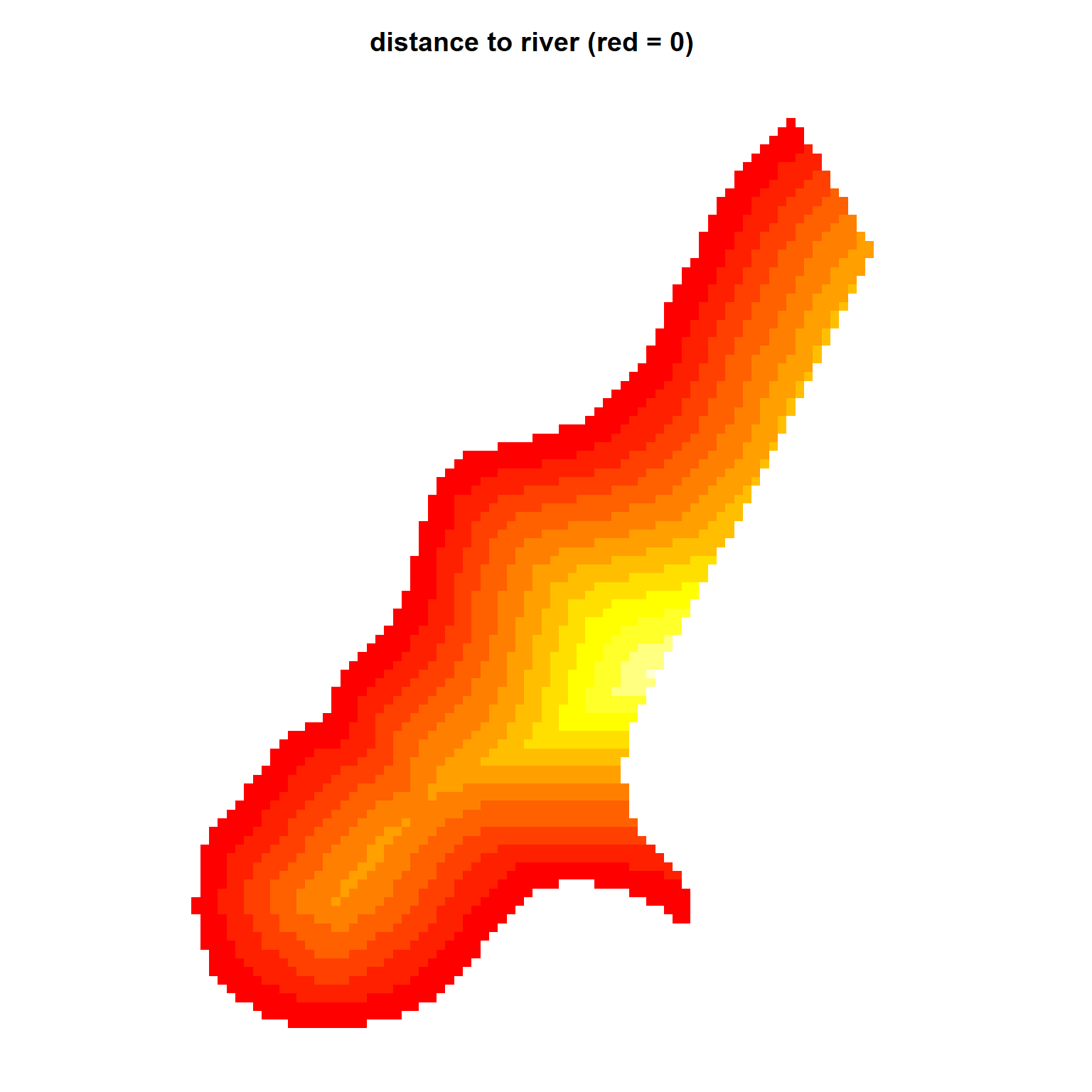
Comparing the bubble plot of zinc concentrations with the plot shown above, it’s evident that the larger concentrations are measured at locations close to the river, suggesting a spatial trend within the data. These data are located along a bend in the Meuse River, and the zinc concentrations are higher where it floods regularly. Previously, we verified that distance is an appropriate predictor of zinc concentration by fitting a linear model that predicts the log of zinc concentrations as a function of the square root of distance from the river. Other available covariates (or predictor variables) for this site are soil type and flood frequency. However, for this example, we will restrict our analysis to distance from the river.
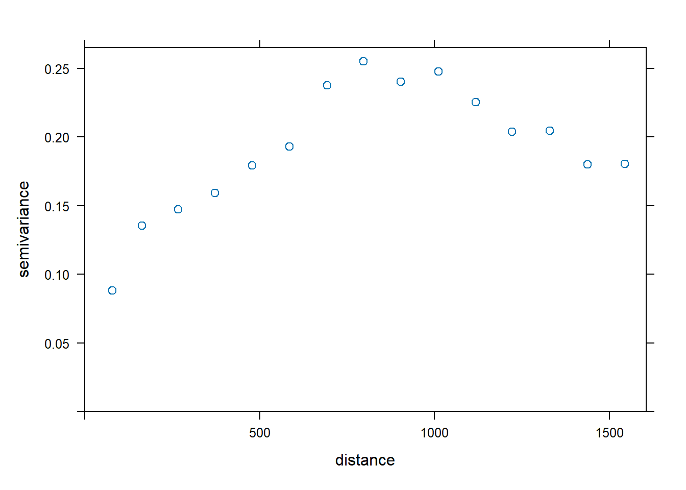
To evaluate if there is a spatial structure to the regression residuals, let’s plot an isotropic variogram of the residuals. Instead of the constant mean as denoted by ~ 1 in the formula to the variogram() function, we specify a mean function by using ~ sqrt(dist) as a predictor variable.
vgm.dist <- variogram(log(zinc) ~ sqrt(dist), data = meuse)
plot(vgm.dist, cex = 1)
Now, let’s plot the anisotropic variograms of the residuals.
vgm.dist.aniso <- variogram(
  log(zinc) ~ sqrt(dist), data = meuse,
  alpha = c(0, 45, 90, 135)
)
plot(vgm.dist.aniso)
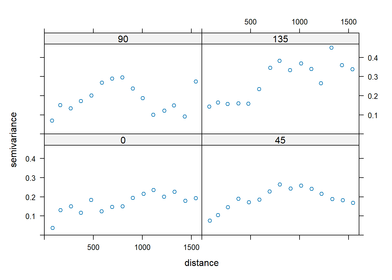
The variograms do not suggest the presence of anistropy; any differences in the directional sample variograms are more than likely due to noise. Thus, let’s fit a spherical variogram model to the isotropic sample variogram. In this case, the variogram of residuals with respect to a fitted mean function are used, where residuals are calculated using ordinary least squares.
fit.reg.sph <- fit.variogram(vgm.dist, vgm(0.25, 'Sph', 1500, 0.1))
kbl(
  fit.reg.sph[, 1:4],
  col.names = c('model', 'psill', 'range', 'kappa'),
  align = 'lccc'
) %>%
kable_paper(full_width = F, position = 'left', html_font = 'Cambria')
| model | psill | range | kappa |
|---|---|---|---|
| Nug | 0.0798185 | 0.0000 | 0.0 |
| Sph | 0.1490581 | 872.7402 | 0.5 |
plot(vgm.dist, fit.reg.sph)
Let’s use our fitted variogram model to perfrom regression kriging and add the results to the meuse grid spatial object.
# Perform regression kriging
zn.reg <- krige(
  log(zinc) ~ sqrt(dist),
  meuse, meuse.grid,
  model = fit.reg.sph
)
## [using universal kriging]
meuse.grid$zn.reg <- exp(zn.reg$var1.pred)
Co-Kriging
Co-kriging is an extension of ordinary kriging that utilizes multiple input variables, assuming there is a known correlation between the primary and secondary variables. This is common practice in the presence of sparse primary data with exhaustive secondary data. Co-kriging requires estimating the autocorrelation for each variable as well as all cross-correlations.
First, we need to determine if we have a strong degree of correlation between our parameters. We will test the zinc concentrations from the meuse data against the other elements measured in the top-soil samples.
cor(meuse@data[,1:4])
##           cadmium    copper      lead      zinc
## cadmium 1.0000000 0.9254499 0.7989466 0.9162139
## copper  0.9254499 1.0000000 0.8183069 0.9082695
## lead    0.7989466 0.8183069 1.0000000 0.9546913
## zinc    0.9162139 0.9082695 0.9546913 1.0000000
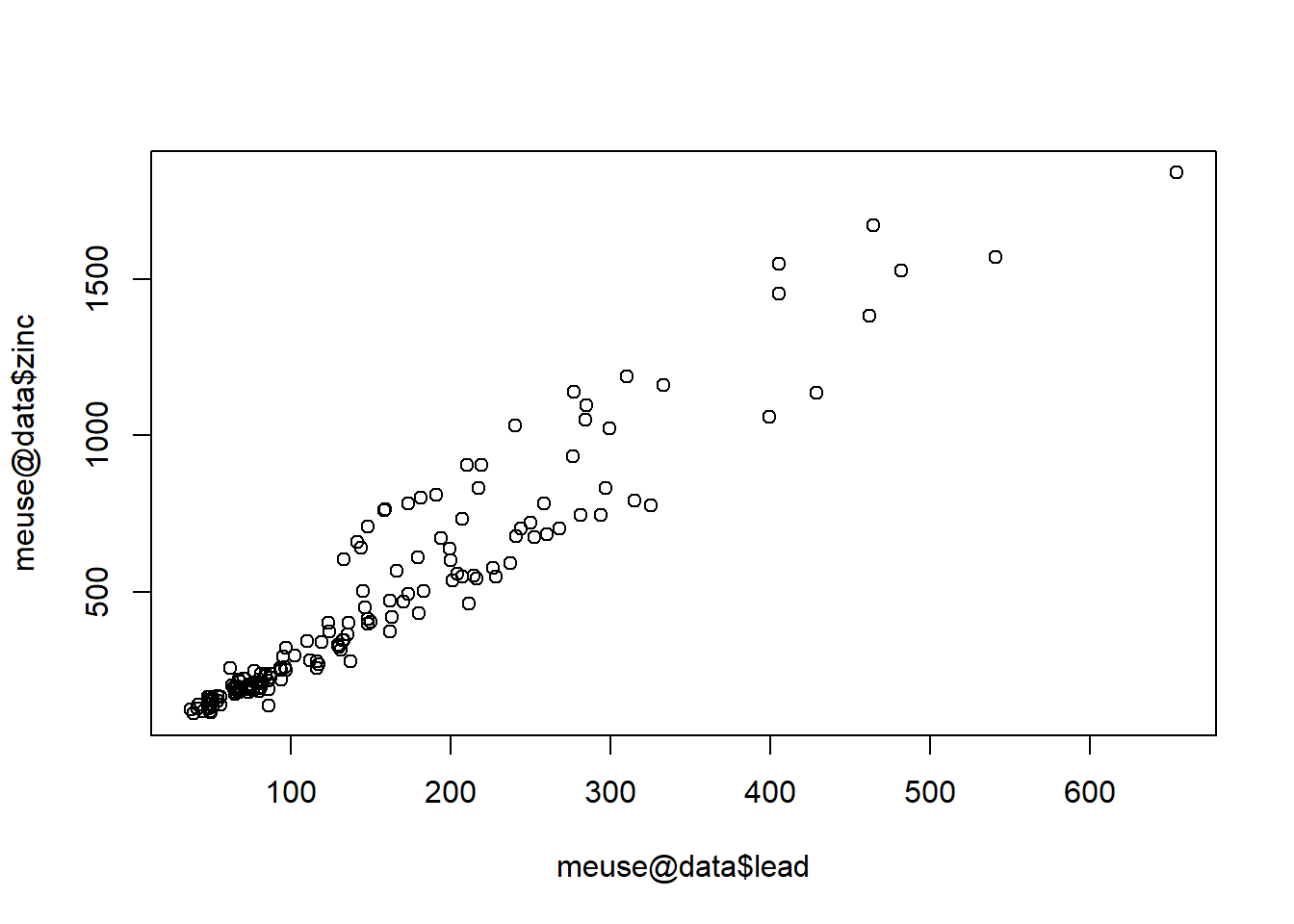
Concentrations of the four heavy metals at the site are strongly correlated with each other, which is not surprising. Lead has the strongest correlation with zinc, with a correlation coefficient of 0.955. Let’s visualize this relationship to ensure that it is consistent across the entire concentration range.
plot(meuse@data$lead, meuse@data$zinc)
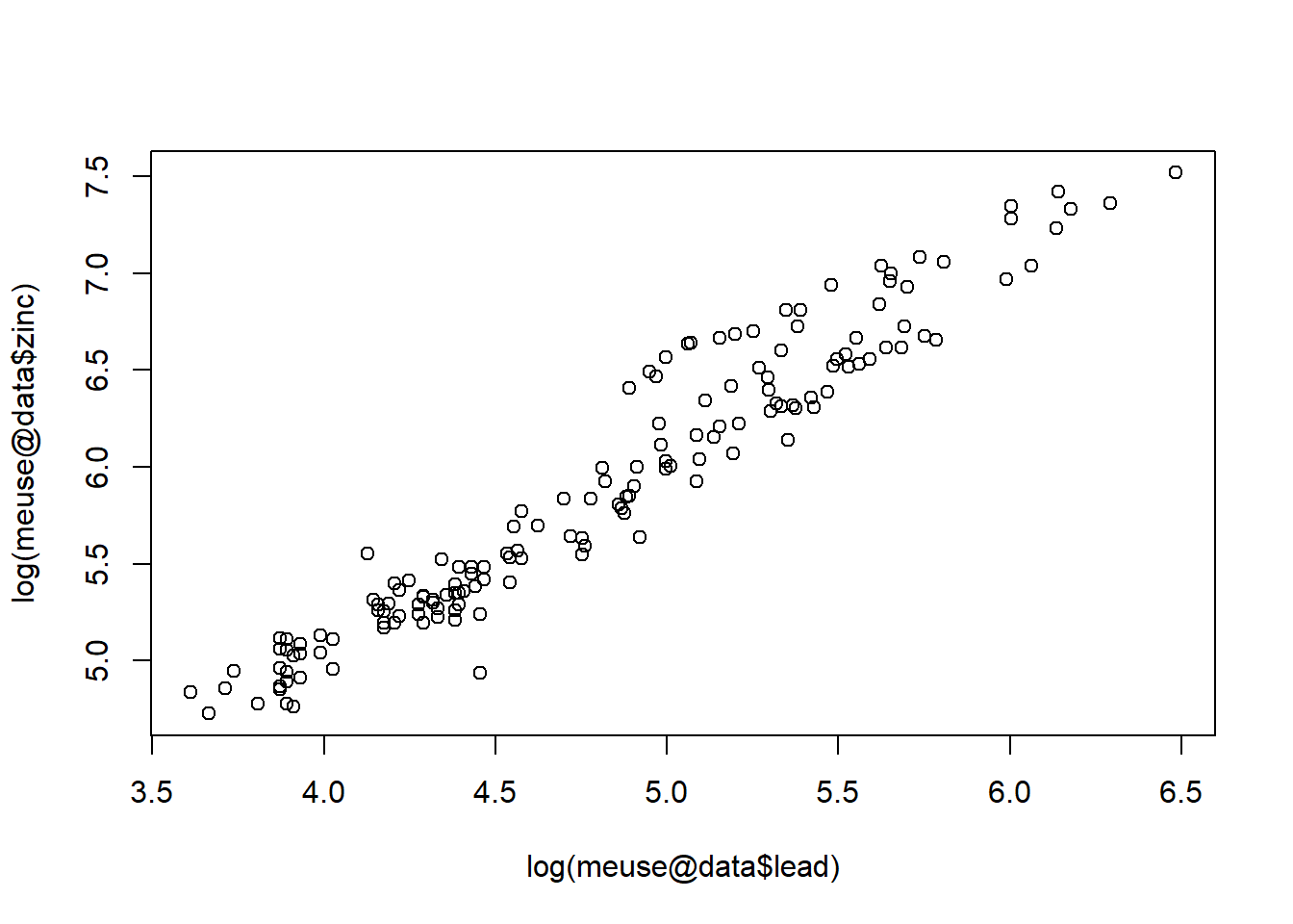
Because the values are skewed, let’s plot the log of each variable.
plot(log(meuse@data$lead), log(meuse@data$zinc))
Now that we have identified that lead has the strongest correlation with zinc, let’s build a gstat structure containing the two data sets. The gstat() function copys information into a single object.
zinc.lead <- gstat(NULL, id = 'log.zinc', form = log(zinc) ~ 1, data = meuse)
zinc.lead <- gstat(zinc.lead, id = 'log.lead', form = log(lead) ~ 1, data = meuse)
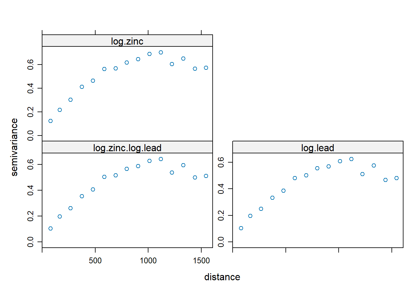
Let’s compute and display the two direct experimental variograms and one cross-variogram.
v.cross <- variogram(zinc.lead)
plot(v.cross)
Now we need to add the variogram models to the gstat object and then fit a linear model of co-regionalization to them.
zinc.lead <- gstat(
  zinc.lead, id = 'log(zn)',
  model = vgm(0.5, 'Sph', 800, 0.1),
  fill.all = TRUE
)
zinc.lead
## data:
## log.zinc : formula = log(zinc)`~`1 ; data dim = 155 x 12
## log.lead : formula = log(lead)`~`1 ; data dim = 155 x 12
## variograms:
##                      model psill range
## log.zinc[1]            Nug   0.1     0
## log.zinc[2]            Sph   0.5   800
## log.lead[1]            Nug   0.1     0
## log.lead[2]            Sph   0.5   800
## log.zinc.log.lead[1]   Nug   0.1     0
## log.zinc.log.lead[2]   Sph   0.5   800
The fit.lmc() function is used to fit a linear model of coregionalization across all three variograms together.
zinc.lead <- fit.lmc(v.cross, zinc.lead)
zinc.lead
## data:
## log.zinc : formula = log(zinc)`~`1 ; data dim = 155 x 12
## log.lead : formula = log(lead)`~`1 ; data dim = 155 x 12
## variograms:
##                      model      psill range
## log.zinc[1]            Nug 0.03616482     0
## log.zinc[2]            Sph 0.57792145   800
## log.lead[1]            Nug 0.03259976     0
## log.lead[2]            Sph 0.49394061   800
## log.zinc.log.lead[1]   Nug 0.02752283     0
## log.zinc.log.lead[2]   Sph 0.52261875   800
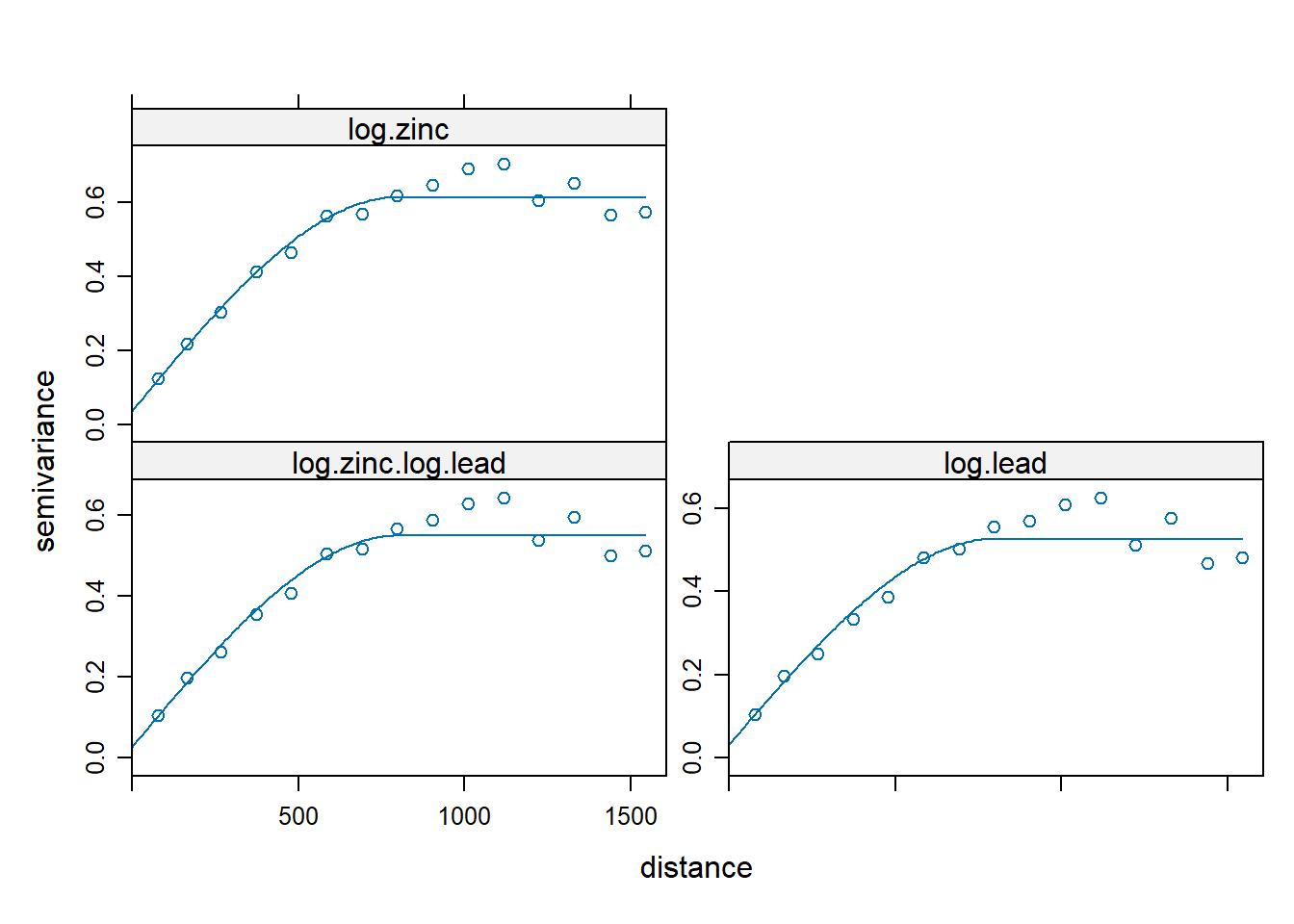
plot(variogram(zinc.lead), model = zinc.lead$model)
Finally, let’s perform co-kriging using the predict() function from gstat and add the results to the meuse grid spatial object.
# Perform co-kriging using the predict function in the gstat package
cokrig.model <- predict(zinc.lead, meuse.grid)
## Linear Model of Coregionalization found. Good.
## [using ordinary cokriging]
meuse.grid$zn.cok <- exp(cokrig.model$log.zinc.pred)
A summary of the results is given below.
# Summarize the predictions and their errors
summary(cokrig.model)
## Object of class SpatialPixelsDataFrame
## Coordinates:
##      min    max
## x 178440 181560
## y 329600 333760
## Is projected: TRUE
## proj4string :
## [+proj=sterea +lat_0=52.1561605555556 +lon_0=5.38763888888889
## +k=0.9999079 +x_0=155000 +y_0=463000 +ellps=bessel +units=m +no_defs]
## Number of points: 3103
## Grid attributes:
##   cellcentre.offset cellsize cells.dim
## x            178460       40        78
## y            329620       40       104
## Data attributes:
##  log.zinc.pred    log.zinc.var    log.lead.pred    log.lead.var
##  Min.   :4.747   Min.   :0.0668   Min.   :3.653   Min.   :0.05932
##  1st Qu.:5.239   1st Qu.:0.1245   1st Qu.:4.207   1st Qu.:0.10842
##  Median :5.580   Median :0.1523   Median :4.553   Median :0.13219
##  Mean   :5.709   Mean   :0.1768   Mean   :4.646   Mean   :0.15321
##  3rd Qu.:6.184   3rd Qu.:0.2060   3rd Qu.:5.091   3rd Qu.:0.17809
##  Max.   :7.461   Max.   :0.5154   Max.   :6.339   Max.   :0.44243
##  cov.log.zinc.log.lead
##  Min.   :0.05357
##  1st Qu.:0.10622
##  Median :0.13149
##  Mean   :0.15354
##  3rd Qu.:0.17958
##  Max.   :0.46019
Kriging Results
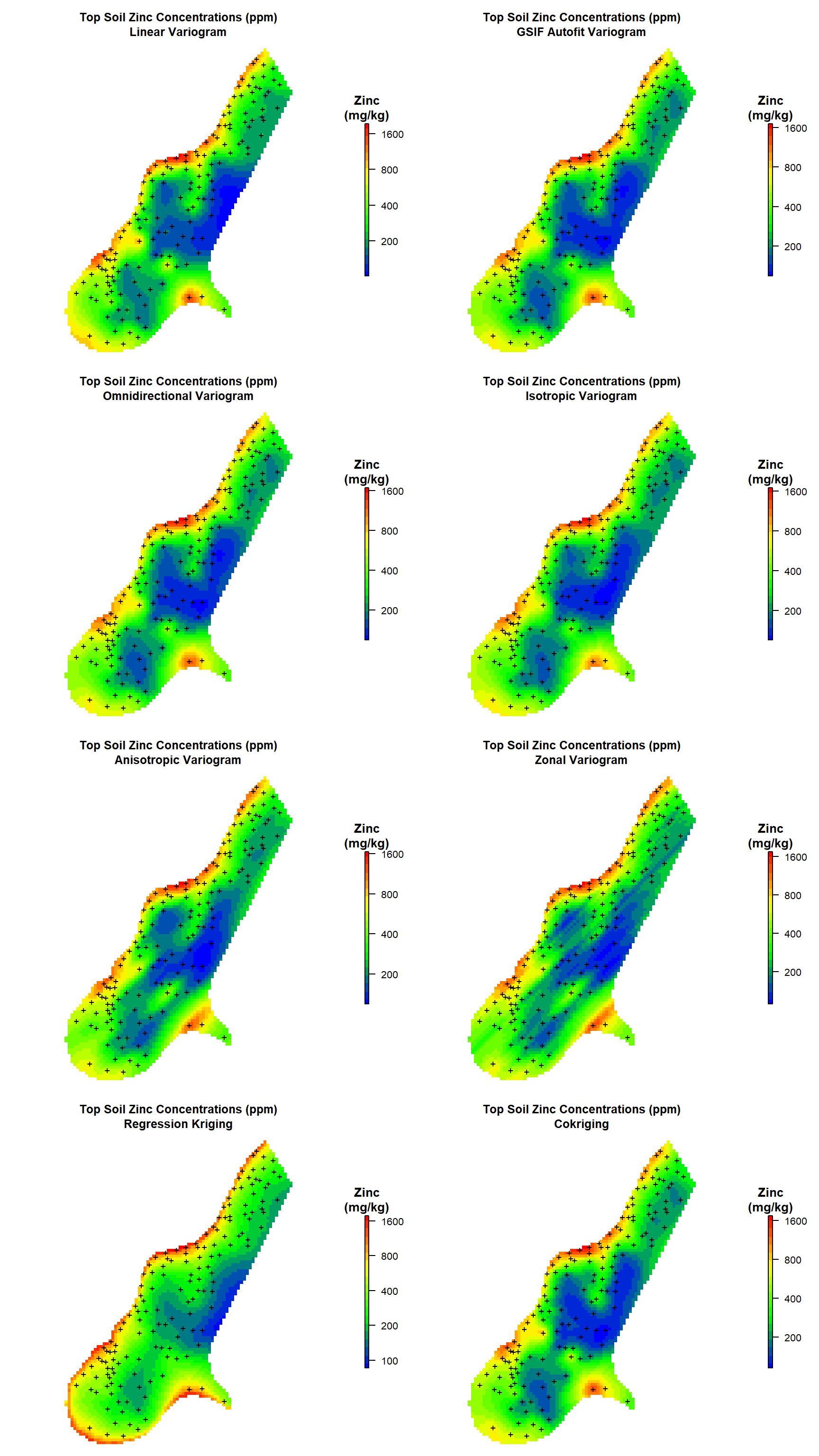
Now that we have kriging predictions for zinc concentrations in top soil along the river Meuse for all of our variogram models, let’s create heat maps comparing the results.
First, let’s create a custom color-scale and break points for plotting.
# Create color-scale for plot
leg <- c(
  "#0000ff", "#0028d7", "#0050af", "#007986", "#00a15e",
  "#00ca35", "#00f20d", "#1aff00", "#43ff00", "#6bff00",
  "#94ff00", "#bcff00", "#e5ff00", "#fff200", "#ffca00",
  "#ffa100", "#ff7900", "#ff5000", "#ff2800", "#ff0000"
)

# Create breaks for legend
axis.ls <- list(
  at = log10(c(100, 200, 400, 800, 1600)),
  labels = c(100, 200, 400, 800, 1600)
)
Now, let’s create a function to help generate the heat maps.
# Function to create plots
get_plot <- function(d, mtitle) {
  plot(
    log10(raster(d)),
    col = leg,
    main = mtitle,
    axes = FALSE,
    box = FALSE,
    axis.args = axis.ls,
    legend.args = list(text = "Zinc\n(mg/kg)", side = 3, font = 2, line = 0.2, cex = 0.8)
  )
  points(coordinates(meuse), pch = "+")
}
Finally, let’s create the maps.
# Create plots
par(mfrow = c(4, 2), oma = c(0, 0, 0, 1), mar = c(1, 1, 4, 3))

# Plot #1
get_plot(
  d = meuse.grid['zn.lin'],
  mtitle = paste0('Top Soil Zinc Concentrations (ppm)\n', 'Linear Variogram')
)

# Plot #2
get_plot(
  d = meuse.grid['zn.gsif'],
  mtitle = paste0('Top Soil Zinc Concentrations (ppm)\n', 'GSIF Autofit Variogram')
)

# Plot #3
get_plot(
  d = meuse.grid['zn.omni'],
  mtitle = paste0('Top Soil Zinc Concentrations (ppm)\n', 'Omnidirectional Variogram')
)

# Plot #4
get_plot(
  d = meuse.grid['zn.iso'],
  mtitle = paste0('Top Soil Zinc Concentrations (ppm)\n', 'Isotropic Variogram')
)

# Plot #5
get_plot(
  d = meuse.grid['zn.aniso'],
  mtitle = paste0('Top Soil Zinc Concentrations (ppm)\n', 'Anisotropic Variogram')
)

# Plot #6
get_plot(
  d = meuse.grid['zn.zonal'],
  mtitle = paste0('Top Soil Zinc Concentrations (ppm)\n', 'Zonal Variogram')
)

# Plot #7
get_plot(
  d = meuse.grid['zn.reg'],
  mtitle = paste0('Top Soil Zinc Concentrations (ppm)\n', 'Regression Kriging')
)

# Plot #8
get_plot(
  d = meuse.grid['zn.cok'],
  mtitle = paste0('Top Soil Zinc Concentrations (ppm)\n', 'Cokriging')
)
Cross-Validation
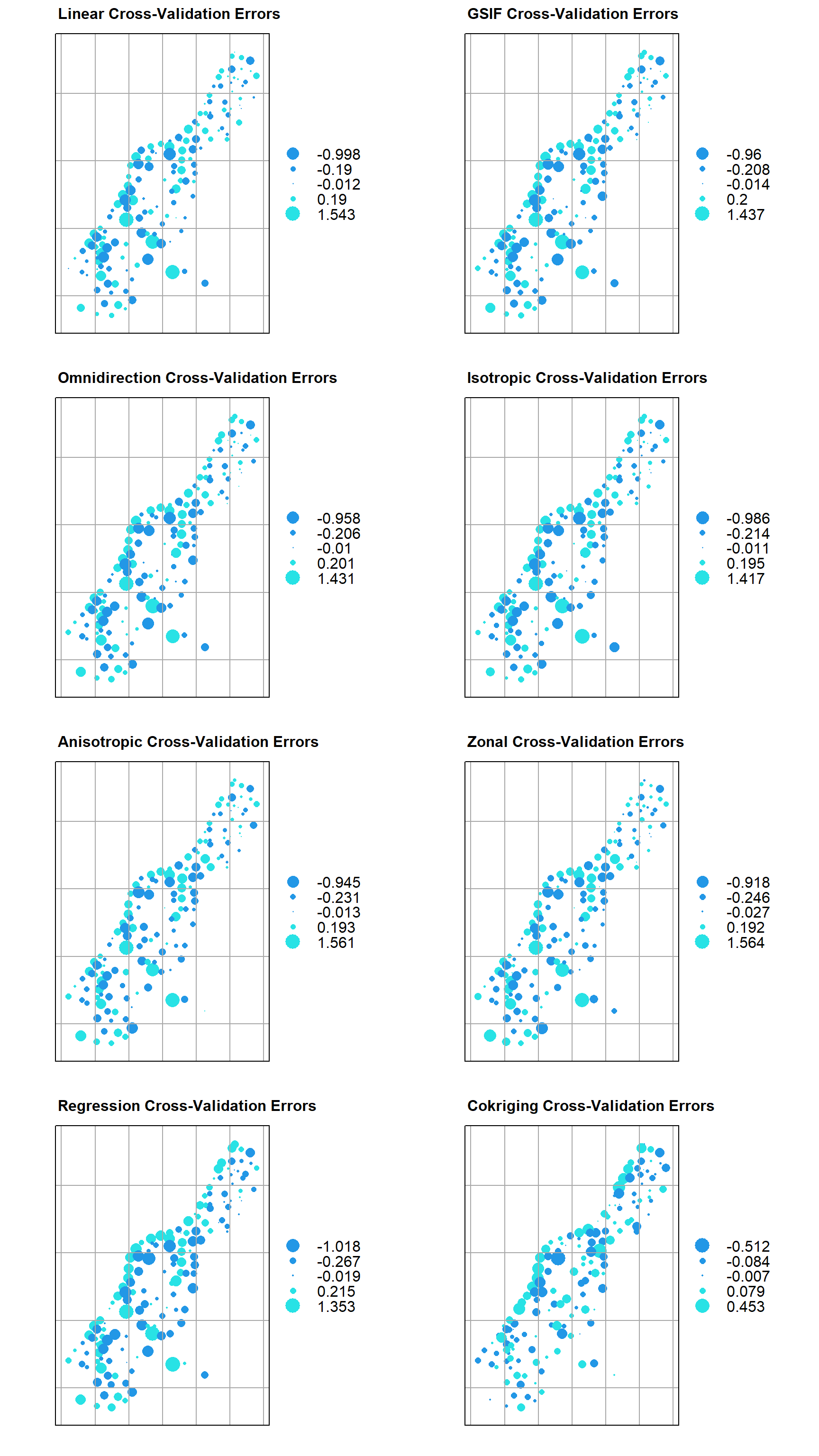
While there are different levels of validation that can be performed, and having an independent data set to validate against is the most ideal approach, other approaches such as leave-one-out cross validation can be useful in many instances. Leave-one-out cross-validation removes a single data point, one at a time, and estimates the result at the now missing location. In the cross-validation process, several errors can be calculated.
Let’s run leave-one-out cross-validation using each of our variogram models and the cross-validation function krige.cv(). By default, this function will run leave-one-out cross-validation, but it also can be used to run n-fold cross validation.
# Function to suppress output messages
quiet <- function(x) {
    sink(tempfile())
    on.exit(sink())
    invisible(force(x))
}

# Perform cross validaion for all models
zn.lin.cv <- quiet(
  krige.cv(log(zinc) ~ 1, meuse, model = fit.lin, verbose = FALSE)
)
zn.gsif.cv <- quiet(
  krige.cv(log(zinc) ~ 1, meuse, model = fit.gsif$vgm, verbose = FALSE)
)
zn.omni.cv <- quiet(
  krige.cv(log(zinc) ~ 1, meuse, model = fit.omni, verbose = FALSE)
)
zn.iso.cv <- quiet(
  krige.cv(log(zinc) ~ 1, meuse, model = fit.sph, verbose = FALSE)
)
zn.aniso.cv <- quiet(
  krige.cv(log(zinc) ~ 1, meuse, model = sph.aniso, verbose = FALSE)
)
zn.zonal.cv <- quiet(
  krige.cv(log(zinc) ~ 1, meuse, model = sph.zonal, verbose = FALSE)
)
zn.reg.cv <- quiet(
  krige.cv(log(zinc) ~ 1, meuse, model = fit.reg.sph, verbose = FALSE)
)
zn.cok.cv <- quiet(
  gstat.cv(zinc.lead, verbose = FALSE)
)
Different sets of cross-validation statistics can be used for performing model diagnostics, depending on the complexity of the model. For this example, let’s use the following cross-validation statistics:
- mean error - ideally 0
- mean squared prediction error (MSPE) - ideally small
- mean square normalized error (MSNE) - ideally close to 1
- correlation between observed and predicted - ideally close to 1
- correlation predicted and residual - ideally close to 0
- root-mean-squared error (RMSE) - ideally small
The mean error indicates whether the predictions are biased by being, on average, too high or too low. The RMSE is a measure of the total error in either direction. Beyond assessing the overall ability of the model to make good predictions, these set of statistics provide an assessment of how accurately the model reflects the variability of the data. When interpreting the cross-validation statistics, the following factors should be considered (ITRC 2016):
-
Prediction errors depend on the scale and units of the data, so it is better to assess standardized prediction errors (prediction errors divided by their prediction standard errors). The mean of these should be close to zero.
-
If the average standard error is close to the root-mean-square prediction error, then the model generally reflects the variability of the data, and the root-mean-square standardized error should be close to one. Variability is likely overestimated if the average standard error is greater than the root-mean-square prediction error, or if the root-mean-square standardized error is less than one. Variability is likely underestimated if the average standard error is less than the root-mean-square prediction error, or if the root-mean-square standardized error is greater than one.
-
When comparing geostatistical models through cross-validation, the better model will have the standardized mean nearest to zero, the smallest root-mean-square prediction error, the average standard error nearest the root-mean-square prediction error, and the standardized root-mean-square prediction error nearest to one.
Let’s inspect the cross-validation statistics for each of our models.
# Function to get cross validation statistics
get_stats <- function(x, method) {

  mean_err <- mean(x$residual)
  mspe <- mean(x$residual^2)
  msne <- mean(x$zscore^2)
  cor_obs_pred <- cor(x$observed, x$observed - x$residual)
  cor_pred_resid <- cor(x$observed - x$residual, x$residual)
  rmse <- sqrt(sum(x$residual^2)/length(x$residual))

  return(
    data.frame(
      method = method, mean_err, mspe, msne, cor_obs_pred, cor_pred_resid, rmse
    ) %>%
    mutate_at(2:7, round, 3)
  )
}

# Compare cross validation statistics across models
rbind(
  get_stats(x = zn.lin.cv, method = 'lin'),
  get_stats(x = zn.gsif.cv, method = 'gsif'),
  get_stats(x = zn.omni.cv, method = 'omni'),
  get_stats(x = zn.iso.cv, method = 'iso'),
  get_stats(x = zn.aniso.cv, method = 'aniso'),
  get_stats(x = zn.zonal.cv, method = 'zonal'),
  get_stats(x = zn.reg.cv, method = 'regres'),
  get_stats(x = zn.cok.cv, method = 'cokrige')
) %>%
  kbl(
    col.names = c(
      'method', 'mean_err', 'mspe', 'msne',
      'cor_obs_pred', 'cor_pred_resid', 'rmse'
    ),
    align = 'lcccccc'
  ) %>%
kable_paper(full_width = F, position = 'left', html_font = 'Cambria')
| method | mean_err | mspe | msne | cor_obs_pred | cor_pred_resid | rmse |
|---|---|---|---|---|---|---|
| lin | 0.004 | 0.148 | 0.001 | 0.845 | -0.032 | 0.385 |
| gsif | 0.000 | 0.154 | 0.819 | 0.839 | 0.058 | 0.392 |
| omni | 0.000 | 0.154 | 0.791 | 0.838 | 0.066 | 0.393 |
| iso | -0.001 | 0.152 | 1.164 | 0.841 | 0.060 | 0.390 |
| aniso | 0.003 | 0.155 | 0.914 | 0.837 | 0.045 | 0.394 |
| zonal | 0.005 | 0.159 | 0.807 | 0.833 | -0.011 | 0.398 |
| regres | 0.000 | 0.173 | 1.331 | 0.824 | 0.193 | 0.416 |
| cokrige | 0.001 | 0.019 | 0.850 | 0.981 | 0.000 | 0.138 |
For the models evaluated, co-kriging gives the lowest mean error and RMSE. It also gives the highest MSNE and correlation between the observed and predicted concentrations. Interestly, the linear variogram model has the next lowest RMSE and the next highest correlation between the observed and predicted concentrations. As previoulsy mentioned, estimation variances generated using a linear variogram are meaningless, which explains the nonsensical value obtained for the MSNE.
Now, let’s plot the cross-validation errors for each of our models.
# Function for plotting kriging cross-validation errors
plot_valid <- function(cv.o, title = "") {

  my.settings <- list(
    par.main.text = list(
      fontsize = 10,
      just = 'left',
      x = grid::unit(7, 'mm')
    )
  )

  extreme <- max(abs(range(as.data.frame(cv.o)$residual)))
  b <- bubble(
    cv.o, z = 'residual',
    par.settings = my.settings,
    main = paste(title, 'Cross-Validation Errors'),
    col = c(4, 5),
    maxsize = 2*(max(abs(range(cv.o$residual))))/extreme,
    panel = function(x, ...) {
      panel.xyplot(x, ...);
      panel.grid(h = -1, v = -1, col = 'darkgrey')
    })
  return(b)
}

# Create plots
p1 <- plot_valid(zn.lin.cv, 'Linear')
p2 <- plot_valid(zn.gsif.cv, 'GSIF')
p3 <- plot_valid(zn.omni.cv, 'Omnidirection')
p4 <- plot_valid(zn.iso.cv, 'Isotropic')
p5 <- plot_valid(zn.aniso.cv, 'Anisotropic')
p6 <- plot_valid(zn.zonal.cv, 'Zonal')
p7 <- plot_valid(zn.reg.cv, 'Regression')
p8 <- plot_valid(zn.cok.cv, 'Cokriging')

# Show plots
grid.arrange(
  p1, p2, p3, p4,
  p5, p6, p7, p8,
  ncol = 2
)
Compare Kriging Estimates
Let’s visually compare differences in the predicted zinc concentration between a few of our models. First, let’s define a new color scheme and define a few settings to be used in creating the main title for the plots.
# Re-define default color scheme
old_theme <- get_col_regions()
new_theme <- set_col_regions(leg)

# Set main title settings
my.settings <- list(
  par.main.text = list(
    fontsize = 12,
    just = 'left',
    x = grid::unit(6, 'mm')
  )
)
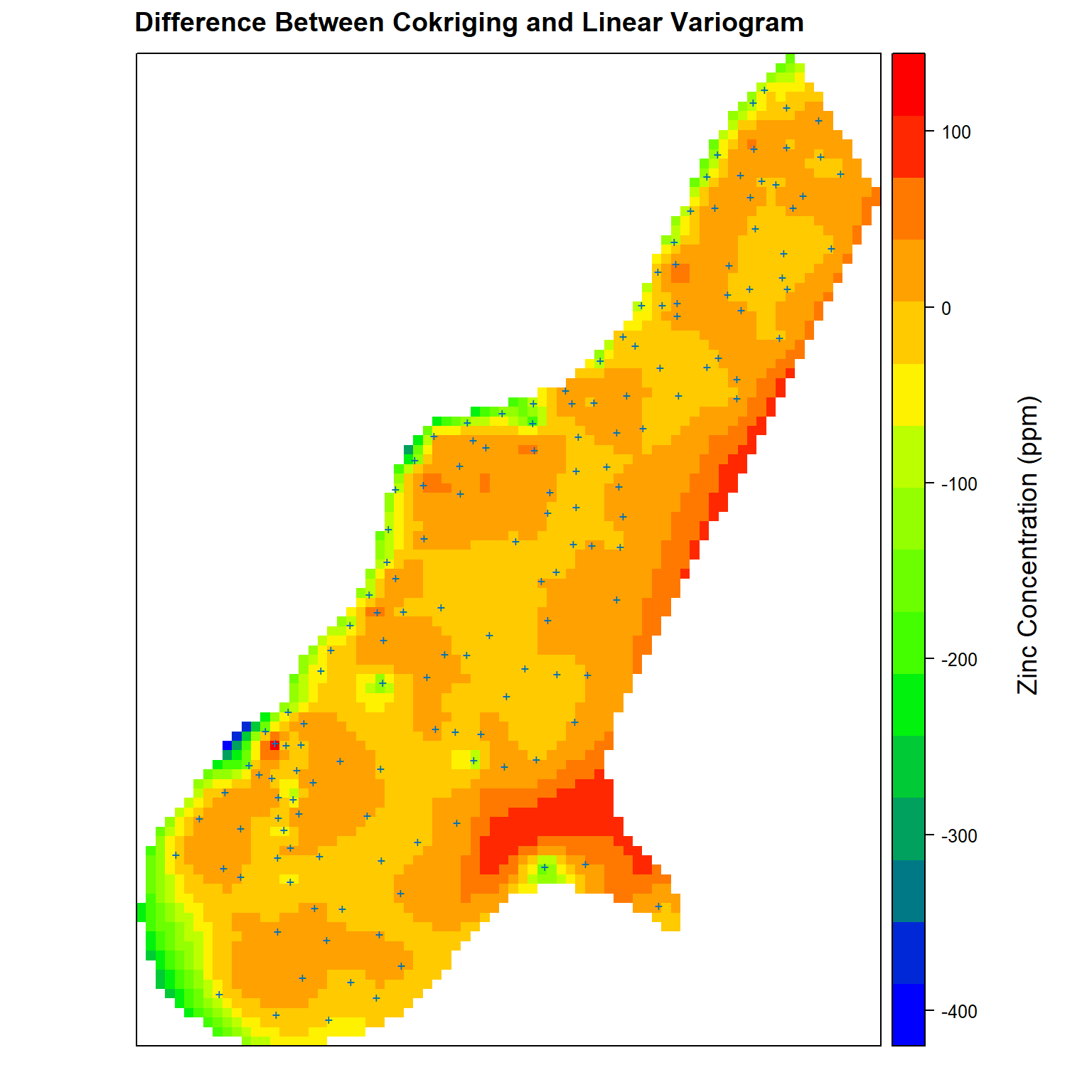
Now, let’s compare the differences between co-kriging and the linear variogram model. Positive values represent higher predicted zinc concentrations for co-kriging while negative values represent higher zinc concentrations predicted using the linear variogram model.
# Get difference between cokriging and linear variogram kriging estimates
zn.diff <- meuse.grid
zn.diff$cok.lin <- zn.diff$zn.cok - zn.diff$zn.lin

# Create plot comparing difference between cokriging and linear variogram
spplot(
  zn.diff['cok.lin'],
  par.settings = my.settings,
  panel = function(...) {
    panel.gridplot(...)
    panel.xyplot(meuse$x, meuse$y, pch = '+', cex = 1)
  },
  main = 'Difference Between Cokriging and Linear Variogram'
)
grid.text(
  'Zinc Concentration (ppm)', x = unit(0.94, 'npc'), y = unit(0.50, 'npc'), rot = 90,
  gp = gpar(fontsize = 14, col = 'black')
)
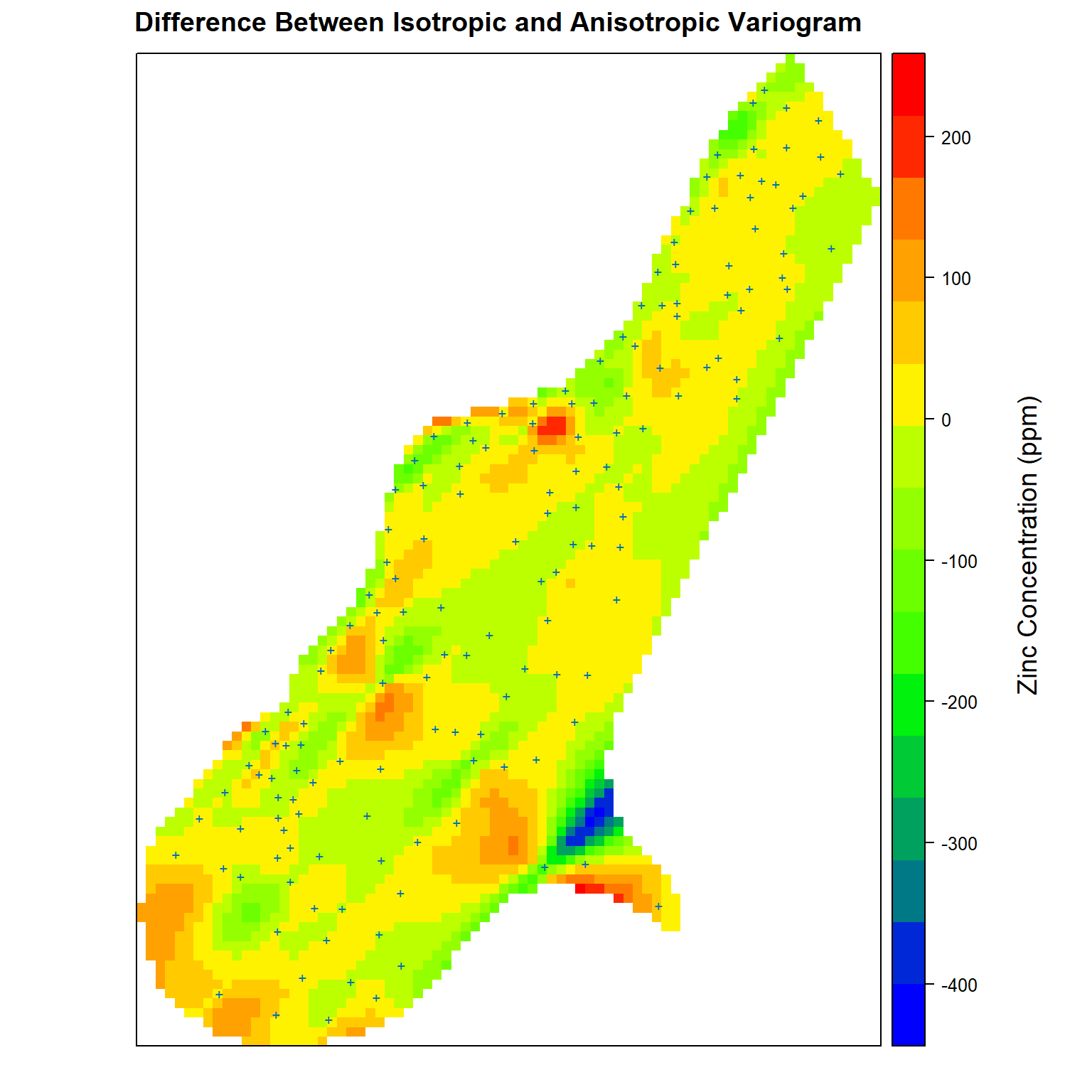
Finally, let’s compare the differences between the isotropic and anisotropic variogram models. Positive values represent higher predicted zinc concentrations using the isotropic variogram model while negative values represent higher zinc concentrations predicted using the anisotropic variogram model.
# Get difference between isotropic and anisotropic variogram kriging estimates
zn.diff$iso.aniso <- zn.diff$zn.iso - zn.diff$zn.aniso

# Create plot comparing difference between isotropic and anisotropic variograms
spplot(
  zn.diff['iso.aniso'],
  par.settings = my.settings,
  panel = function(...) {
    panel.gridplot(...)
    panel.xyplot(meuse$x, meuse$y, pch = '+', cex = 1)
  },
  main = 'Difference Between Isotropic and Anisotropic Variogram'
)
grid.text(
  'Zinc Concentration (ppm)', x = unit(0.94, 'npc'), y = unit(0.50, 'npc'), rot = 90,
  gp = gpar(fontsize = 14, col = 'black')
)
Conclusions
ESDA is an important process that is used for identifying spatial dependence patterns and spatial heterogeneity within a data set. It is used to determine optimal values for input parameters controlling the variogram and kriging procedure. Because kriging requires a positive definite model of spatial variability, a model must be fitted to the data to mathematically describe the spatial continuity of the data. This variogram model summarizes the continuity between measurements in space which then can be used to estimate values at unsampled locations. If the model does not adequately describe the spatial relationship of the data, these estimates may be highly inaccurate. Incidently, the quantitative characterization of relatedness afforded by the variogram is useful for assessing any prediction procedure. Thus, the variogram has applicability far beyond its use in kriging.
In the example calculations presented here, models developed for both ordinary kriging and ordinary co-kriging were shown to generate adequate predictions of zinc concentration in top soil along the river Meuse. As expected, the gain of the secondary variable was obvious. However, we always need to consider the cost of obtaining the secondary variable and the quality of the prediction without it.
References
Bivand, R.S., E. Pebesma, and V. Gomez-Rubio. 2013. Applied Spatial Data Analysis with R, Second Edition. Springer, New York.
Inerstate Technology & Regulatory Council (ITRC). 2016. Geospatial Analysis for Optimization at Environmental Sites. https://gro-1.itrcweb.org/. November.
Middelhoop, H. 2000. Heavy-metal pollution of the river Rhine and Meuse floodplains in the Netherlands. Netherlands Journal of Geosciences 79, 411-428.
Pebesma, E.J. 2014. gstat user’s manual. Dept. of Physical Geography, Utrecht University, Utrecht, The Netherlands.
Pebesma, E.J. 2022. The meuse data set: a brief tutorial for the gstat R package. ( https://cran.r- project.org/web/packages/gstat/vignettes/gstat.pdf)
Pebesma, E.J. and R.S. Bivand. 2023. * Spatial Data Science With Applications in R*. CRC Press, Boca Raton.
- Posted on:
- May 29, 2023
- Length:
- 43 minute read, 9024 words
- See Also: