Examination of England's Surface Water Quality
By Charles Holbert
July 18, 2022
The Water Framework Directive (WFD) is an important mechanism for assessing and managing the water environment in the European Union. The WFD specifies the quality elements that can be used to assess the surface water status of a water body. Quality elements can be biological (for example, fish, invertebrates and plants), chemical (for example, heavy metals, pesticides and nutrients) or indicators of the condition of the habitats and water flows and levels (for example, presence of barriers to fish migration and modelled lake level data). Classifications indicate where the quality of the environment is good, where it may need improvement, and what may need to be improved. They also can be used, over the years, to plan improvements, show trends, and monitor progress. Surface water status is a composite measure that looks at both the chemical status and the ecological (including biological and habitat condition) status of a water body.
There has been a decrease in the proportion of surface water bodies in England assigned a high or good ecological status since the indicator was first prepared in 2009. The impacts of poor water quality are felt throughout freshwater ecosystems, with negative consequences for invertebrates, plants and larger species, which may live both on water and land. This post examines the status of various surface water bodies across different classifications, covering both ecological and chemical criteria.
Load Libraries
This exploratory examination will use the R language for statistical computing and visualization. In R, the fundamental unit of reproducible code is the package, also referred to as a library. A package bundles together code, data, and documentation into a well-defined format that is easy to share with others. Let’s load the libraries that will be used to summarize and visualize the chemical and ecological status of surface water bodies in England.
# Load libraries
library(dplyr)
library(ggplot2)
library(ggrepel)
library(gridExtra)
library(grid)
library(raster)
library(sp)
library(sf)
library(summarytools)
library(RColorBrewer)
Load Data
Data were downloaded from the Catchment Data Explorer, which is designed to help individuals explore and download information about the river basin management water environment. This system can be used to navigate to catchments and water bodies, view catchment summaries, and download river basin planning data. The data were downloaded as a comma-delimited (csv) file that is read into memory as shown below.
# Read data in comma-delimited file
class <- read.csv('data/England_classifications.csv', header = T)
In addition to the csv file, geographic information system (GIS) shapefiles also were downloaded from the Catchment Data Explorer. The shapefiles include feature geometries for each of the water bodies as well as information on the chemical and ecological status. A shapefile of the clipped NUTS Level 2 (January 2018) boundaries in the United Kingdom also was downloaded. This will be used as a reference base map. The various shapefiles are loaded below using the R package sf.
# Load shapefiles
lakes <- sf::st_read('data/shapes/WFD_Lake_Water_Bodies_Cycle_2.shp', quiet = T)
canals <- sf::st_read('data/shapes/WFD_Canal_Water_Bodies_Cycle_2.shp', quiet = T)
rivers <- sf::st_read('data/shapes/WFD_River_Water_Bodies_Cycle_2.shp', quiet = T)
coastal <- sf::st_read('data/shapes/WFD_Coastal_Water_Bodies_Cycle_2.shp', quiet = T)
wb <- sf::st_read(
  'data/shapes/WFD_River_Canal_and_Surface_Water_Transfer_Water_Bodies_Cycle_2_2019.shp',
  quiet = T
)

# Load boundary shapefile
boundary <- sf::st_read('data/nuts/NUTS_Boundaries.shp', quiet = T)
Data Processing
Prior to performing any computations, the data will be processed to remove groundwater and those surface water bodies that do not require assessment. The “status” and “water body type” categories will be condensed to help simplify output.
# Prep class data
class <- class %>%
  filter(
    Water.Body.Type != 'GroundWaterBody' &
    Status != 'Does not require assessment') %>%
  mutate(
    Status = ifelse(Status == 'Moderate or less', 'Moderate',
               ifelse(Status == 'Supports Good', 'Good',
                 ifelse(Status == 'Does Not Support Good', 'Poor', Status
                 )
               )
             ),
    Water.Body.Type = ifelse(Water.Body.Type == 'CoastalWater', 'Coasts',
                        ifelse(Water.Body.Type == 'Lake', 'Lakes',
                          ifelse(Water.Body.Type == 'River', 'Rivers', 'Estuaries'
                          )
                        )
                      )
  ) %>%
  droplevels
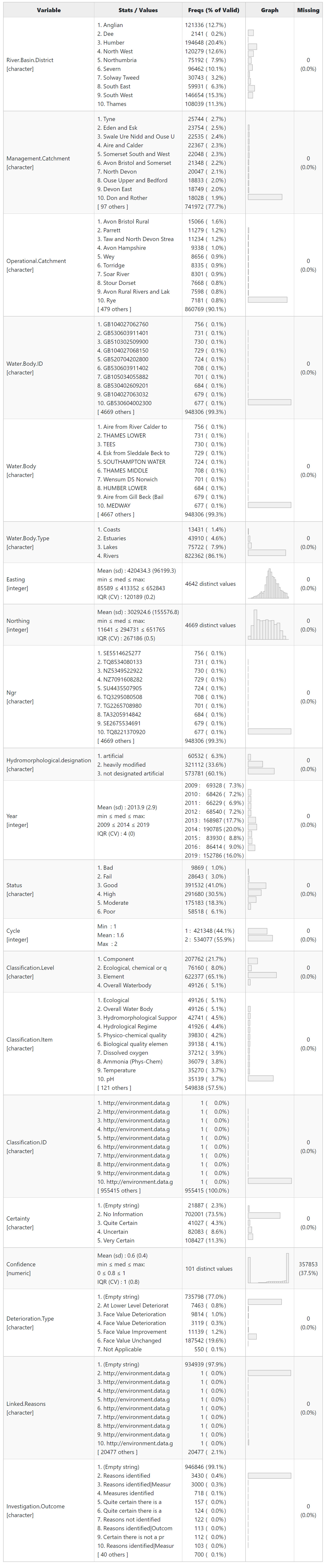
Data Inspection
After preparing the data for analysis, the next step is to inspect the data to ensure variables are as expected. The dfSummary() function in the R package summarytools provides a quick graphical presentation of the data as shown below. The dfSummary() function creates a summary table with statistics, frequencies, and graphs for all variables in a data frame. The information displayed is type-specific (character, factor, numeric, date) and also varies according to the number of distinct values. This information is useful to quickly detect anomalies and identify trends at a glance.
# Summary of class dataframe
print(
  dfSummary(
    class,
    varnumbers   = FALSE,
    valid.col    = FALSE,
    style        = 'grid',
    plain.ascii  = FALSE,
    headings     = FALSE,
    graph.magnif = 0.8
  ),
  footnote = NA,
  method = 'render'
)
A list of the chemical and ecological status categories is shown below. This list will be used to create an ordered factor for plotting the variable Status.
# Get listing of status categories
sort(unique(class$Status))
## [1] "Bad"      "Fail"     "Good"     "High"     "Moderate" "Poor"

# Create ordered factor
cats <- c('High', 'Good', 'Moderate', 'Poor', 'Bad', 'Fail')
class$Status <- factor(class$Status, ordered = TRUE, levels = cats)
Summary of Ecological Status
Ecological status is an assessment of the quality of the structure and functioning of surface water ecosystems. It shows the influence of pollution and habitat degradation on the identified quality elements. Ecological status is determined for each of the surface water bodies of rivers, lakes, transitional waters and coastal waters, based on biological quality elements and supported by physicochemical and hydromorphological quality elements. The overall ecological status classification for a water body is determined by the element with the worst status out of all the biological and supporting quality elements.
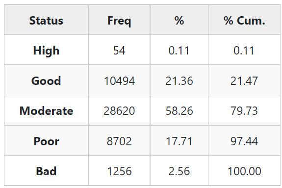
The freq() function in the R package summarytools generates frequency tables featuring counts, proportions, and cumulative statistics. A frequency table for ecological status of surface water bodies is shown below.
# Get ecological classifications
classE <- class %>%
  filter(Classification.Item == 'Ecological') %>%
  droplevels()

print(
  freq(
    classE$Status,
    report.nas = FALSE,
    totals     = FALSE,
    headings   = FALSE
  ),
  footnote = NA,
  method = 'render'
)
The ctable() function in the R package summarytools generates cross-tabulations (joint frequencies) between pairs of discrete/categorical variables, featuring marginal sums as well as row, column, or total proportions. A cross-tabulation of ecological status by calendar year is shown below.
print(
  ctable(
    x = classE$Year,
    y = classE$Status,
    prop = 'r',   # Show row proportions
    headings = FALSE
  ),
  footnote = NA,
  method = 'render'
)
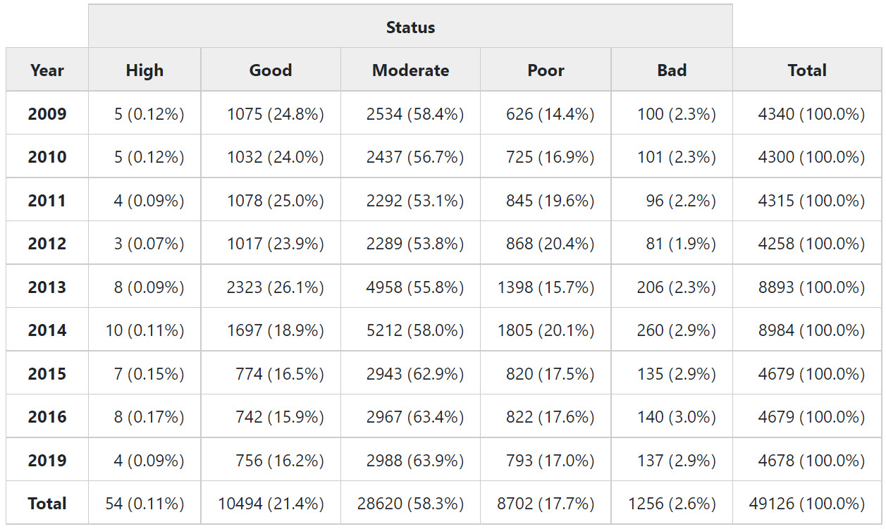
During 2013 and 2014, England introduced the Ecological Status Indicator (ESI) monitoring program in order to establish a new fixed network of sampling points and provide a complete baseline of ecological status, covering every river water body in England. This new monitoring program significantly increased the number of samples that would normally be collected in any single year. This resulted in an increase to the number of status classifications during 2013 and 2014.
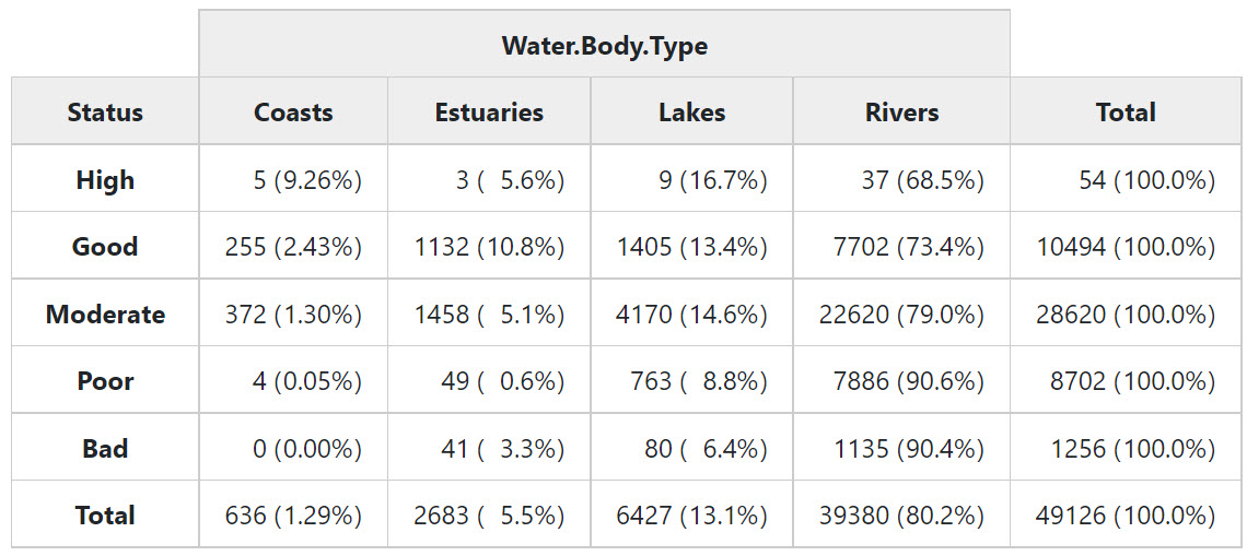
A cross-tabulation of ecological status by water body type is shown below.
print(
  ctable(
    x = classE$Status,
    y = classE$Water.Body.Type,
    prop = 'r',   # Show row proportions
    headings = FALSE
  ),
  footnote = NA,
  method = 'render'
)
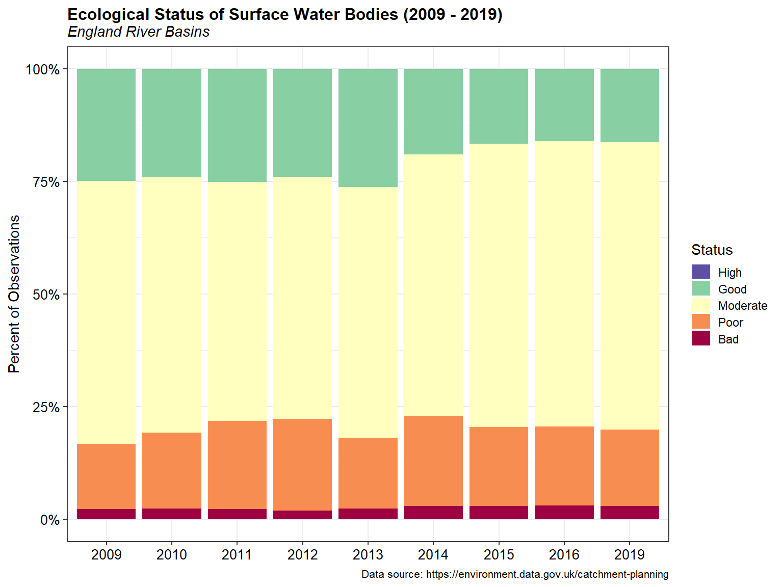
A bar chart of the ecological status of surface water bodies from 2009 through 2019 is shown below.
# Get totals
totals <- classE %>%
  group_by(Year, Status) %>%
  summarize(
    NObs = n()
  ) %>%
  ungroup() %>%
  mutate(
    Year = as.factor(Year)
  ) %>%
  droplevels() %>%
  data.frame()

# Create vector of colors
colourCount <- length(unique(totals$Status))
getPalette <- colorRampPalette(rev(brewer.pal(11, 'Spectral')))

# Stacked + percent
ggplot(data = totals, aes(x = Year, y = NObs, fill = Status)) +
  geom_bar(position = 'fill', stat = 'identity') +
  scale_y_continuous(labels = scales::percent) + #, expand = c(0, 0)) +
  scale_fill_manual(name   = 'Status',
                    values = getPalette(colourCount),
                    drop = FALSE,
                    guide  = guide_legend(keywidth = 1, keyheight = 0.85)) +
  labs(title = 'Ecological Status of Surface Water Bodies (2009 - 2019)',
       subtitle = 'England River Basins',
       caption = 'Data source: https://environment.data.gov.uk/catchment-planning',
       x = NULL,
       y = 'Percent of Observations') +
  theme_bw() +
  theme(plot.title = element_text(margin = margin(b = 2), size = 12,
                                  hjust = 0, face = 'bold'),
        plot.subtitle = element_text(margin = margin(b = 5), size = 11,
                                  hjust = 0, face = 'italic'),
        plot.caption = element_text(size = 8, color = 'black'),
        axis.title.y = element_text(size = 11, color = 'black'),
        axis.title.x = element_text(size = 11, color = 'black'),
        axis.text.x = element_text(size = 10, color = 'black'),
        axis.text.y = element_text(size = 10, color = 'black'))
Cross-tabulations also can be created using the R packages dplyr and tidyr. These are shown below for ecological status by year, both for counts and relative frequency as percentage.
# Add margin totals and spread
totals %>%
  bind_rows(
    group_by(. ,Status) %>%
    summarise(NObs = sum(NObs)) %>%
    mutate(Year = 'Total')
  ) %>%
  bind_rows(
    group_by(. ,Year) %>%
    summarise(NObs = sum(NObs)) %>%
   mutate(Status = 'Total')
  ) %>%
  tidyr::spread(Status, NObs) %>%
  dplyr::select(
    'Year', 'High', 'Good', 'Moderate',
    'Poor', 'Bad', 'Total'
  )
##     Year High  Good Moderate Poor  Bad Total
## 1   2009    5  1075     2534  626  100  4340
## 2   2010    5  1032     2437  725  101  4300
## 3   2011    4  1078     2292  845   96  4315
## 4   2012    3  1017     2289  868   81  4258
## 5   2013    8  2323     4958 1398  206  8893
## 6   2014   10  1697     5212 1805  260  8984
## 7   2015    7   774     2943  820  135  4679
## 8   2016    8   742     2967  822  140  4679
## 9   2019    4   756     2988  793  137  4678
## 10 Total   54 10494    28620 8702 1256 49126

# Get percentages
dt <- totals %>%
  group_by(Year, Status) %>%
  summarize(n = sum(NObs)) %>%
  mutate(rel.freq = round(100 * n/sum(n), 1)) %>%
  dplyr::select(-n)

# Show table of percentagers
dt %>%
  mutate(rel.freq = paste0(rel.freq, "%")) %>%
  tidyr::spread(Status, rel.freq) %>%
  dplyr::select(
    'Year', 'High', 'Good', 'Moderate',
    'Poor', 'Bad'
  )
## # A tibble: 9 x 6
## # Groups:   Year [9]
##   Year  High  Good  Moderate Poor  Bad
##   <fct> <chr> <chr> <chr>    <chr> <chr>
## 1 2009  0.1%  24.8% 58.4%    14.4% 2.3%
## 2 2010  0.1%  24%   56.7%    16.9% 2.3%
## 3 2011  0.1%  25%   53.1%    19.6% 2.2%
## 4 2012  0.1%  23.9% 53.8%    20.4% 1.9%
## 5 2013  0.1%  26.1% 55.8%    15.7% 2.3%
## 6 2014  0.1%  18.9% 58%      20.1% 2.9%
## 7 2015  0.1%  16.5% 62.9%    17.5% 2.9%
## 8 2016  0.2%  15.9% 63.4%    17.6% 3%
## 9 2019  0.1%  16.2% 63.9%    17%   2.9%
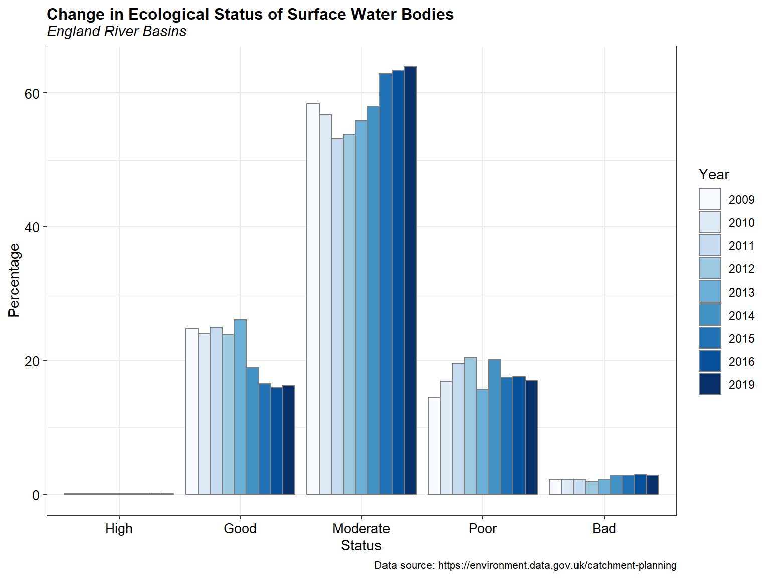
A bar chart illustrating the change in ecological status of surface water bodies from 2009 through 2019 is shown below.
# Plot relative frequencies
ggplot(data = dt, aes(x = Status, y = rel.freq, fill = Year)) +
  geom_bar(stat = 'identity', position = position_dodge(), color = 'gray50') +
  labs(title = 'Change in Ecological Status of Surface Water Bodies',
       subtitle = 'England River Basins',
       caption = 'Data source: https://environment.data.gov.uk/catchment-planning',
       x = 'Status',
       y = 'Percentage') +
  scale_fill_brewer(palette = 'Blues') +
  theme_bw() +
  theme(plot.title = element_text(margin = margin(b = 2), size = 12,
                                  hjust = 0, face = 'bold'),
        plot.subtitle = element_text(margin = margin(b = 5), size = 11,
                                  hjust = 0, face = 'italic'),
        plot.caption = element_text(size = 8, color = 'black'),
        axis.title.y = element_text(size = 11, color = 'black'),
        axis.title.x = element_text(size = 11, color = 'black'),
        axis.text.x = element_text(size = 10, color = 'black'),
        axis.text.y = element_text(size = 10, color = 'black'))
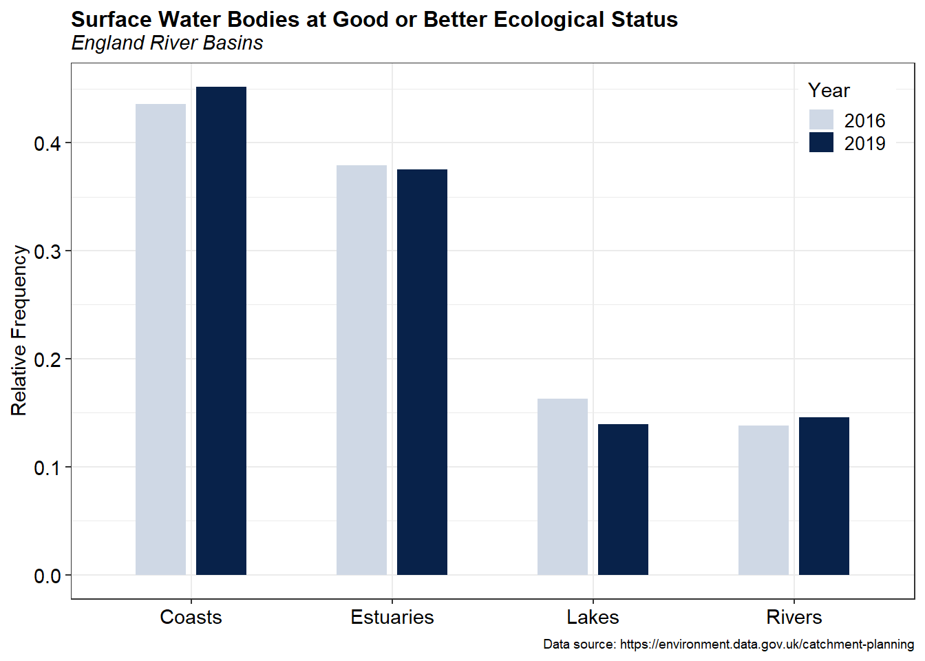
 A bar chart of the relative frequency of surface water bodies at good or better ecological status for 2016 and 2019 is shown below.
# Surface Water Bodies at Good or Better Ecological Status
classE %>%
  group_by(Year, Water.Body.Type, Status) %>%
  summarise(n = n()) %>%
  mutate(freq = n / sum(n)) %>%
  filter(
    Year %in% c(2016, 2019) &
    Status %in% c('High', 'Good')
  ) %>%
  ggplot(aes(x = Water.Body.Type, y = freq, fill = as.factor(Year))) +
  geom_col(width = 0.5, position = position_dodge(0.6)) +
 # geom_bar(stat = "identity", position = position_dodge()) +
  scale_fill_manual(name    = 'Year',
                    values = c('2016' = '#CFD8E5',
                               '2019' = '#08224A'),
                    guide  = guide_legend(keywidth = 1, keyheight = 0.85)) +
  labs(title = 'Surface Water Bodies at Good or Better Ecological Status',
       subtitle = 'England River Basins',
       caption = 'Data source: https://environment.data.gov.uk/catchment-planning',
       x = NULL,
       y = 'Relative Frequency') +
  theme_bw() +
  theme(plot.title = element_text(margin = margin(b = 2), size = 12,
                                  hjust = 0, face = 'bold'),
        plot.subtitle = element_text(margin = margin(b = 5), size = 11,
                                  hjust = 0, face = 'italic'),
        plot.caption = element_text(size = 7, color = 'black'),
        axis.title.y = element_text(size = 11, color = 'black'),
        axis.title.x = element_text(size = 11, color = 'black'),
        axis.text.x = element_text(size = 11, color = 'black'),
        axis.text.y = element_text(size = 11, color = 'black'),
        legend.position = c(0.92, 0.90),
        legend.title = element_text(size = 11),
        legend.text = element_text(size = 10))
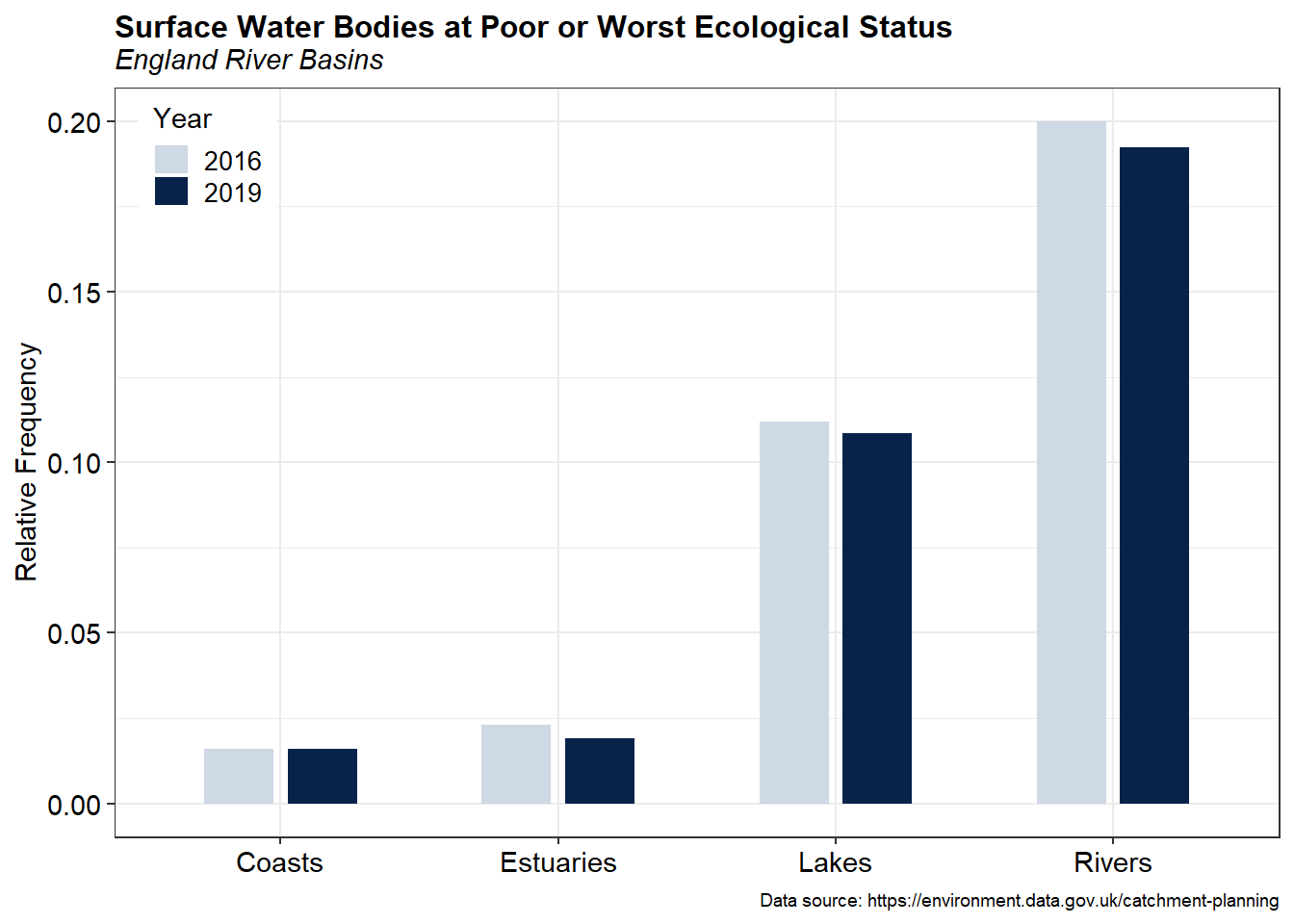
A bar chart of the relative frequency of surface water bodies at poor or worst ecological status for 2016 and 2019 is shown below.
# Surface Water Bodies at Poor or Worst Ecological Status
classE %>%
  group_by(Year, Water.Body.Type, Status) %>%
  summarise(n = n()) %>%
  mutate(freq = n / sum(n)) %>%
  filter(
    Year %in% c(2016, 2019) &
    Status %in% c('Poor', 'Bad', 'Fail')
  ) %>%
  ggplot(aes(x = Water.Body.Type, y = freq, fill = as.factor(Year))) +
  geom_col(width = 0.5, position = position_dodge(0.6)) +
 # geom_bar(stat = "identity", position = position_dodge()) +
  scale_fill_manual(name    = 'Year',
                    values = c('2016' = '#CFD8E5',
                               '2019' = '#08224A'),
                    guide  = guide_legend(keywidth = 1, keyheight = 0.85)) +
  labs(title = 'Surface Water Bodies at Poor or Worst Ecological Status',
       subtitle = 'England River Basins',
       caption = 'Data source: https://environment.data.gov.uk/catchment-planning',
       x = NULL,
       y = 'Relative Frequency') +
  theme_bw() +
  theme(plot.title = element_text(margin = margin(b = 2), size = 12,
                                  hjust = 0, face = 'bold'),
        plot.subtitle = element_text(margin = margin(b = 5), size = 11,
                                  hjust = 0, face = 'italic'),
        plot.caption = element_text(size = 7, color = 'black'),
        axis.title.y = element_text(size = 11, color = 'black'),
        axis.title.x = element_text(size = 11, color = 'black'),
        axis.text.x = element_text(size = 11, color = 'black'),
        axis.text.y = element_text(size = 11, color = 'black'),
        legend.position = c(0.08, 0.91),
        legend.title = element_text(size = 11),
        legend.text = element_text(size = 10))
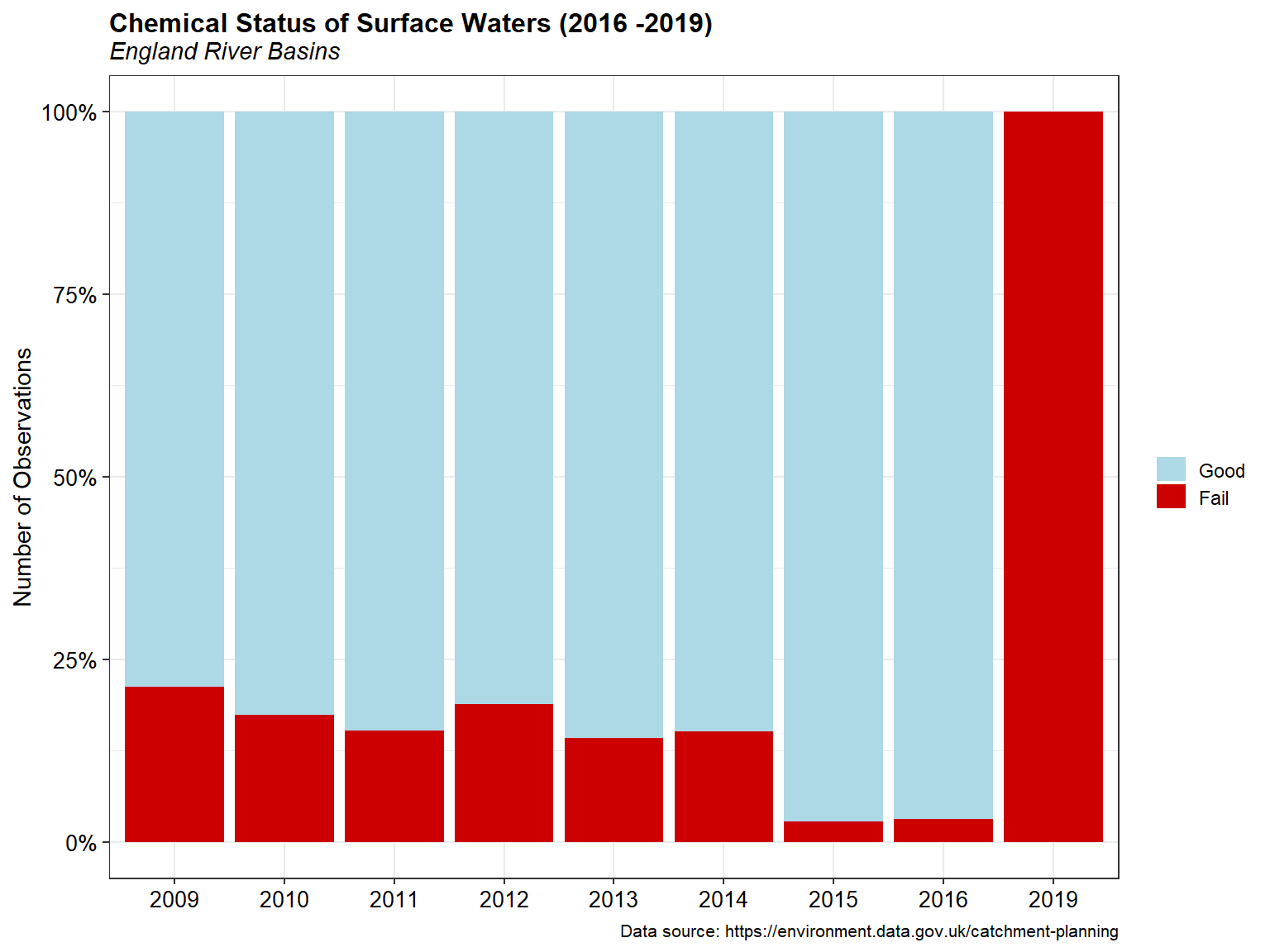
Summary of Chemical Status
Chemical status is determined by assessing compliance with environmental standards for chemicals that are listed in the Environmental Quality Standards (EQS) Directive (2008/105/EC) as amended by the Priority Substances Directive 2013/39/EU. Good Chemical Status is achieved if every EQS is met; a single EQS failure means Good Status for the water body cannot be achieved.
A bar chart of the chemical status for surface water bodies is shown below.
# Get ecological classifications
classC <- class %>%
  filter(Classification.Item == 'Chemical') %>%
  droplevels()

totals <- classC %>%
  group_by(Year, Status) %>%
  summarize(
    NObs = n()
  ) %>%
  ungroup() %>%
  mutate(
    Year = as.factor(Year)
  ) %>%
  droplevels() %>%
  data.frame()

# Stacked + percent
ggplot(data = totals, aes(x = Year, y = NObs, fill = Status)) +
  geom_bar(position = 'fill', stat = 'identity') +
  scale_y_continuous(labels = scales::percent) + #, expand = c(0, 0)) +
  scale_fill_manual(name   = NULL,
                    values = c('Good' = 'lightblue',
                               'Fail' = 'red3'),
                    drop = FALSE,
                    guide  = guide_legend(keywidth = 1, keyheight = 0.85)) +
  labs(title = 'Chemical Status of Surface Waters (2016 -2019)',
       subtitle = 'England River Basins',
       caption = 'Data source: https://environment.data.gov.uk/catchment-planning',
       x = NULL,
       y = 'Number of Observations') +
  theme_bw() +
  theme(plot.title = element_text(margin = margin(b = 2), size = 12,
                                  hjust = 0, face = 'bold'),
        plot.subtitle = element_text(margin = margin(b = 5), size = 11,
                                  hjust = 0, face = 'italic'),
        plot.caption = element_text(size = 8, color = 'black'),
        axis.title.y = element_text(size = 11, color = 'black'),
        axis.title.x = element_text(size = 11, color = 'black'),
        axis.text.x = element_text(size = 10, color = 'black'),
        axis.text.y = element_text(size = 10, color = 'black'))
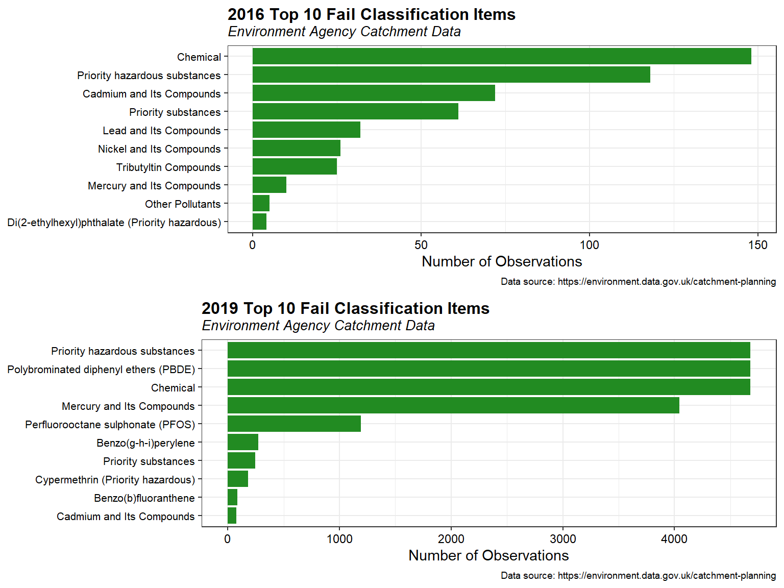
The top 10 chemical classifications items that failed in 2016 and 2019 are shown below.
# Filter class data on status fail
classF <- class %>%
  filter(Status == 'Fail') %>%
  droplevels()

# Get totals
totals <- classF %>%
  group_by(Year, Classification.Item) %>%
  summarize(
    NObs = n()
  ) %>%
  ungroup() %>%
  mutate(
    Year = as.factor(Year)
  ) %>%
  arrange(Year, -NObs) %>%
  data.frame()

# Create plot for 2016
p1 <- top_n(totals[totals$Year == '2016', ], n = 10, NObs) %>%
  ggplot(., aes(x = reorder(Classification.Item, NObs), y = NObs))+
  geom_bar(stat = 'identity', fill = 'forestgreen') +
  coord_flip() +
  labs(title = '2016 Top 10 Fail Classification Items',
       subtitle = 'Environment Agency Catchment Data',
       caption = 'Data source: https://environment.data.gov.uk/catchment-planning',
       x = NULL,
       y = 'Number of Observations') +
  theme_bw() +
  theme(plot.title = element_text(margin = margin(b = 2), size = 12,
                                  hjust = 0, face = 'bold'),
        plot.subtitle = element_text(margin = margin(b = 5), size = 10,
                                  hjust = 0, face = 'italic'),
        plot.caption = element_text(size = 7, color = 'black'),
        axis.title.y = element_text(size = 11, color = 'black'),
        axis.title.x = element_text(size = 11, color = 'black'),
        axis.text.x = element_text(size = 9, color = 'black'),
        axis.text.y = element_text(size = 8, color = 'black'))

# Create plot for 2019
p2 <- top_n(totals[totals$Year == '2019', ], n = 10, NObs) %>%
  ggplot(., aes(x = reorder(Classification.Item, NObs), y = NObs))+
  geom_bar(stat = 'identity', fill = 'forestgreen') +
  coord_flip() +
  labs(title = '2019 Top 10 Fail Classification Items',
       subtitle = 'Environment Agency Catchment Data',
       caption = 'Data source: https://environment.data.gov.uk/catchment-planning',
       x = NULL,
       y = 'Number of Observations') +
  theme_bw() +
  theme(plot.title = element_text(margin = margin(b = 2), size = 12,
                                  hjust = 0, face = 'bold'),
        plot.subtitle = element_text(margin = margin(b = 5), size = 10,
                                  hjust = 0, face = 'italic'),
        plot.caption = element_text(size = 7, color = 'black'),
        axis.title.y = element_text(size = 11, color = 'black'),
        axis.title.x = element_text(size = 11, color = 'black'),
        axis.text.x = element_text(size = 9, color = 'black'),
        axis.text.y = element_text(size = 8, color = 'black'))

grid.arrange(p1, p2, ncol = 1)
Spatial Distribution
There are many factors affecting surface water quality degradation. The spatial distribution of surface water quality reflects the process of human social and economic activities. Geospatial analysis tools can be used to quantify patterns and relationships in data and display the results as maps, tables, and charts. However, for this evaluation, only a visual analysis of the surface water quality data will be explored.
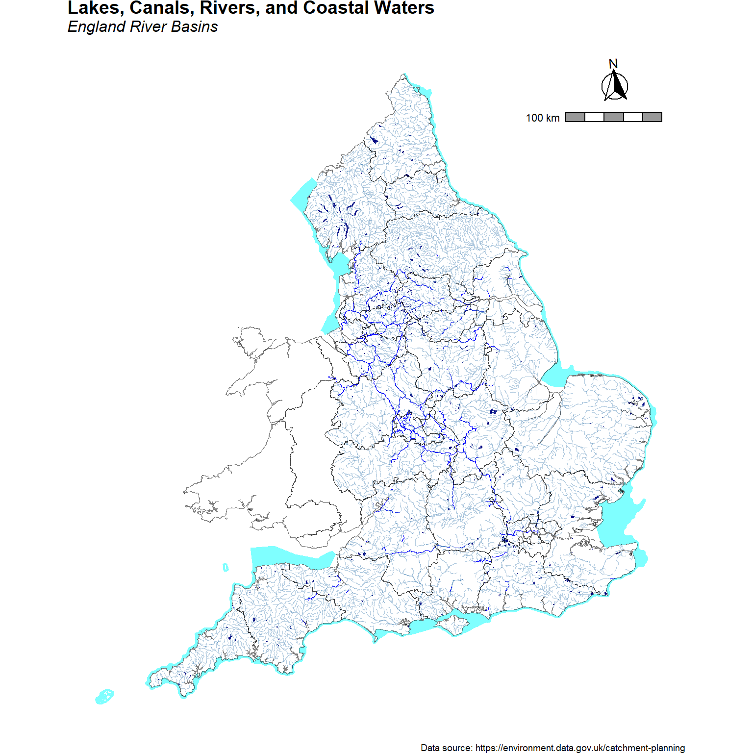
A map showing geographical coverage of England’s surface water bodies, including lakes, canals, rivers, and coastal waters is presented below.
p <- ggplot() +
  geom_sf(data = lakes, color = 'navy', fill = 'navy', size = 0.3, alpha = 1) +
  geom_sf(data = canals, color = 'blue', fill = 'blue', size = 0.3, alpha = 1) +
  geom_sf(data = rivers, color = 'steelblue', fill = 'steelblue', size = 0.2, alpha = 0.4) +
  geom_sf(data = coastal, color = NA, fill = 'cyan', size = 0.1, alpha = 0.5) +
  geom_sf(data = boundary, color = alpha('black', 0.5), fill = NA, size = 0.1) +
  coord_sf() +
  labs(title = 'Lakes, Canals, Rivers, and Coastal Waters',
       subtitle = 'England River Basins',
       caption = 'Data source: https://environment.data.gov.uk/catchment-planning') +
  theme_void() +
  theme(plot.title = element_text(margin = margin(b = 2), size = 14, hjust = 0.0,
                                  color = 'black', face = 'bold'),
        plot.subtitle = element_text(margin = margin(b = 5), size = 12,
                                     hjust = 0.0, color = 'black', face = 'italic'),
        plot.caption = element_text(size = 7, color = 'black'),
        legend.position = c(0.12, 0.85),
        legend.title = element_text(size = 9),
        legend.text = element_text(size = 9),
        panel.grid.major = element_blank(),
        panel.grid.minor = element_blank())

# Add north arrow and scale
p <- p +
  ggspatial::annotation_scale(
    plot_unit = 'm',
    height = unit(0.25, 'cm'),
    unit_category = 'metric',
    location = 'tr',
    pad_x = unit(0.25, 'in'), pad_y = unit(0.76, 'in'),
    bar_cols = c('grey60', 'white'),
    line_width = 1, line_col = 'black',
    text_col = 'black',
    text_family = 'sans'
  ) +
  ggspatial::annotation_north_arrow(
    location = 'tr', which_north = 'true',
    height = unit(1.2, 'cm'), width = unit(1.2, 'cm'),
    pad_x = unit(0.52, 'in'), pad_y = unit(0.2, 'in'),
    style = ggspatial::north_arrow_fancy_orienteering()
  )
p
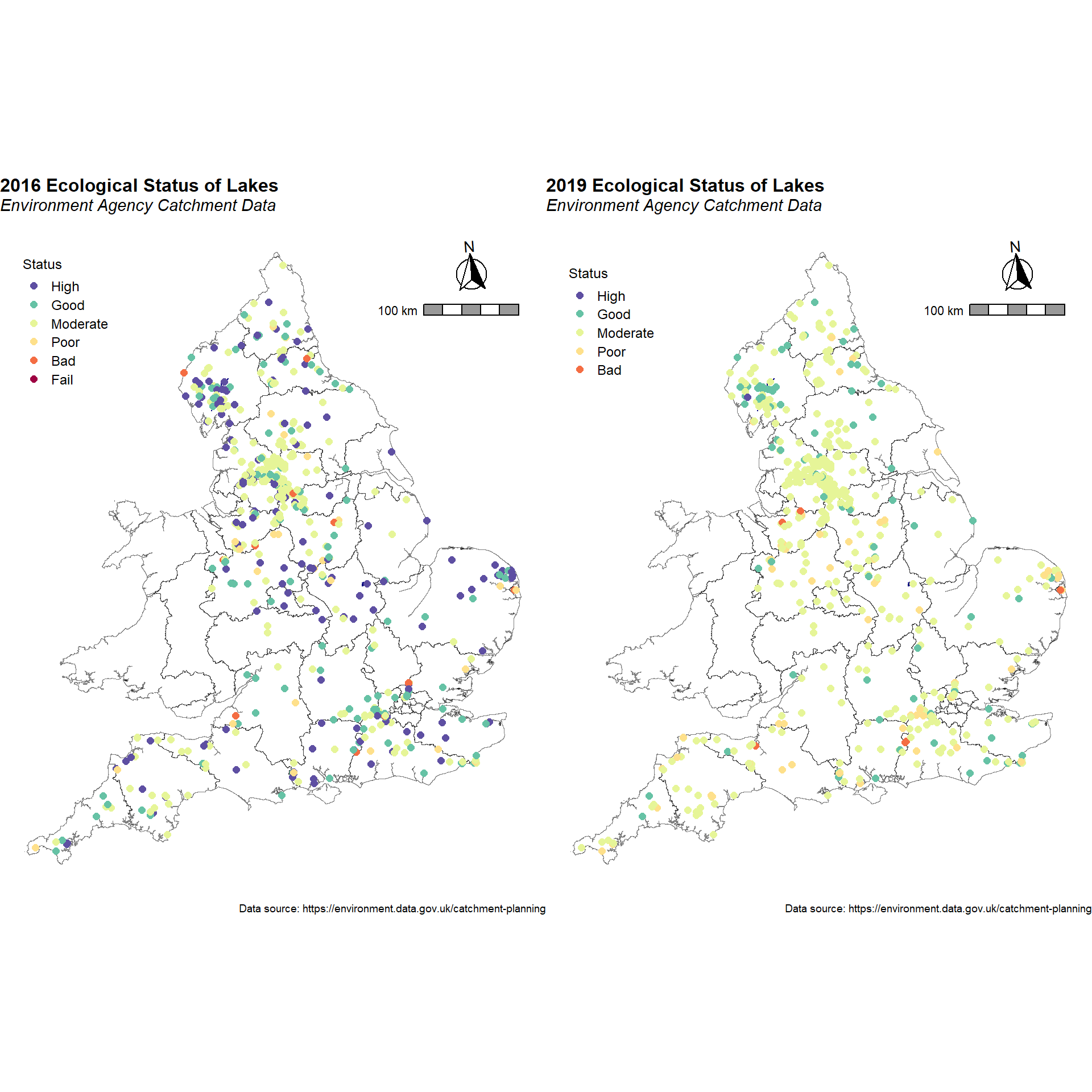
Post plots of the ecological status of lakes during 2016 and 2019 are shown below. Ecological status is shown as circles, where the color of the circle is correlated to the status level reported for that lake.
# Create plot for 2016
p1 <- ggplot() +
  geom_sf(data = boundary, color = alpha('black', 0.5), fill = NA, size = 0.1) +
  geom_sf(data = lakes, color = 'navy', fill = 'navy', size = 0.3, alpha = 1) +
  geom_point(data = subset(class, Water.Body.Type == 'Lakes' & Year == 2016),
             aes(x = Easting, y = Northing, color = Status), shape = 16,
             size = 2) +
  coord_sf() +
  scale_color_manual(name   = 'Status',
                     values = getPalette(6),
                     drop   = FALSE,
                     guide  = guide_legend(keywidth = 1, keyheight = 0.85)) +
  labs(title = '2016 Ecological Status of Lakes',
       subtitle = 'Environment Agency Catchment Data',
       caption = 'Data source: https://environment.data.gov.uk/catchment-planning') +
  theme_void() +
  theme(plot.title = element_text(margin = margin(b = 2), size = 12, hjust = 0.0,
                                  color = 'black', face = 'bold'),
        plot.subtitle = element_text(margin = margin(b = 5), size = 11,
                                     hjust = 0.0, color = 'black', face = 'italic'),
        plot.caption = element_text(size = 7, color = 'black'),
        legend.position = c(0.12, 0.85),
        legend.title = element_text(size = 9),
        legend.text = element_text(size = 9),
        panel.grid.major = element_blank(),
        panel.grid.minor = element_blank())

# Add north arrow and scale
p1 <- p1 +
  ggspatial::annotation_scale(
    plot_unit = 'm',
    height = unit(0.25, 'cm'),
    unit_category = 'metric',
    location = 'tr',
    pad_x = unit(0.25, 'in'), pad_y = unit(0.76, 'in'),
    bar_cols = c('grey60', 'white'),
    line_width = 1, line_col = 'black',
    text_col = 'black',
    text_family = 'sans'
  ) +
  ggspatial::annotation_north_arrow(
    location = 'tr', which_north = 'true',
    height = unit(1.2, 'cm'), width = unit(1.2, 'cm'),
    pad_x = unit(0.45, 'in'), pad_y = unit(0.2, 'in'),
    style = ggspatial::north_arrow_fancy_orienteering()
  )

# Create plot for 2019
p2 <- ggplot() +
  geom_sf(data = boundary, color = alpha('black', 0.5), fill = NA, size = 0.1) +
  geom_sf(data = lakes, color = 'navy', fill = 'navy', size = 0.3, alpha = 1) +
  geom_point(data = subset(classE, Water.Body.Type == 'Lakes' & Year == 2019),
             aes(x = Easting, y = Northing, color = Status), shape = 16,
             size = 2) +
  coord_sf() +
  scale_color_manual(name   = 'Status',
                     values = getPalette(6),
                     drop   = FALSE,
                     guide  = guide_legend(keywidth = 1, keyheight = 0.85)) +
  labs(title = '2019 Ecological Status of Lakes',
       subtitle = 'Environment Agency Catchment Data',
       caption = 'Data source: https://environment.data.gov.uk/catchment-planning') +
  theme_void() +
  theme(plot.title = element_text(margin = margin(b = 2), size = 12, hjust = 0.0,
                                  color = 'black', face = 'bold'),
        plot.subtitle = element_text(margin = margin(b = 5), size = 11,
                                     hjust = 0.0, color = 'black', face = 'italic'),
        plot.caption = element_text(size = 7, color = 'black'),
        legend.position = c(0.12, 0.85),
        legend.title = element_text(size = 9),
        legend.text = element_text(size = 9),
        panel.grid.major = element_blank(),
        panel.grid.minor = element_blank())

# Add north arrow and scale
p2 <- p2 +
  ggspatial::annotation_scale(
    plot_unit = 'm',
    height = unit(0.25, 'cm'),
    unit_category = 'metric',
    location = 'tr',
    pad_x = unit(0.25, 'in'), pad_y = unit(0.76, 'in'),
    bar_cols = c('grey60', 'white'),
    line_width = 1, line_col = 'black',
    text_col = 'black',
    text_family = 'sans'
  ) +
  ggspatial::annotation_north_arrow(
    location = 'tr', which_north = 'true',
    height = unit(1.2, 'cm'), width = unit(1.2, 'cm'),
    pad_x = unit(0.45, 'in'), pad_y = unit(0.2, 'in'),
    style = ggspatial::north_arrow_fancy_orienteering()
  )

# Show plots side-by-side
grid.arrange(p1, p2, ncol = 2)
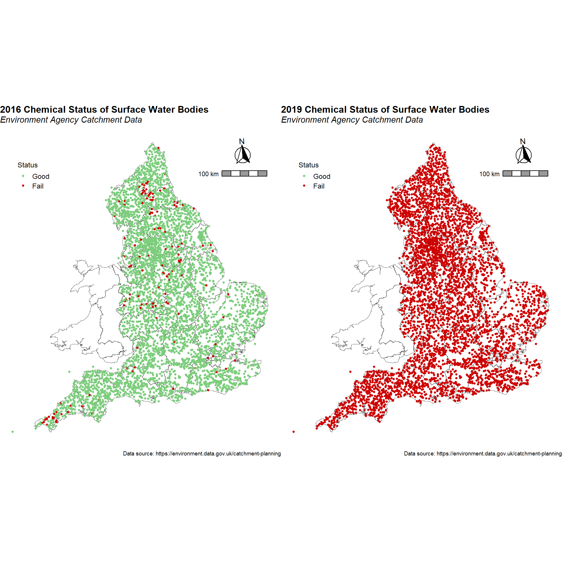
Post plots of the chemical status of all surface water bodies during 2016 and 2019 are shown below. Chemical status is shown as circles, where the color of the circle is correlated to the status level reported for that water body.
# Create plot for 2016
p1 <- ggplot() +
  geom_sf(data = boundary, color = alpha('black', 0.5), fill = NA, size = 0.1) +
  geom_point(data = subset(classC, Year == 2016),
             aes(x = Easting, y = Northing, color = Status), shape = 16,
             size = 1) +
  coord_sf() +
  scale_color_manual(name   = 'Status',
                     values = c('Good' = 'palegreen3',
                                'Fail' = 'red3'),
                     drop = FALSE,
                     guide  = guide_legend(keywidth = 1, keyheight = 0.85)) +
  labs(title = '2016 Chemical Status of Surface Water Bodies',
       subtitle = 'Environment Agency Catchment Data',
       caption = 'Data source: https://environment.data.gov.uk/catchment-planning',
       x = 'Easting',
       y = 'Northing') +
  theme_void() +
  theme(plot.title = element_text(margin = margin(b = 2), size = 12, hjust = 0.0,
                                  color = 'black', face = 'bold'),
        plot.subtitle = element_text(margin = margin(b = 5), size = 11,
                                     hjust = 0.0, color = 'black', face = 'italic'),
        plot.caption = element_text(size = 7, color = 'black'),
        legend.position = c(0.12, 0.85),
        legend.title = element_text(size = 9),
        legend.text = element_text(size = 9),
        panel.grid.major = element_blank(),
        panel.grid.minor = element_blank())

# Add north arrow and scale
p1 <- p1 +
  ggspatial::annotation_scale(
    plot_unit = 'm',
    height = unit(0.25, 'cm'),
    unit_category = 'metric',
    location = 'tr',
    pad_x = unit(0.25, 'in'), pad_y = unit(0.76, 'in'),
    bar_cols = c('grey60', 'white'),
    line_width = 1, line_col = 'black',
    text_col = 'black',
    text_family = 'sans'
  ) +
  ggspatial::annotation_north_arrow(
    location = 'tr', which_north = 'true',
    height = unit(1.2, 'cm'), width = unit(1.2, 'cm'),
    pad_x = unit(0.45, 'in'), pad_y = unit(0.2, 'in'),
    style = ggspatial::north_arrow_fancy_orienteering()
  )

# Create plot for 2019
p2 <- ggplot() +
  geom_sf(data = boundary, color = alpha('black', 0.5), fill = NA, size = 0.1) +
  geom_point(data = subset(classC, Year == 2019),
             aes(x = Easting, y = Northing, color = Status), shape = 16,
             size = 1) +
  coord_sf() +
  scale_color_manual(name   = 'Status',
                     values = c('Good' = 'palegreen3',
                                'Fail' = 'red3'),
                     drop = FALSE,
                     guide  = guide_legend(keywidth = 1, keyheight = 0.85)) +
  labs(title = '2019 Chemical Status of Surface Water Bodies',
       subtitle = 'Environment Agency Catchment Data',
       caption = 'Data source: https://environment.data.gov.uk/catchment-planning',
       x = 'Easting',
       y = 'Northing') +
  theme_void() +
  theme(plot.title = element_text(margin = margin(b = 2), size = 12, hjust = 0.0,
                                  color = 'black', face = 'bold'),
        plot.subtitle = element_text(margin = margin(b = 5), size = 11,
                                     hjust = 0.0, color = 'black', face = 'italic'),
        plot.caption = element_text(size = 7, color = 'black'),
        legend.position = c(0.12, 0.85),
        legend.title = element_text(size = 9),
        legend.text = element_text(size = 9),
        panel.grid.major = element_blank(),
        panel.grid.minor = element_blank())

# Add north arrow and scale
p2 <- p2 +
  ggspatial::annotation_scale(
    plot_unit = 'm',
    height = unit(0.25, 'cm'),
    unit_category = 'metric',
    location = 'tr',
    pad_x = unit(0.25, 'in'), pad_y = unit(0.76, 'in'),
    bar_cols = c('grey60', 'white'),
    line_width = 1, line_col = 'black',
    text_col = 'black',
    text_family = 'sans'
  ) +
  ggspatial::annotation_north_arrow(
    location = 'tr', which_north = 'true',
    height = unit(1.2, 'cm'), width = unit(1.2, 'cm'),
    pad_x = unit(0.45, 'in'), pad_y = unit(0.2, 'in'),
    style = ggspatial::north_arrow_fancy_orienteering()
  )

# Show plots side-by-side
grid.arrange(p1, p2, ncol = 2)
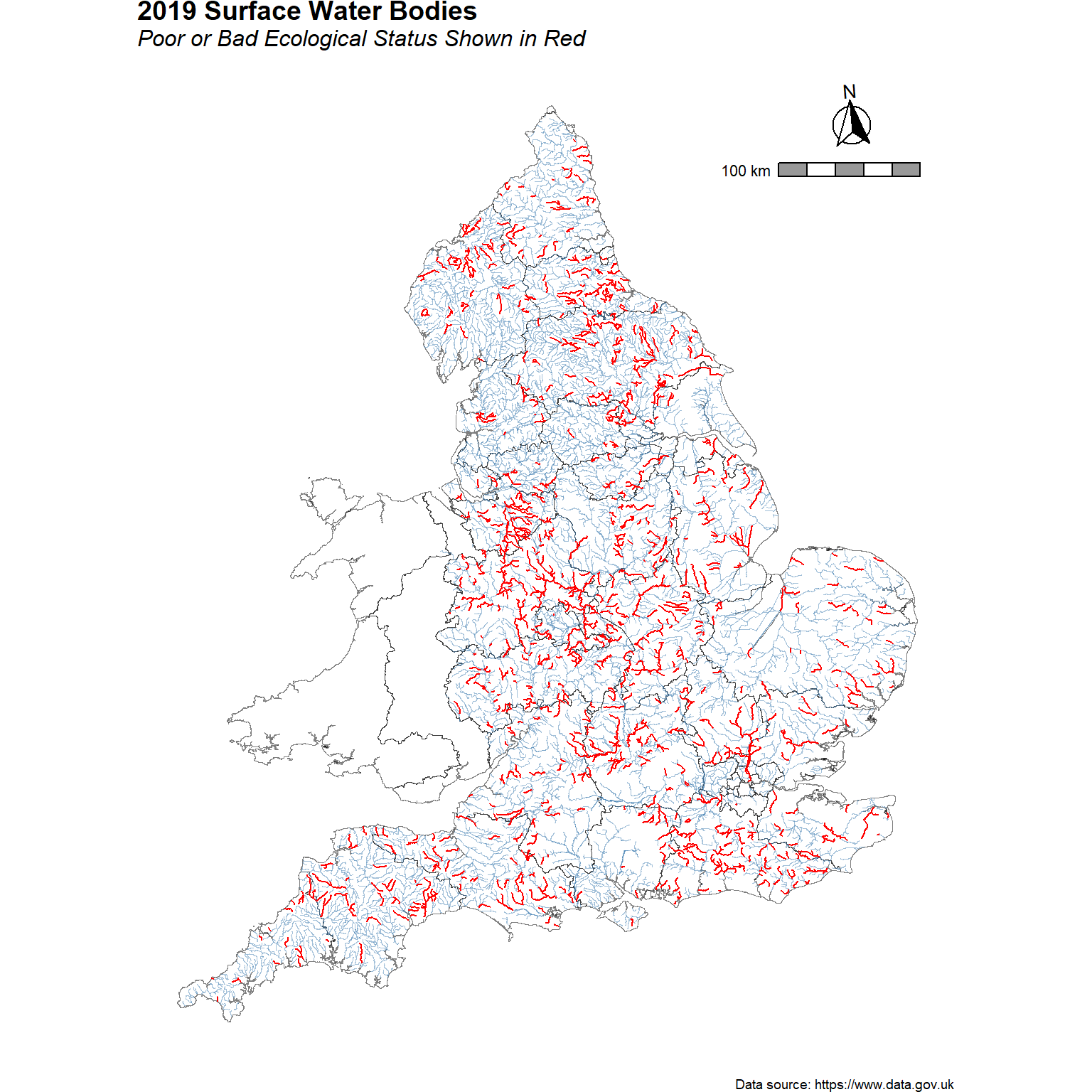
A map of surface water bodies in 2019 is shown below. Surface water bodies with an ecological status of poor or bad are shown in red.
cats <- c('Poor', 'Bad', 'Fail')
p <- ggplot() +
  geom_sf(data = boundary, color = alpha('black', 0.5), fill = NA, size = 0.01) +
  geom_sf(data = wb, color = alpha('steelblue', 0.5), size = 0.1) +
  geom_sf(data = wb[wb$eco_class %in% cats,], color = 'red', size = 0.5) +
  coord_sf() +
  labs(title = '2019 Surface Water Bodies',
       subtitle = 'Poor or Bad Ecological Status Shown in Red',
       caption = 'Data source: https://www.data.gov.uk') +
  theme_void() +
  theme(plot.title = element_text(margin = margin(b = 2), size = 14, hjust = 0.0,
                                  color = 'black', face = 'bold'),
        plot.subtitle = element_text(margin = margin(b = 5), size = 12,
                                     hjust = 0.0, color = 'black', face = 'italic'),
        plot.caption = element_text(size = 7, color = 'black'),
        legend.position = c(0.12, 0.85),
        legend.title = element_text(size = 9),
        legend.text = element_text(size = 9),
        panel.grid.major = element_blank(),
        panel.grid.minor = element_blank())

# Add north arrow and scale
p <- p +
  ggspatial::annotation_scale(
    plot_unit = 'm',
    height = unit(0.25, 'cm'),
    unit_category = 'metric',
    location = 'tr',
    pad_x = unit(0.25, 'in'), pad_y = unit(0.76, 'in'),
    bar_cols = c('grey60', 'white'),
    line_width = 1, line_col = 'black',
    text_col = 'black',
    text_family = 'sans'
  ) +
  ggspatial::annotation_north_arrow(
    location = 'tr', which_north = 'true',
    height = unit(1.2, 'cm'), width = unit(1.2, 'cm'),
    pad_x = unit(0.52, 'in'), pad_y = unit(0.2, 'in'),
    style = ggspatial::north_arrow_fancy_orienteering()
  )
p
Population
Due to rapid urbanization, human activities have a significant impact on the health of natural ecosystems. Discharge of municipal wastewater and urban drainage into river basins is more pronounced in areas with larger population density.
Under an Open Government Licence, a gridded population data product at 1 km x 1 km spatial resolution based on the British National Grid (OSGB36 datum) can be downloaded from the Environmental Information Data Centre. The gridded data combines the 2011 UK Census population data with the 2015 land cover map. The data can be loaded using the raster package. After loading, the raster file will need to be clipped to the boundary polygon and then converted to a dataframe for plotting using ggplot2.
# Read raster file
r <- raster('data/population/UK_residential_population_2011_1_km.asc')

# Clip raster to boundary
r <- mask(r, boundary)

# Convert the raster to points for plotting
map.p <- rasterToPoints(r)

# Make the points a dataframe for plotting with ggplot
df <- data.frame(map.p)

# Make appropriate column headings
colnames(df) <- c('x', 'y', 'pop')
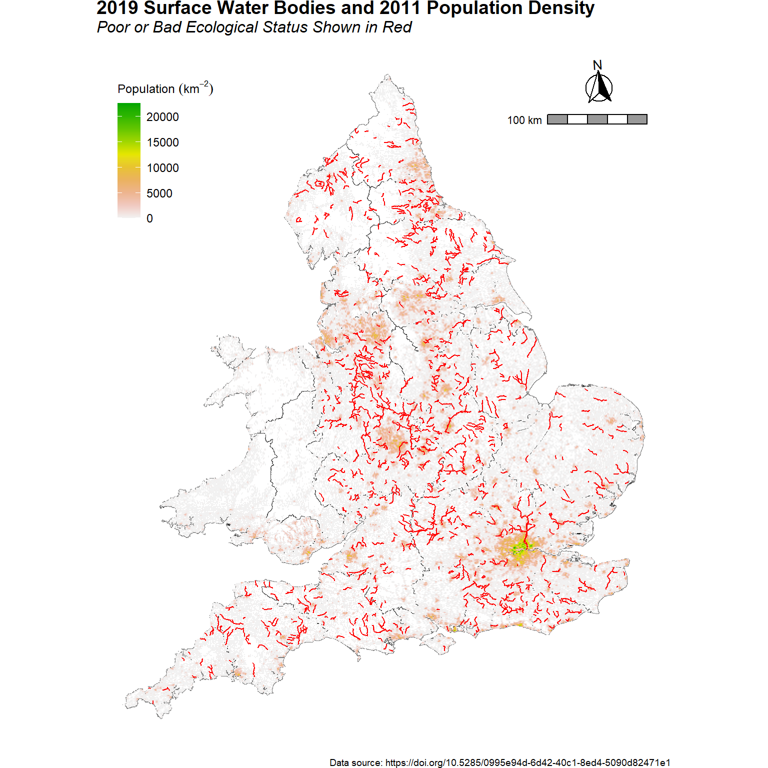
A map of surface water bodies in 2019 and the 2011 residendial population density is shown below. Surface water bodies with an ecological status of poor or bad are shown in red.
# Create plot
cats <- c('Poor', 'Bad', 'Fail')
p <- ggplot() +
  geom_sf(data = boundary, color = alpha('black', 0.5), fill = NA, size = 0.01) +
  geom_tile(data = df, aes(x = x, y = y, fill = pop)) +
  geom_sf(data = wb[wb$eco_class %in% cats,], color = 'red', size = 0.4) +
  coord_sf() +
  labs(title = '2019 Surface Water Bodies and 2011 Population Density',
       subtitle = 'Poor or Bad Ecological Status Shown in Red',
       caption = 'Data source: https://doi.org/10.5285/0995e94d-6d42-40c1-8ed4-5090d82471e1') +
  scale_fill_gradientn(name   = bquote('Population '(km^-2)),
                       colors = rev(terrain.colors(10))) +
  theme_void() +
  theme(plot.title = element_text(margin = margin(b = 2), size = 14, hjust = 0.0,
                                  color = 'black', face = 'bold'),
        plot.subtitle = element_text(margin = margin(b = 5), size = 12,
                                     hjust = 0.0, color = 'black', face = 'italic'),
        plot.caption = element_text(size = 7, color = 'black'),
        legend.position = c(0.12, 0.85),
        legend.title = element_text(size = 9),
        legend.text = element_text(size = 9),
        panel.grid.major = element_blank(),
        panel.grid.minor = element_blank())

# Add north arrow and scale
p <- p +
  ggspatial::annotation_scale(
    plot_unit = 'm',
    height = unit(0.25, 'cm'),
    unit_category = 'metric',
    location = 'tr',
    pad_x = unit(0.25, 'in'), pad_y = unit(0.76, 'in'),
    bar_cols = c('grey60', 'white'),
    line_width = 1, line_col = 'black',
    text_col = 'black',
    text_family = 'sans'
  ) +
  ggspatial::annotation_north_arrow(
    location = 'tr', which_north = 'true',
    height = unit(1.2, 'cm'), width = unit(1.2, 'cm'),
    pad_x = unit(0.52, 'in'), pad_y = unit(0.2, 'in'),
    style = ggspatial::north_arrow_fancy_orienteering()
  )
p
Conclusion
This post is intended to provide tools and insights to those individuals interested in analyzing the ecological and chemical status of various water bodies across England. Information and data about the river basin management water environment easily can be accessed from the Catchment Data Explorer.
- Posted on:
- July 18, 2022
- Length:
- 24 minute read, 5010 words
- See Also: